WPF MessageBox Sample Creator
Real-time simulation of the standard Windows MessageBox.
Pre-built .exe available on GitHub—start UI specification reviews without a dev environment.
Overview: Interactive MessageBox Simulator
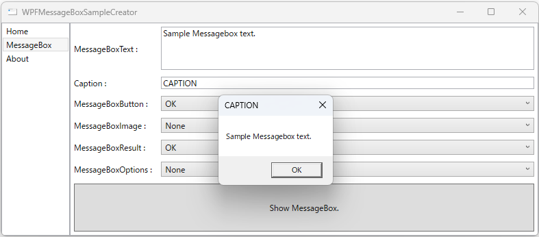
The WPF MessageBox Sample Creator is a prototyping application that allows you to intuitively customize the standard MessageBox and preview its actual behavior instantly.
Set the message text, caption, button set, icon, default result and display options, then show the dialog with exactly those settings.
Since pre-built executable files (.exe) are available on the GitHub Releases page, anyone can use the tool by simply downloading it—no Visual Studio or development environment required. The builds are framework-dependent, so the matching x64 .NET Desktop Runtime does have to be installed already; see System Requirements below.
Background: Removing the “Build Barrier”
In WPF development, repeatedly writing code just to check the behavior of dialogs is inefficient. Furthermore, designers and architects often find it difficult to use tools that are only shared as source code, as setting up a build environment is a significant hurdle.
To solve this, this tool is distributed in a ready-to-run format. By adhering strictly to standard WPF Style definitions without third-party libraries, I achieved a lightweight tool with minimal dependencies.
Configurable Parameters
The arguments of the MessageBox.Show overload this tool calls are each exposed as an
independent input, so combinations can be tried without editing and rebuilding code.
The overloads that take an owner Window as their first argument are out of scope —
the tool does not set an owner:
| Parameter | Type | Effect |
|---|---|---|
| Message text | string |
The body of the dialog. Useful for checking how long text wraps and how the dialog resizes. |
| Caption | string |
The title bar text. |
| Buttons | MessageBoxButton |
The button set: OK, OK/Cancel, Yes/No, or Yes/No/Cancel. |
| Icon | MessageBoxImage |
The system icon shown beside the message. All nine enum values are selectable. |
| Default result | MessageBoxResult |
Which button receives focus when the dialog opens — that is, what Enter activates. Every member of the enum is selectable here, but the value only takes effect when the chosen button set actually contains that button. Ask for a result the dialog is not displaying and the first button becomes the default instead, which is worth trying once to see. |
| Options | MessageBoxOptions |
Display options such as right-aligned text and right-to-left reading order. |
What the Tool Makes Obvious: Nine Icon Names, Four Icons
MessageBoxImage has nine members, which suggests nine different icons are available.
It is not the case. Several members share the same underlying numeric value, so they are indistinguishable
at runtime — the enum simply offers alternative names for the same Win32 flag:
| Enum members | Value | Icon actually displayed |
|---|---|---|
None |
0 | No icon |
Error / Hand / Stop |
16 | White X in a red circle |
Question |
32 | Question mark in a circle |
Exclamation / Warning |
48 | Exclamation point in a yellow triangle |
Asterisk / Information |
64 | Lowercase i in a circle |
Selecting Error, Hand and Stop in turn and seeing the identical dialog
each time settles a question that reading the enum definition tends to raise. It also means picking between
those names is a readability decision for the code, not a visual one for the user.
One further caveat worth knowing before you reach for it: Microsoft documents the
Question icon as no longer recommended, on the grounds that a question mark does not identify a
category of message and can be mistaken for a help affordance. It remains in the enum for backward
compatibility. For a confirmation prompt, Warning or no icon at all is the safer choice.
Technical Insights: Flexibility and Portability
1. No Build Required: Download and Run
Sharing a tool with non-engineers requires more than just providing source code. By maintaining a public release of the executable, I've established a workflow where every team member can verify the latest UI specifications on their own machines instantly.
2. Independent Property Settings
Each control is designed to be configured independently. This allows users to test complex scenarios—such as specific button/icon combinations or automatic resizing—without worrying about code logic.
3. Clean UI Management via XAML
The layout is defined purely in XAML, separating design from logic. It serves as an implementation sample showing how standard controls can be optimized through Styles alone.
Typical Uses
- Settling dialog wording in a spec review. Show the actual dialog to reviewers instead of describing it, and agree on the text and button set in the meeting itself.
- Checking how long messages render. A message that reads fine in code can wrap awkwardly or stretch the dialog once displayed. Pasting the real string in shows the result immediately.
- Confirming which button Enter triggers. Getting the default result wrong on a destructive confirmation is a real usability defect; the tool shows where focus lands before the code is written.
- Verifying right-to-left layout. The options parameter covers RTL reading order, which is otherwise awkward to check.
System Requirements
- OS: Windows, x64
- Runtime: The release ZIP contains two win-x64 builds, one for .NET 8 and one for .NET 10. Both are framework-dependent — the runtime is not bundled — so the matching x64 .NET Desktop Runtime has to be installed. Pick the executable for whichever version you already have.
- UI framework: WPF, no third-party dependencies
Downloads & Repository
You can download the executable or browse the source code on GitHub:
🚀 Download Pre-built .exe (GitHub Releases)
View GitHub Repository (Source Code)