WPF Standard Control Demo App › ProgressBar
ProgressBar Display
ProgressBar displays the progress of an operation. It supports both determinate mode (showing a specific percentage) and indeterminate mode (showing an animation when progress cannot be measured).
Overview
The WPF ProgressBar control provides visual feedback for long-running operations,
communicating to the user that work is in progress and preventing the perception of an unresponsive
application. It descends from RangeBase, the same abstract class used by Slider
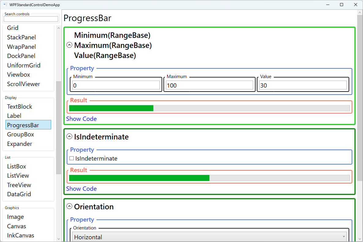
and ScrollBar, providing a consistent model of Minimum, Maximum,
and Value properties that define the range and current progress position.
In determinate mode (the default, IsIndeterminate="False"), the filled portion of
the bar is proportional to (Value - Minimum) / (Maximum - Minimum), giving users a concrete
percentage indication. Binding Value to an observable property in the view model and
updating it from a background task via IProgress<T> or a Task's
progress callback produces smooth real-time updates without blocking the UI thread.
In indeterminate mode (IsIndeterminate="True"), the bar displays a looping animation
rather than a filled segment. This mode is appropriate when the total duration or number of steps is
unknown — for example, during an initial data load, a network request, or a file system enumeration.
The animation is driven by the control template and consumes minimal CPU, making it safe to leave
running while background work completes.
The Orientation property allows the ProgressBar to be rendered vertically, filling from
bottom to top, which suits certain dashboard gauge and level-meter designs. Both orientations respect
the same Minimum, Maximum, and Value properties, so switching
orientation is purely cosmetic and requires no logic changes.
Screen Preview
Demonstrated Properties
The following properties are demonstrated interactively in the WPF Standard Control Demo App. Each property can be configured in real time within the app to observe its behavior.
| Property | Values | Description |
|---|---|---|
IsIndeterminate |
bool |
Switches between determinate (filled bar showing percentage) and indeterminate (looping animation) modes. Use true for operations where the total work cannot be measured — network requests, file-system enumeration, or initial data loads. Setting back to false and updating Maximum/Value once the scope is known is the recommended pattern. Pitfall: the indeterminate animation continues consuming CPU as long as the control is visible. Always set IsIndeterminate="False" and/or set Visibility="Collapsed" after the operation finishes to release rendering resources. |
Orientation |
Horizontal / Vertical |
Controls whether the progress bar fills horizontally (left to right) or vertically (bottom to top). Use Vertical for dashboard gauges, audio level meters, and bar-chart visualizations where upward growth is the expected mental model. Pitfall: in vertical mode the value increases from the bottom edge up, which is correct for most level-meter designs. If you need the bar to grow from top to bottom, apply a custom ControlTemplate or use a ScaleTransform to flip the rendering. |
Minimum (RangeBase) |
double |
The value at which the progress bar displays as completely empty. Defaults to 0. For operations that start at a non-zero baseline (e.g., resuming a partially complete download), setting a non-zero minimum lets the visual accurately represent the remaining work. Pitfall: setting Maximum equal to Minimum causes a divide-by-zero in the internal fill calculation and the bar will not display correctly. Always ensure Maximum > Minimum before binding Value. |
Maximum (RangeBase) |
double |
The value at which the progress bar displays as completely full. Defaults to 100. Setting this to the total item count (e.g., the number of files in a batch job) and incrementing Value by 1 per processed item produces an accurate percentage without manual math. Pitfall: if Maximum is set to 0 or if Maximum == Minimum, the bar will not render correctly. Validate these values before starting any progress reporting loop. |
Value (RangeBase) |
double |
The current progress value, clamped between Minimum and Maximum. In MVVM applications, this is the primary binding target, updated from a background operation. Use IProgress<T> (which captures the UI thread's synchronization context) or Dispatcher.InvokeAsync to push updates safely. Pitfall: updating Value directly from a Task or background thread without marshaling to the UI thread throws an InvalidOperationException. Always use IProgress<T> or Dispatcher for cross-thread updates. |
XAML Example
The following XAML demonstrates both determinate and indeterminate ProgressBars with MVVM bindings:
<StackPanel Margin="16" Width="400">

  <!-- Determinate progress bar bound to a view model property -->
  <TextBlock Text="{Binding ProgressPercent, StringFormat='Processing: {0:0}%'}"
             Margin="0,0,0,4" />
  <ProgressBar Minimum="0" Maximum="100"
               Value="{Binding ProgressPercent}"
               Height="20" Margin="0,0,0,16" />

  <!-- Indeterminate mode for operations of unknown length -->
  <TextBlock Text="Loading data..."
             Visibility="{Binding IsLoading, Converter={StaticResource BoolToVisibilityConverter}}"
             Margin="0,0,0,4" />
  <ProgressBar IsIndeterminate="{Binding IsLoading}"
               Height="8" Margin="0,0,0,16" />

  <!-- Vertical progress bar -->
  <ProgressBar Orientation="Vertical"
               Minimum="0" Maximum="100"
               Value="{Binding Level}"
               Width="24" Height="120"
               HorizontalAlignment="Left" />

</StackPanel>
Common Use Cases
- File operations: Showing copy, move, or download progress during bulk file operations, with the
Valuebound to bytes transferred or files processed. - Data loading indicators: Indeterminate bars displayed while fetching data from a database or REST API, switching to determinate mode once the total record count is known.
- Installation wizards: Step-by-step installation progress using a determinate bar with
Maximumset to the total installation step count. - Media playback: A horizontal ProgressBar as a read-only playback position indicator in a media player, styled to match the application's media controls.
- Dashboard gauges and level meters: Vertical ProgressBars styled with custom colors and tick marks to represent audio levels, battery charge, or resource utilization in monitoring dashboards.
Tips and Best Practices
- Use
IProgress<T>for thread-safe updates: Construct aProgress<int>with a callback that updates your ViewModel property. TheProgress<T>class captures the synchronization context so the callback runs on the UI thread, eliminating the need for explicitDispatcher.Invokecalls. - Pair with a Cancel button: Long operations with a progress bar should always offer a cancellation path. Use
CancellationTokenSourceandCancellationTokenin your async task, and resetIsIndeterminateandVisibilityin the cancellation handling code. - Add a percentage label alongside the bar: A
TextBlockshowing the numeric percentage (e.g., "47%") in addition to the bar provides accessibility for users with color vision deficiency. Place it inside aGridcentered over the ProgressBar usingHorizontalAlignment="Center"andVerticalAlignment="Center". - Set
Maximumto item count, not 100: Using the actual item count (e.g., 500 files) and incrementing by 1 avoids floating-point percentage calculations in the view model and keeps the binding logic simple. - Hide the bar when idle: Set
Visibility="Collapsed"on the ProgressBar when no operation is in progress to avoid the indeterminate animation consuming CPU and distracting users.
Related Controls
Source Code
The source code for this demo screen is available on GitHub. Use the built-in code view buttons in the app to see the exact XAML for each property.