WPF Standard Control Demo App › Slider
Slider Inputs
Slider is a control that allows users to select a value from a continuous or stepped range by dragging a thumb along a track. It is commonly used for volume controls, zoom levels, opacity settings, and other range-based inputs where visual feedback is important.
Overview
The WPF Slider control inherits from RangeBase, sharing its
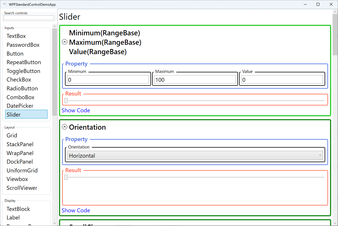
Minimum, Maximum, and Value properties with
ProgressBar. The thumb — the draggable element — moves proportionally between the
minimum and maximum bounds, and the Value property reflects the current position as a
double. Data-binding Value two-way to a ViewModel property is the standard
approach for integrating Slider into MVVM applications.
Slider supports both continuous and discrete (snapped) value selection. Setting
IsSnapToTickEnabled="True" combined with TickFrequency restricts the value
to multiples of the tick interval, turning the slider into a stepped selector. You can also provide
a custom Ticks collection (DoubleCollection) for irregular snap points
rather than evenly spaced ones.
Tick marks are rendered on the slider track when TickPlacement is set to
TopLeft, BottomRight, or Both. The spacing between rendered
ticks is controlled by TickFrequency, while the optional selection range indicator
(a highlighted section of the track between SelectionStart and SelectionEnd)
visualizes a sub-range within the overall scale — useful for showing valid ranges or target zones.
An auto-tooltip can be enabled via AutoToolTipPlacement, which shows the current numeric
value in a tooltip while the user drags the thumb. The number of decimal places displayed is controlled
by AutoToolTipPrecision. This provides immediate numeric feedback without requiring a
separate TextBlock bound to Value.
Screen Preview
Demonstrated Properties
The following properties are demonstrated interactively in the WPF Standard Control Demo App. Each property can be configured in real time within the app to observe its behavior.
| Property | Values | Description |
|---|---|---|
Minimum / Maximum / Value (RangeBase) |
double |
Defines the range of selectable values and the current position. Use this for continuous inputs such as volume (0–100), zoom (10–400%), or opacity (0.0–1.0). Value is always clamped between Minimum and Maximum. Bind Value two-way to a ViewModel property to read or set the slider position programmatically. Pitfall: setting Maximum < Minimum raises a validation error. When binding both properties dynamically, set Minimum before (or simultaneously with) Maximum to avoid a transient invalid state. |
Orientation |
Horizontal / Vertical |
Sets the slider's layout direction. Horizontal (default) increases value left-to-right; Vertical increases value bottom-to-top by default. Use IsDirectionReversed to flip the direction if needed. Pitfall: for a vertical slider where large values should be at the top (e.g., audio fader), set IsDirectionReversed="True" — without this, the maximum is at the bottom, which is counterintuitive for most designs. |
SmallChange / LargeChange |
double |
SmallChange is the value increment for arrow-key navigation; LargeChange is the increment for Page Up/Down. Set these to meaningful domain units (e.g., 1 for integer steps, 0.1 for fine-grained floats) for keyboard accessibility. Pitfall: values too close to the full range make keyboard fine-tuning impossible. For a 0–100 volume slider, SmallChange=1 and LargeChange=10 is appropriate; overly large values lock users into coarse steps. |
IsDirectionReversed |
bool |
When true, reverses the value direction so the maximum is at the left (horizontal) or top (vertical). Useful for scenarios like a thermometer where higher values are visually at the top, or an audio balance control. Pitfall: reversing the direction does not automatically flip custom tick labels — if you have a Ticks-based label overlay, the labels must be manually reordered to match the reversed direction. |
TickPlacement |
None / TopLeft / BottomRight / Both |
Controls where tick marks are rendered relative to the track. Use this when visual step indicators improve usability — for example, showing 0/25/50/75/100 marks on a volume slider. Pitfall: TickPlacement only controls rendering; it does not enable snap-to-tick behavior. Set IsSnapToTickEnabled="True" separately to make the thumb snap to tick positions. |
TickFrequency |
double |
The interval between rendered tick marks and snap positions (when IsSnapToTickEnabled is true). A value of 10 on a 0–100 slider creates ticks at 0, 10, 20, …, 100. Pitfall: if TickFrequency does not evenly divide the range, the last tick will not coincide with Maximum (e.g., Minimum=0, Maximum=100, TickFrequency=30 gives ticks at 0, 30, 60, 90 — the 100 mark is missing). |
IsSnapToTickEnabled |
bool |
When true, restricts Value to positions defined by tick marks (from TickFrequency or the custom Ticks collection). The thumb snaps to the nearest valid position on drag release. Pitfall: with TickFrequency=1 on a 0–100 slider, only integers can be selected. If your scenario requires float precision (e.g., 0.5), keep IsSnapToTickEnabled="False". |
Ticks |
DoubleCollection |
An explicit list of tick positions. When provided, ticks are drawn only at these values rather than at uniform TickFrequency intervals. Useful for non-linear scales or labeled breakpoints such as font sizes (8, 9, 10, 11, 12, 14, 16). |
SelectionStart / SelectionEnd / IsSelectionRangeEnabled |
double / double / bool |
Highlights a sub-range on the track between SelectionStart and SelectionEnd when IsSelectionRangeEnabled is true. Useful for showing valid or recommended value zones on the slider track. |
AutoToolTipPlacement |
None / TopLeft / BottomRight |
Enables a tooltip showing the current numeric value while dragging — useful when exact values matter, such as zoom percentage or volume level. TopLeft positions the tooltip above (horizontal) or to the left (vertical) of the thumb. Pitfall: the tooltip only shows the raw number with decimal precision controlled by AutoToolTipPrecision. Custom formats (e.g., "50%" or "120 bpm") are not supported. Use a separate TextBlock bound to Value with a StringFormat for custom displays. |
AutoToolTipPrecision |
int |
The number of decimal places displayed in the auto-tooltip. Set to 0 for integer display, or higher for floating-point precision feedback. Pitfall: setting AutoToolTipPrecision=0 truncates the display to integers even when the actual Value is a float. The displayed value may differ from the stored value if IsSnapToTickEnabled is false. |
Delay / Interval |
int (ms) |
Controls the repeat behavior when the user clicks on the track (not the thumb) to move the slider by LargeChange increments. Delay is the initial pause before repeating; Interval is the time between repeat steps. |
XAML Example
A volume-style slider from 0 to 100 with tick marks, snap-to-tick, and an auto-tooltip:
<Slider Minimum="0" Maximum="100" Value="{Binding Volume, Mode=TwoWay}"
        Orientation="Horizontal"
        TickPlacement="BottomRight" TickFrequency="10"
        IsSnapToTickEnabled="True"
        AutoToolTipPlacement="TopLeft" AutoToolTipPrecision="0"
        SmallChange="1" LargeChange="10"
        Width="300" />

<!-- Vertical slider with reversed direction (max at top) -->
<Slider Orientation="Vertical" Minimum="0" Maximum="1"
        Value="{Binding Opacity, Mode=TwoWay}"
        IsDirectionReversed="True"
        Height="200" />
Common Use Cases
- Volume and audio controls — Drag to set speaker volume, balance, or equalizer bands with immediate visual feedback.
- Zoom and scale controls — Let users zoom into a map, image, or document by dragging a slider rather than typing a percentage.
- Color picker components — Use three vertical sliders for R, G, B channels in a custom color selection panel.
- Video/media timeline — Display playback position on a horizontal slider that updates as the media plays and allows seek-by-drag.
- Opacity and transparency — Bind a slider's Value to an element's
Opacityfor a live preview effect.
Tips and Best Practices
- Use UpdateSourceTrigger=PropertyChanged for live preview — By default, two-way bindings update on focus loss. Set
UpdateSourceTrigger=PropertyChangedto push every drag movement to the ViewModel for real-time feedback. Be aware that if the ViewModel setter does heavy work, dragging performance will suffer; consider throttling updates in that case. - Show a numeric readout — Pair the slider with a
TextBlockorTextBoxbound to the same Value so users know the exact number. UseStringFormator anIValueConverterto display custom units such as "50%" or "120 bpm". - Disable snap for continuous values — For opacity (0.0–1.0) or other continuous ranges, keep
IsSnapToTickEnabled="False"andTickPlacement="None"for a cleaner, unconstrained look. - Set meaningful SmallChange/LargeChange — These drive keyboard navigation, which is critical for accessibility. Match the step sizes to the domain units (e.g., 1 volume unit, 5% zoom). Overly large values prevent fine-grained keyboard control.
- Validate input bounds — If users can also type a value in an adjacent TextBox, clamp the ViewModel property to [Minimum, Maximum] to prevent the thumb from going out of range.
Related Controls
- ProgressBar — Shares the RangeBase base class; read-only display of a value within a range.
- ScrollViewer — Uses Slider-like scroll bars internally for content navigation.
- RepeatButton — An alternative for step-by-step increments without a draggable thumb.
Source Code
The source code for this demo screen is available on GitHub. Use the built-in code view buttons in the app to see the exact XAML for each property.