WPF Standard Control Demo App › DatePicker
DatePicker Inputs
DatePicker is a control that allows users to select a date using a popup calendar. It supports date range restrictions, first day of week configuration, and custom date display formats.
Overview
The WPF DatePicker provides a compact, user-friendly way to select a calendar date
without requiring the user to type raw date strings. It renders as a text field showing the selected
date and a small calendar-button that, when clicked, opens a popup Calendar control.
Users can navigate months by clicking the month/year header and select any date with a single click.
The calendar closes automatically on selection, placing the chosen date into the text field.
The core value is exposed through SelectedDate, a nullable DateTime?
property that integrates cleanly with WPF data binding. When bound to a ViewModel property
two-way, the selected date updates the model immediately on selection. The Text
property reflects the formatted text in the input field and can differ from the
SelectedDate value if the user has typed an invalid or partial date string.
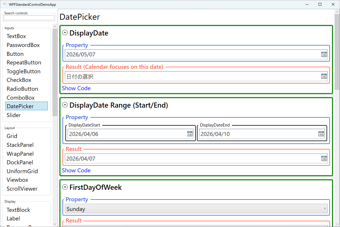
Date range restrictions are applied through DisplayDateStart and
DisplayDateEnd, which cause out-of-range dates to appear greyed out and
unselectable in the popup calendar. DisplayDate controls which month is
initially shown when the calendar opens, regardless of the currently selected date. This
is useful for booking systems where you want to pre-navigate to a relevant month.
The SelectedDateFormat property toggles between Short (e.g., "12/31/2025")
and Long (e.g., "Wednesday, December 31, 2025") display formats, using the
current culture settings. FirstDayOfWeek lets you configure which day starts
each week row in the calendar — important for applications targeting multiple locales where
conventions differ (Sunday vs. Monday).
Screen Preview
Demonstrated Properties
The following properties are demonstrated interactively in the WPF Standard Control Demo App. Each property can be configured in real time within the app to observe its behavior.
| Property | Values | Description |
|---|---|---|
SelectedDate |
DateTime? |
The currently selected date as a nullable DateTime. Bind this two-way to a DateTime? ViewModel property to read and set the selected date from code. When the user clears the text field, SelectedDate becomes null. Pitfall: if you bind to a non-nullable DateTime property, a binding error occurs when the value is null. Always use DateTime? (nullable) as the binding target for SelectedDate. |
DisplayDate |
DateTime |
Controls which month is shown when the calendar popup first opens. By default this tracks the selected date, but you can override it to pre-navigate to a specific month — for example, a booking calendar that opens three months ahead. Pitfall: changing DisplayDate only moves the calendar's visible month; it does not change SelectedDate. To pre-select a date you must also set SelectedDate separately. |
DisplayDateStart / DisplayDateEnd |
DateTime? |
Sets the earliest and latest dates the user can select. Dates outside this range appear greyed out in the calendar. Combine them to define a valid selection window — for example, "today to 30 days out" for appointment booking. Pitfall: these properties restrict the calendar UI but do not prevent a user from typing an out-of-range date directly into the text field. Always validate SelectedDate in the ViewModel as well. |
FirstDayOfWeek |
DayOfWeek |
Sets which day of the week appears in the leftmost column of the calendar grid. The default is determined by the thread's current culture. Pitfall: WPF does not automatically derive this from the OS locale at runtime. For Japanese or European audiences where Monday is the conventional first day, set FirstDayOfWeek="Monday" explicitly. |
IsDropDownOpen |
bool |
Gets or sets whether the calendar popup is open. You can bind or set this programmatically to open the calendar without a button click — useful for keyboard-driven workflows where pressing a key should reveal the picker. Pitfall: attempting to open the dropdown before the DatePicker is fully rendered (e.g., in a constructor before the Loaded event) can cause layout issues. Always open it from within a Loaded handler or later. |
IsTodayHighlighted |
bool |
When True (the default), today's date is visually highlighted in the popup calendar. Set to False to remove this highlight for scenarios where today has no special significance — such as historical data entry — and the highlight could mislead users. Pitfall: disabling the highlight does not make today unselectable; it is purely cosmetic and has no effect on which dates are valid choices. |
SelectedDateFormat |
Short / Long |
Controls how the selected date is formatted in the text field. Short uses the culture's short date pattern (e.g., "1/15/2026" in en-US, "2026/01/15" in ja-JP); Long uses the long date pattern including the full day and month names. Pitfall: Long format is locale-dependent and may produce unexpected output for non-target locales. If you need a specific fixed format (e.g., ISO 8601), use an IValueConverter rather than relying on this property. |
Text |
string |
The raw string currently shown in the text field. This may differ from SelectedDate if the user has typed a partial or invalid date. Monitoring Text is useful for real-time validation feedback before the date is committed. Pitfall: when a user types an invalid date string, SelectedDate may remain null while Text still contains the user's input, so checking only SelectedDate for null is not sufficient for detecting invalid user input. |
XAML Example
The following XAML demonstrates common DatePicker configurations including range restriction and format selection:
<StackPanel Margin="16" Spacing="12">

  <!-- Basic date picker bound to a ViewModel property -->
  <DatePicker SelectedDate="{Binding BirthDate}"
              IsTodayHighlighted="True"
              SelectedDateFormat="Short" />

  <!-- Booking date restricted to today or later -->
  <DatePicker SelectedDate="{Binding CheckInDate}"
              DisplayDateStart="{x:Static sys:DateTime.Today}"
              FirstDayOfWeek="Monday"
              SelectedDateFormat="Long" />

  <!-- Date range: only current month -->
  <DatePicker SelectedDate="{Binding ReportDate}"
              DisplayDateStart="{Binding MonthStart}"
              DisplayDateEnd="{Binding MonthEnd}"
              DisplayDate="{Binding MonthStart}"
              IsTodayHighlighted="False" />

</StackPanel>
Common Use Cases
- Date of birth entry: A DatePicker with
DisplayDateEndset to today andDisplayDateStartset 120 years ago, preventing obviously invalid selections. - Hotel/flight booking: Check-in and check-out DatePickers where the check-out
DisplayDateStartis bound to the check-inSelectedDateplus one day. - Report date range selector: Two DatePickers (From / To) where the To picker's minimum date is always constrained by the From picker's selection.
- Event scheduling: A calendar-style booking form with
FirstDayOfWeekset appropriately for the target locale and today highlighted to help users orient quickly. - Deadline or expiry date fields: Contract or subscription expiry fields where past dates are greyed out and the user can only select future dates.
Tips and Best Practices
- Bind to
DateTime?(nullable) in your ViewModel rather thanDateTime, because unset date fields are naturally represented asnull, not a sentinel value likeDateTime.MinValue. - Validate the
Textproperty alongsideSelectedDate. If a user types an invalid date string,SelectedDatemay remainnullwhileTextcontains the user input, requiring a clear validation message. - Set
DisplayDateon open for future-biased pickers (booking forms). Opening the calendar three months ahead saves the user navigation steps when selecting future dates. - Use
BlackoutDatesfor specific unavailable dates — holidays, weekends, or days already booked. AddCalendarDateRangeentries to theBlackoutDatescollection to make those days unclickable in the calendar. - Use a custom date range with two DatePickers. For From/To date ranges, bind the second picker's
DisplayDateStartto the first picker'sSelectedDateso users can only select an end date on or after the start date. Validate both dates in the ViewModel. - Test localization. Date format, first day of week, and month names all vary by culture. Always test DatePicker behavior with representative non-English locales to ensure formatting is correct and usable.
Related Controls
- Calendar — the standalone calendar control embedded inside DatePicker; use it directly when always-visible date selection is needed.
- TextBox — plain text entry; an alternative for date input when a calendar popup would feel excessive, combined with a masked input converter.
- ComboBox — useful for selecting from a short, fixed list of date-related options such as month or year when a full calendar is unnecessary.
Source Code
The source code for this demo screen is available on GitHub. Use the built-in code view buttons in the app to see the exact XAML for each property.