WPF Standard Control Demo App › ComboBox
ComboBox Inputs
ComboBox is a dropdown list control that allows users to select an item from a list. It can also be made editable to allow users to type custom values. It supports both simple item lists and complex data-bound collections.
Overview
The WPF ComboBox combines a selection display area with a collapsible dropdown list, making it the standard control for choosing one value from a discrete set while conserving screen space. In its default (non-editable) form, it behaves like a traditional drop-down: the user clicks the control to reveal the list, selects an item, and the list closes. The selected item is then displayed in the collapsed state.
Setting IsEditable="True" transforms the ComboBox into an editable text field backed by
the dropdown list. This enables auto-complete behaviour — as the user types, WPF filters or scrolls to
the closest matching item. IsReadOnly can further restrict text input while still showing
the dropdown, useful for cases where you want the visual appearance of a text box but only allow
pre-defined choices.
For data-driven scenarios, ComboBox inherits from ItemsControl, which means its items
can be populated via ItemsSource binding to any collection. The
DisplayMemberPath property selects which property of a complex object is displayed as
the item label, while SelectedValuePath determines which property is exposed through
SelectedValue. This pattern is essential for database-backed foreign-key selectors such
as country pickers or category selectors.
The IsSynchronizedWithCurrentItem property integrates the ComboBox with WPF's
CollectionView currency mechanism. When enabled, selecting an item in the ComboBox also
advances the current item in a shared CollectionViewSource, which allows multiple
bound controls — such as a ComboBox and a detail form — to stay automatically synchronized without
extra event wiring.
Screen Preview
Demonstrated Properties
The following properties are demonstrated interactively in the WPF Standard Control Demo App. Each property can be configured in real time within the app to observe its behavior.
| Property | Values | Description |
|---|---|---|
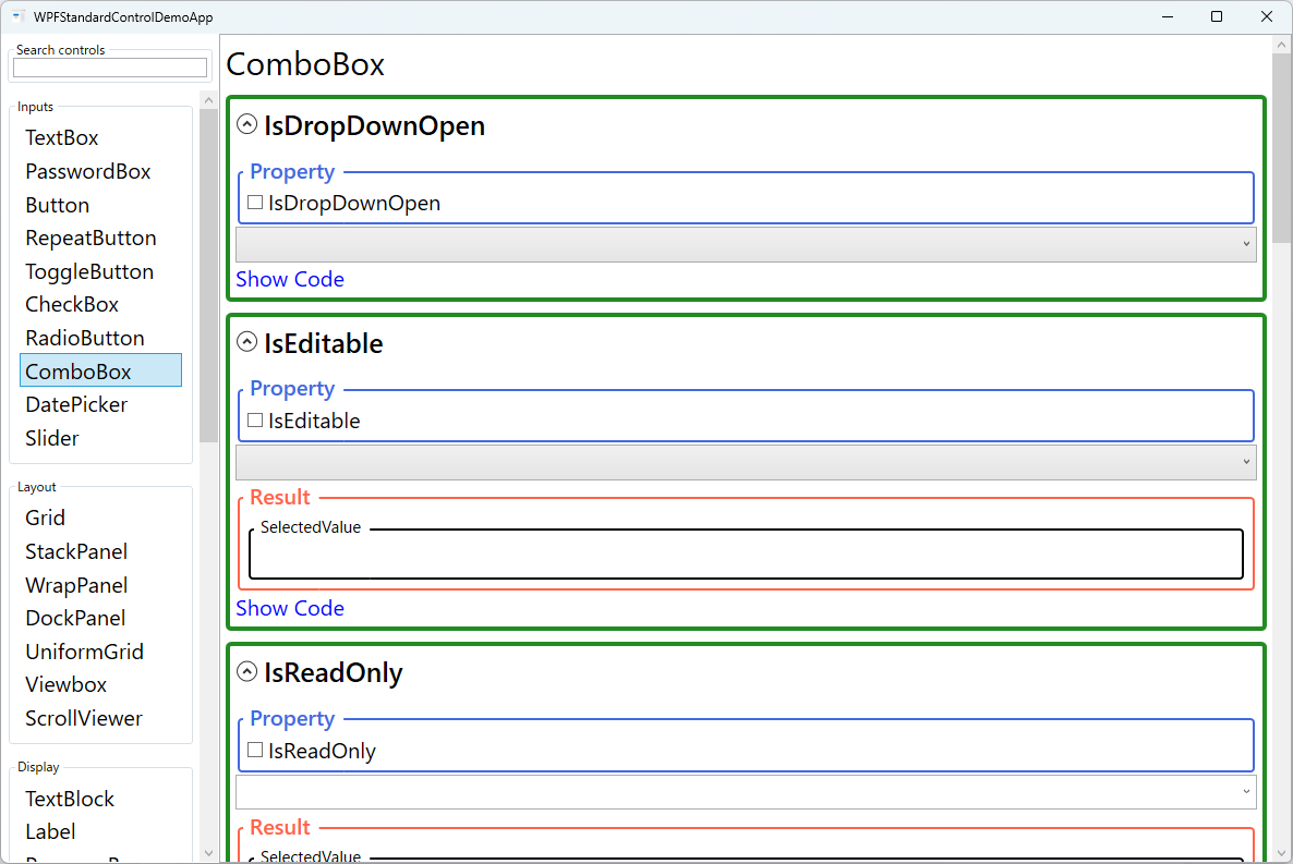
IsDropDownOpen |
bool |
Use this to programmatically open or close the dropdown — for example, to auto-open the list when a dialog appears, or to close it from code after a selection is processed. Setting it to True opens the list; False closes it. Pitfall: if you use a two-way binding on this property, be careful about timing. When the user closes the dropdown, the binding updates the ViewModel property to False. If your code then immediately sets it back to True, the dropdown reopens involuntarily. Always guard against unintentional re-opens by checking the current state before programmatically opening. |
IsEditable |
bool |
Set to True when you want the ComboBox to act as both a dropdown selector and a free-text input — typical for auto-complete search boxes or fields where users may type a value not in the list. When enabled, the Text property becomes active and can be two-way bound to receive typed input. Pitfall: when IsEditable="True" and the user types a value that does not match any item in the list, SelectedItem becomes null. If your ViewModel only observes SelectedItem, the typed text will be silently lost. Always also bind Text to capture free-form input alongside list selections. |
IsReadOnly |
bool |
Only effective when IsEditable="True". Use it when you want the visual appearance of an editable text field but you only want to allow selections from the dropdown list — preventing the user from typing arbitrary values. With IsEditable="True" and IsReadOnly="True", the text portion is non-editable but the dropdown still opens for list selection. Pitfall: setting IsReadOnly="True" without also setting IsEditable="True" has no effect. To disable the entire control including the dropdown, use IsEnabled="False" instead. |
MaxDropDownHeight |
double |
Use this when the dropdown list contains many items and could extend off-screen or obscure important UI elements. Setting a maximum height caps the dropdown and adds a scrollbar automatically when the content overflows. The default value is double.PositiveInfinity (no limit), meaning a very long list can cover the entire screen. Pitfall: setting an extremely small value — smaller than a single item's height — will make the dropdown nearly unusable. As a rule of thumb, set this to approximately the item height multiplied by 5–8 to show a comfortable number of choices. |
Text |
string |
Represents the current text shown in the editable portion of the ComboBox. This property is active only when IsEditable="True". Two-way binding it allows the ViewModel to both read the user's typed input and programmatically set the displayed text. When the selected item changes, Text automatically reflects the item's display string (based on DisplayMemberPath or ToString()). Pitfall: setting Text programmatically has no visual effect when IsEditable="False" (the default). To change the displayed value in a non-editable ComboBox, set SelectedItem or SelectedIndex instead. |
StaysOpenOnEdit |
bool |
Controls whether the dropdown list stays open while the user is typing (requires IsEditable="True"). When True, the list remains visible during text entry, which is the foundation of inline filtering — as the user types, you update the ItemsSource to match the input and the updated suggestions appear immediately. Pitfall: keeping the dropdown open continuously while typing can feel intrusive and disrupt the user's flow in contexts where free-form input is the primary goal. Only enable this when the inline suggestion list genuinely adds value. |
ShouldPreserveUserEnteredPrefix |
bool |
Determines whether the text typed by the user is preserved as they navigate the dropdown with the keyboard. When True, the typed prefix is maintained as the user arrows through the list, so the auto-complete highlight is applied on top of the original input. This aids auto-complete scenarios where partial input guides navigation without overwriting what the user typed. |
SelectedIndex (Selector) |
int |
Gets or sets the zero-based index of the currently selected item. A value of -1 means nothing is selected. Useful for programmatically selecting the first item on load or resetting the selection to empty. Pitfall: setting SelectedIndex=-1 clears the index-based selection, but SelectedItem may not automatically update to null in all scenarios. To guarantee a full selection clear, set both SelectedIndex=-1 and SelectedItem=null. |
SelectedItem (Selector) |
object |
Gets or sets the currently selected item object directly. When ItemsSource contains complex objects, two-way binding SelectedItem to a ViewModel property gives you the full selected object on every selection change. Pitfall: WPF compares SelectedItem using reference equality — it checks whether the set value is the exact same object instance as one in the ItemsSource collection. If you set it to a freshly loaded object from a database (different instance, same data), the selection will not match. Either ensure you use the same instance from the existing collection, or use SelectedValue + SelectedValuePath to match by a key property instead. |
SelectedValue / SelectedValuePath / DisplayMemberPath (ItemsControl) |
object / string / string |
Use SelectedValuePath to name the property of your data objects whose value should be exposed as SelectedValue. This is the standard pattern for foreign-key selection: set SelectedValuePath="Id" and bind SelectedValue to an integer ID in the ViewModel, while DisplayMemberPath="Name" shows the friendly name in the list. Pitfall: SelectedValuePath is case-sensitive — if the property name is ProductId but you write productId, SelectedValue will always be null. Also note that DisplayMemberPath and ItemTemplate are mutually exclusive: setting both causes DisplayMemberPath to be ignored. |
IsSynchronizedWithCurrentItem (ItemsControl) |
bool? |
When True, the ComboBox selection is kept in sync with the current item of the underlying CollectionView. This is the standard way to create master-detail views where selecting a ComboBox item automatically updates a bound details panel without extra event wiring. |
XAML Example
The following XAML demonstrates data binding patterns and an editable ComboBox configuration:
<StackPanel Margin="16" Spacing="12">

  <!-- Simple string list -->
  <ComboBox Width="200" SelectedIndex="0">
    <ComboBoxItem>Option A</ComboBoxItem>
    <ComboBoxItem>Option B</ComboBoxItem>
    <ComboBoxItem>Option C</ComboBoxItem>
  </ComboBox>

  <!-- Data-bound with display and value paths -->
  <ComboBox Width="220"
            ItemsSource="{Binding Countries}"
            DisplayMemberPath="Name"
            SelectedValuePath="Id"
            SelectedValue="{Binding SelectedCountryId}" />

  <!-- Editable with type-ahead and capped dropdown height -->
  <ComboBox Width="220"
            IsEditable="True"
            StaysOpenOnEdit="True"
            MaxDropDownHeight="160"
            ItemsSource="{Binding Cities}"
            Text="{Binding CityText, UpdateSourceTrigger=PropertyChanged}" />

</StackPanel>
Common Use Cases
- Country / region pickers: Binding a ComboBox to a lookup collection with
DisplayMemberPath="Name"andSelectedValuePath="Code"to select and store ISO country codes. - Enumeration selectors: Exposing a set of enum values (priority levels, status codes, sort orders) in a dropdown, optionally using a value converter for display-friendly strings.
- Search-and-select: Editable ComboBox with server-side suggestions loaded dynamically as the user types, simulating an auto-complete search box.
- Unit and currency selectors: Compact dropdowns in data-entry forms where the user picks the unit (kg, lb, cm) alongside a numeric input field.
- Theme / language pickers: Application-level settings dropdowns that immediately apply a new resource dictionary or locale when the selection changes.
Tips and Best Practices
- Choose between
SelectedItemandSelectedValuedeliberately — UseSelectedItemwhen the ViewModel needs the whole object; useSelectedValue+SelectedValuePathwhen you only need a key property (such as an ID). Remember thatSelectedItemuses reference equality — setting it to a freshly loaded object with the same data as an item inItemsSourcewill not produce a match unless it is the exact same instance. - Set an initial selection explicitly — On dialog open, set
SelectedItemorSelectedIndexfrom the ViewModel to show a meaningful default. When usingSelectedItem, make sure you reference the same object instance that is in theItemsSourcecollection. - Add an empty placeholder item for required fields — Rather than leaving the ComboBox blank at startup, add a "— Select —" entry at the top of the collection (using
CompositeCollectionto avoid modifying the source data), so users clearly understand a selection is required. - Always set
MaxDropDownHeightfor large collections — Without a height limit, a dropdown with hundreds of items will extend off-screen on small monitors. Set it to a value that shows 5–8 items comfortably. - Handle
IsEditable=Truenull SelectedItem gracefully — WhenIsEditable="True"and the user types a value not in the list,SelectedItemisnull. Always check bothSelectedItemandTextin your ViewModel logic to handle free-form input correctly. - Use
ItemTemplatefor rich item appearance, but not withDisplayMemberPath— If list items need icons or multi-line content, define aDataTemplateasItemTemplate. Note thatDisplayMemberPathandItemTemplateare mutually exclusive — setting both will causeDisplayMemberPathto be silently ignored.
Related Controls
- ListView — shows all items at once without collapsing; suited for longer lists that benefit from always-visible selection.
- RadioButton — mutually exclusive selection directly visible in the UI; prefer for small option sets (2–5 items).
- TextBox — free-text input without a predefined list; use when no suggestion set exists.
- TreeView — hierarchical selection; use when choices have a parent-child structure.
Source Code
The source code for this demo screen is available on GitHub. Use the built-in code view buttons in the app to see the exact XAML for each property.