WPF Standard Control Demo App › TextBox
TextBox Inputs
TextBox is the primary editable text input control in WPF. It supports single-line and multiline input, text wrapping, selection, undo/redo, and keyboard/mouse text manipulation. It is one of the most fundamental and frequently used controls in any data-entry form.
Overview
The WPF TextBox inherits from TextBoxBase, which provides the core
editing engine including selection, clipboard operations (Cut, Copy, Paste), undo/redo history,
and programmatic scroll methods. TextBox adds single-line display features such as
CharacterCasing, MaxLength, and TextAlignment on top of
the base class.
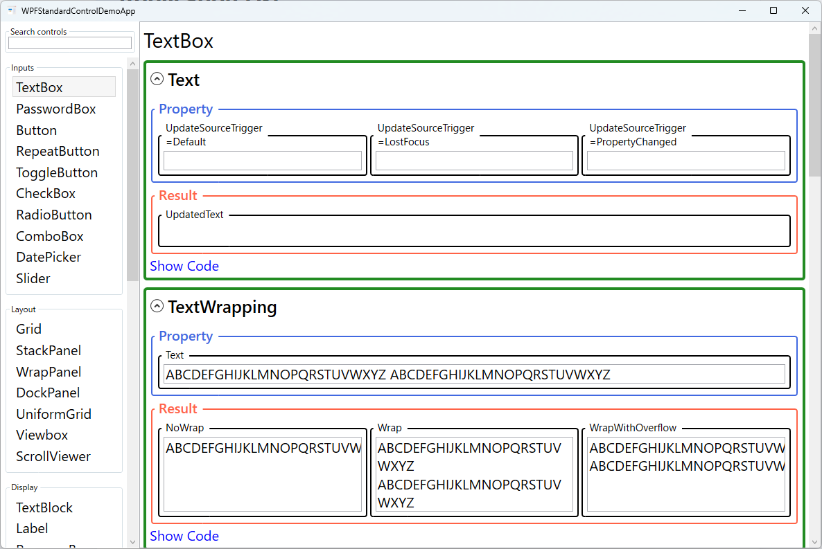
For MVVM data binding, the Text property is the primary binding target. Two-way
binding with UpdateSourceTrigger=PropertyChanged pushes every keystroke to the
ViewModel, enabling live validation and real-time UI updates. The default
UpdateSourceTrigger=LostFocus updates the ViewModel only when the TextBox loses
focus, which reduces unnecessary updates but delays validation feedback.
Multiline input is enabled by setting TextWrapping="Wrap" and optionally setting
MinLines and MaxLines to control the visible height. Combined with
AcceptsReturn="True" (inherited from TextBoxBase), this creates a
full text area suitable for notes, comments, and code editors.
CharacterCasing provides automatic case normalization — setting it to
Upper ensures all typed characters are stored as uppercase regardless of the
shift key state, useful for postal codes, product codes, and other fixed-case identifiers.
Lower enforces lowercase input similarly.
Screen Preview
Demonstrated Properties
The following properties are demonstrated interactively in the WPF Standard Control Demo App. Each property can be configured in real time within the app to observe its behavior.
| Property | Values | Description |
|---|---|---|
Text |
string |
Use this to bind the TextBox content two-way to a ViewModel string property — the standard MVVM pattern for any data-entry field. With UpdateSourceTrigger=PropertyChanged the ViewModel is updated on every keystroke, enabling live search filters and real-time validation; with the default LostFocus it updates only when the user tabs away, reducing unnecessary updates. Pitfall: UpdateSourceTrigger=PropertyChanged fires during IME composition (Japanese, Chinese, Korean input), so the ViewModel may receive incomplete, unconverted characters mid-word — always check for empty or whitespace (using string.IsNullOrWhiteSpace()) in validation logic when supporting CJK input. |
AcceptsReturn |
bool |
Set to True when you need a multiline textarea — for example, a notes or comments field. When True, pressing Enter inserts a newline; when False (the default), Enter activates the window's default button (the IsDefault="True" button such as a Submit button). Pitfall: enabling AcceptsReturn alone does not add a scrollbar — always pair it with TextWrapping="Wrap" and VerticalScrollBarVisibility="Auto", otherwise the TextBox expands vertically without limit and never shows a scrollbar. |
TextWrapping |
NoWrap / Wrap / WrapWithOverflow |
Use Wrap for multiline text areas to break long lines at word boundaries. NoWrap (the default) keeps text on a single line and triggers horizontal scrolling when it overflows. WrapWithOverflow wraps at word boundaries but lets individual unbreakable tokens — such as long URLs or file paths — overflow the control width rather than being clipped. Pitfall: TextTrimming, which trims with an ellipsis, is a TextBlock-only feature and has no effect in TextBox — do not confuse the two. |
IsReadOnly |
bool |
Use when you want to display content the user can read and copy but not edit — for example, generated code snippets, error details, or computed values. Unlike TextBlock, a read-only TextBox still allows the user to select and copy text. The editing operations are blocked, but the caret and selection remain active. Pitfall: by default there is no visual difference between a normal and a read-only TextBox. Always add a Style trigger on IsReadOnly to change the background or border color so users can tell the field is not editable. |
MaxLength |
int (0 = unlimited) |
Use when the field has a hard character limit driven by a database column width, a protocol constraint, or a fixed-format rule such as a postal code or PIN. Once the limit is reached the TextBox silently blocks further input — no error is shown. The default 0 means unlimited. Pitfall: MaxLength is a UI-layer restriction only. If text is set programmatically through code-behind or a behavior, the limit is not enforced. Always implement server-side or ViewModel validation in addition to this property. |
CaretBrush |
Brush |
Use when a custom theme or high-contrast mode makes the default black caret invisible against the background — for example, a dark-themed login form. The caret is drawn in the specified brush color, making the insertion point clearly visible. Pitfall: CaretBrush is only honored by the aero2 WPF theme (Windows 10 and later). On older Windows themes the property is ignored, so test caret visibility across target environments if your app must support older OS versions. |
SelectionBrush / SelectionOpacity |
Brush / double |
Use these together when the default OS selection highlight clashes with your application's color scheme. SelectionBrush sets the highlight color and SelectionOpacity (range 0.0–1.0, default 0.4) controls how transparent the highlight is. Combining both lets you match theme accent colors while maintaining a readable contrast ratio between the highlighted text and the selection background. Pitfall: setting SelectionOpacity to 0 makes the selection completely invisible, which severely harms accessibility — always keep it high enough that users can tell text is selected. |
ScrollToEnd() / ScrollToHome() / LineDown() |
methods |
Use these scroll methods in log viewers, chat windows, and output consoles where new content is appended continuously and you need the latest entry to stay in view. ScrollToEnd() jumps to the last line, ScrollToHome() to the first, and LineDown() scrolls one line at a time. Pitfall: all three methods must be called on the UI thread. When appending text from a background thread, always wrap the call in Dispatcher.Invoke() or Dispatcher.BeginInvoke(); calling them directly from a worker thread throws an InvalidOperationException. |
VerticalScrollBarVisibility / HorizontalScrollBarVisibility |
Disabled / Auto / Visible |
Use Auto (recommended for most cases) to show a scrollbar only when content exceeds the control bounds, keeping the UI clean when the text is short. Visible reserves scrollbar space at all times, and Disabled removes scroll capability entirely. Pitfall: Visible always renders the scrollbar track even when there is nothing to scroll, which can look broken when the TextBox contains only one or two lines — use Auto unless you explicitly need the scrollbar to always be present for layout stability reasons. |
TextDecorations |
None / Underline / Strikethrough / OverLine / Baseline |
Applies a text decoration to all content in the TextBox. Useful for link-style inputs (Underline) or deprecation indicators (Strikethrough). Multiple decorations can be combined by providing a collection. This property is typically set in a style or template rather than directly on individual instances. |
TextAlignment |
Left / Right / Center / Justify |
Aligns the text horizontally within the TextBox. Right is conventional for numeric fields, making digits align at the decimal point; Center works well for short title-style inputs; Justify is appropriate for paragraph-style multiline fields. The default Left is correct for most text inputs. |
MaxLines |
int |
Limits the maximum number of visible lines in a multiline TextBox. Additional lines can be scrolled with the vertical scrollbar. A common pattern is to set MinLines="3" MaxLines="10" for a comment or notes textarea that grows as the user types but caps at ten rows. |
MinLines |
int |
Reserves vertical space for at least this many lines even when the TextBox is empty. This prevents the control from visually collapsing to a single line on an empty form, which would be jarring once the user starts typing. Use it for comment or address fields that should always appear as a textarea regardless of content. |
CharacterCasing |
Normal / Upper / Lower |
Automatically normalizes all typed input to the specified case. Upper forces uppercase — typing "hello" produces "HELLO" in both the displayed text and the bound Text property. Useful for license keys, locale codes, product identifiers, and other fields that must contain only uppercase characters regardless of the shift key state. |
XAML Example
Various TextBox configurations for common form patterns:
<!-- Standard single-line input with live validation -->
<TextBox Text="{Binding Username, Mode=TwoWay,
               UpdateSourceTrigger=PropertyChanged}"
         MaxLength="50" />

<!-- Multiline comment area -->
<TextBox Text="{Binding Notes, Mode=TwoWay}"
         TextWrapping="Wrap" AcceptsReturn="True"
         MinLines="3" MaxLines="8"
         VerticalScrollBarVisibility="Auto" />

<!-- Uppercase postal code field -->
<TextBox Text="{Binding PostalCode, Mode=TwoWay}"
         CharacterCasing="Upper"
         MaxLength="10"
         TextAlignment="Center"
         Width="100" />
Common Use Cases
- Single-line text input — Name, email, username, and search fields in forms and dialogs.
- Multiline text areas — Notes, comments, address fields, and code snippet editors.
- Numeric input with formatting — Currency or quantity fields using TextAlignment="Right" combined with a converter for formatted display.
- Fixed-format fields — License keys, postal codes, and phone numbers using MaxLength and CharacterCasing.
- Search boxes — Live-filter a collection by binding Text with UpdateSourceTrigger=PropertyChanged to a search string ViewModel property.
Tips and Best Practices
- Match UpdateSourceTrigger to the use case — Use
PropertyChangedfor live search filters and real-time validation, and the defaultLostFocusfor standard form fields where batch validation on submit is sufficient. When supporting CJK IME input withPropertyChanged, always null/empty-check the ViewModel value because the binding fires during composition with unconverted characters. - Format numeric display with StringFormat — When displaying a number in a TextBox, you can specify
StringFormat='{}{0:F2}'on the binding to show two decimal places. Note that the format is removed while the user is actively editing, so for dedicated numeric entry consider aValidationRuleor a purpose-built numeric input control. - Customize Validation.ErrorTemplate for richer feedback — The default validation error style shows a red border. Replace it with
Validation.ErrorTemplateto show an inline error message below the field. Reference the error text via a trigger onValidation.HasErrorandValidation.Errors[0].ErrorContent. - Multiline TextBox needs three properties together — For a proper textarea, always set
AcceptsReturn="True",TextWrapping="Wrap", andVerticalScrollBarVisibility="Auto"together. Any one of these missing will produce a control that either doesn't wrap, doesn't scroll, or won't accept newlines. - Select all text on focus with SelectAll() — Calling
SelectAll()in theGotFocusevent handler instantly selects the existing text so the user can overwrite it with a single keystroke. Implement this as an attached behavior to keep it reusable across the application from XAML. - Provide visual feedback for IsReadOnly — When
IsReadOnly="True", add aStyletrigger to change theBackgroundorBorderBrushso users can immediately see the field is view-only. Without this, a read-only TextBox looks identical to an editable one. - Add a watermark with placeholder text — WPF's TextBox does not natively support placeholder text. Overlay a transparent TextBlock with a converter that shows the placeholder only when
Textis empty, or use an attached behavior for a reusable solution. - Use PasswordBox for secrets — Never use a TextBox for passwords; the content is stored and displayed as plain text. Use
PasswordBox, which masks the input and stores it as aSecureString.
Related Controls
- PasswordBox — For masked password input; does not expose the text as a bindable string by default.
- TextBlock — The read-only counterpart for displaying text.
- ComboBox — Provides editable text input combined with a dropdown suggestion list.
Source Code
The source code for this demo screen is available on GitHub. Use the built-in code view buttons in the app to see the exact XAML for each property.