WPF Standard Control Demo App › Image
Image Graphics
Image is a control for displaying images from various sources including files, URIs, and resources. It supports various image formats and provides properties to control how the image is stretched to fit its container.
Overview
The WPF Image control is the primary way to display raster and vector images within a
layout. It derives directly from FrameworkElement rather than Control, meaning
it is a lightweight visual element without the full control template overhead. The image content is
provided through the Source property, which accepts any ImageSource — including
BitmapImage, BitmapFrame, DrawingImage, and
RenderTargetBitmap.
WPF's Image control supports all major raster formats natively: BMP, PNG, JPEG, GIF, TIFF, ICO, and
WBMP. For vector content, DrawingImage wraps a Drawing object and renders
cleanly at any resolution, making it ideal for high-DPI displays. In XAML, you can reference embedded
resources using pack URIs (e.g., pack://application:,,,/Images/logo.png), which are
compiled into the assembly and do not require external files at deployment.
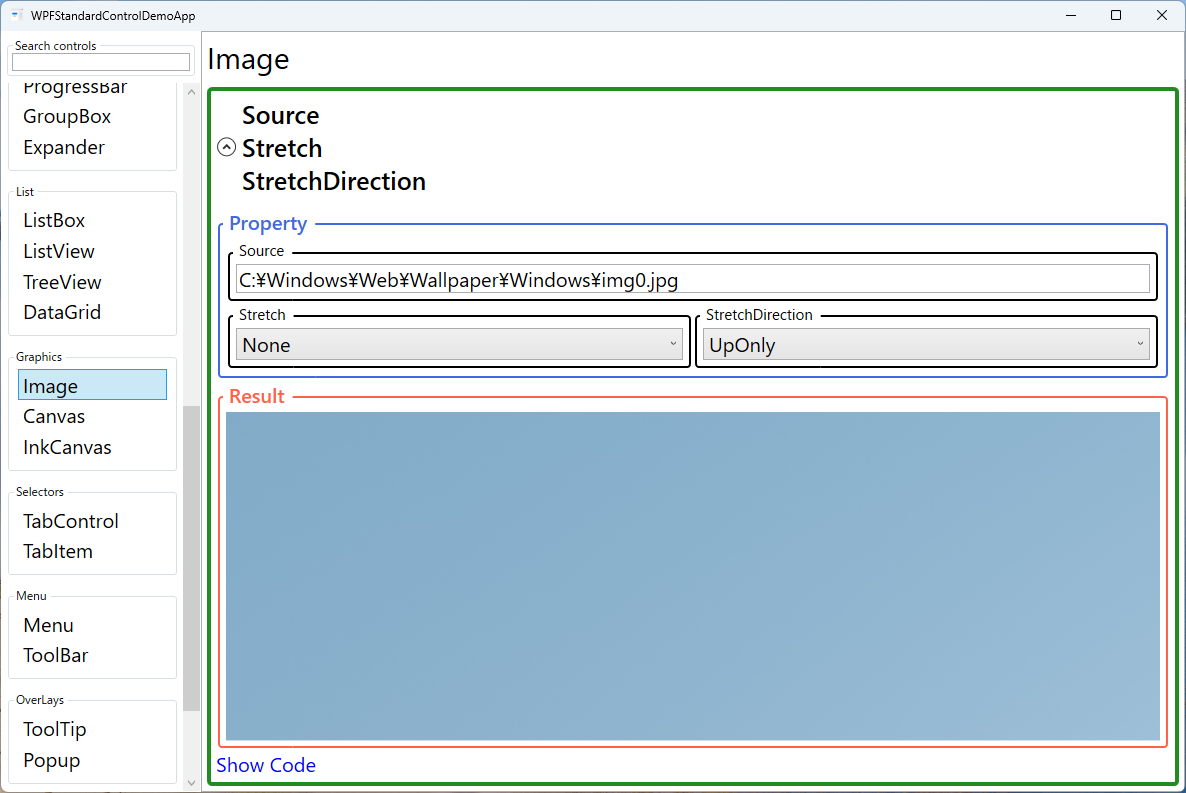
The Stretch property is central to how Image behaves inside its allocated layout space.
None renders the image at its natural pixel size; Fill distorts the image to
fill the container completely; Uniform scales the image proportionally to fit within the
container without distortion; and UniformToFill scales proportionally to fill the container,
cropping excess pixels. Choosing the right mode prevents unintentional stretching or blank borders.
The StretchDirection property further refines scaling behavior by restricting whether the
image is scaled up, scaled down, or both. This is useful when you want to prevent a small thumbnail from
being blown up to fill a large area (DownOnly), or when you want an image to expand to fill
available space but never shrink below its native size (UpOnly).
Screen Preview
Demonstrated Properties
The following properties are demonstrated interactively in the WPF Standard Control Demo App. Each property can be configured in real time within the app to observe its behavior.
| Property | Values | Description |
|---|---|---|
Source |
ImageSource (URI / file path) |
The image data to display, specified as a URI string pointing to a resource, file, or web URL. WPF automatically creates a BitmapImage from the URI during XAML parsing. For application resources, use the pack URI format (e.g., pack://application:,,,/Images/logo.png). For large image collections, set BitmapCacheOption.OnLoad on the BitmapImage to decode immediately and release the stream. Pitfall: in code-behind, you cannot assign a plain string to Image.Source — the implicit string-to-ImageSource converter only runs during XAML parsing. In code, create a BitmapImage or use an ImageSourceConverter instead. |
Stretch |
None / Fill / Uniform / UniformToFill |
Controls how the image scales to fill its allocated layout bounds. Uniform scales proportionally to fit within the container, potentially leaving letterbox bars. UniformToFill scales proportionally to fill the container completely, cropping edges — ideal for profile photos or cover images. Fill ignores the aspect ratio and stretches the image to fill. Pitfall: with UniformToFill, the full image is still decoded into memory even though only part of it is displayed. For very large images, this wastes memory; use DecodePixelWidth/DecodePixelHeight to decode at the display size. |
StretchDirection |
UpOnly / DownOnly / Both |
Restricts the direction in which the image is scaled. Both (the default) allows scaling in both directions; DownOnly prevents enlarging a small image beyond its natural size, which avoids blurriness when a small icon is placed in a large container; UpOnly prevents shrinking a large image below its natural size. Pitfall: combining StretchDirection="UpOnly" with Stretch="Uniform" means a small image will not be upscaled in a large container, which is intentional for icons but can cause unexpected small rendering for photos. |
XAML Example
The following XAML demonstrates Image usage with different stretch modes and a resource URI:
<StackPanel Margin="16" Orientation="Vertical">

  <!-- Resource image with uniform scaling -->
  <Image Source="pack://application:,,,/Assets/photo.jpg"
         Width="300" Height="200"
         Stretch="Uniform"
         Margin="4" />

  <!-- Thumbnail that fills its container, cropping if needed -->
  <Border Width="80" Height="80" CornerRadius="4"
          ClipToBounds="True">
    <Image Source="{Binding ThumbnailUri}"
           Stretch="UniformToFill"
           StretchDirection="Both" />
  </Border>

  <!-- Icon at native size, no scaling -->
  <Image Source="pack://application:,,,/Icons/info.png"
         Stretch="None"
         HorizontalAlignment="Left" />

</StackPanel>
Common Use Cases
- Application logos and splash screens: Displaying a branding image at the top of the main window or on a startup screen with controlled scaling to fit various window sizes.
- Photo galleries and thumbnails: Rendering grid cells of images with
Stretch="UniformToFill"inside a fixed-sizeBorderto create a uniform thumbnail grid. - Button and menu icons: Embedding a small PNG or vector
DrawingImageinside aButtoncontent template to create visually rich icon buttons. - Product catalog images: Binding the
Sourceproperty to a URL in a data-boundDataGridorListViewto display product photos alongside text data. - Backgrounds and watermarks: Using an
Imagewith low opacity inside aGridbehind other content to create a subtle watermark or branded background.
Tips and Best Practices
- Use pack URIs for embedded resources: Mark image files as Resource in their Build Action so they are compiled into the assembly, avoiding missing-file deployment issues.
- Set explicit Width/Height for performance: When displaying images in a virtualized list, set explicit dimensions to prevent the layout engine from re-measuring during scroll virtualization.
- Use
DecodePixelWidth/DecodePixelHeight: When loading large images as small thumbnails, set these on theBitmapImageto decode at the display size and dramatically reduce memory usage. - Prefer
DrawingImagefor icons: Vector-based icons rendered viaDrawingImageorViewboxremain crisp at all DPI settings, unlike raster PNGs that may appear blurry on high-DPI displays. - Handle load failures gracefully: Subscribe to
BitmapImage.DownloadFailedandDecodeFailedevents or provide a fallbackSourceusing a value converter to show a placeholder when images cannot be loaded. - Release large images when no longer needed: Setting
Image.Sourcetonullwhen an image is no longer displayed helps the garbage collector release the decoded bitmap. Large images held in memory can cause significant memory pressure in image-heavy applications. - SVG is not natively supported: WPF's Image control does not support SVG. To display SVG graphics, use a third-party library or re-implement the drawing using
PathandCanvaselements.
Related Controls
Source Code
The source code for this demo screen is available on GitHub. Use the built-in code view buttons in the app to see the exact XAML for each property.