WPF Standard Control Demo App › InkCanvas
InkCanvas Graphics
InkCanvas is a control that allows users to draw with digital ink (stylus or mouse). It supports freehand drawing, selection, and erasing modes. The strokes can be saved and loaded as ink data.
Overview
The WPF InkCanvas control is a specialized drawing surface that captures, stores, and
renders digital ink strokes. Unlike a simple Canvas, InkCanvas has built-in stroke management
through its Strokes property of type StrokeCollection, which holds all drawn
Stroke objects. Each stroke encapsulates spatial point data along with rendering attributes
defined by DrawingAttributes, such as color, width, height, and tip shape.
InkCanvas supports multiple editing modes controlled by the EditingMode property. In
Ink mode, the primary mouse button or stylus draws new strokes. In Select mode,
users can lasso or tap strokes to select, move, and resize them using adorner handles. The
EraseByPoint mode erases any stroke that the pointer passes through at the contact point,
while EraseByStroke removes complete strokes that are touched. None mode disables
all ink input, making InkCanvas a passive display surface.
The EditingModeInverted property maps to the inverted end of a stylus (the eraser tip on a
physical pen), allowing a physical stylus to draw with one end and erase with the other without any
programmatic mode switching. This mirrors the behavior of real-world pen-and-paper interaction and is
important for natural tablet UX.
Strokes can be serialized to and from ISF (Ink Serialized Format) or XAML format using
StrokeCollection.Save and StrokeCollection.Load, enabling ink data persistence.
InkCanvas also raises StrokesChanged, SelectionChanged, and
SelectionMoving events that let you respond to user interactions in real time, making it
suitable for annotation, signature capture, and whiteboard applications.
Screen Preview
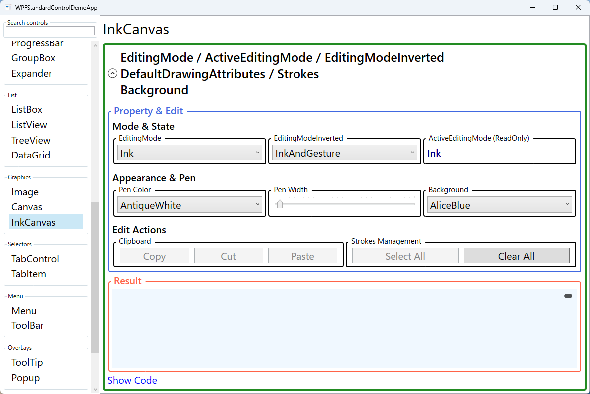
Demonstrated Properties
The following properties are demonstrated interactively in the WPF Standard Control Demo App. Each property can be configured in real time within the app to observe its behavior.
| Property | Values | Description |
|---|---|---|
EditingMode |
None / Ink / GestureOnly / InkAndGesture / Select / EraseByPoint / EraseByStroke |
The primary interaction mode that determines how mouse and stylus input is interpreted. Use Ink for drawing, Select to enable lasso selection and movement of existing strokes, and the erase modes to remove strokes on contact. GestureOnly dedicates input to gesture recognition (e.g., drawing a circle to delete). Pitfall: EditingMode="None" blocks all ink input, making InkCanvas a passive display surface — useful for read-only views, but don't forget to restore the mode when editing is re-enabled. Also note that tablet stylus input uses ActiveEditingMode, which may differ from EditingMode when the inverted stylus tip is in use. |
ActiveEditingMode |
InkCanvasEditingMode (ReadOnly) |
A read-only property reflecting the currently active editing mode. This may differ from EditingMode when a stylus eraser tip is in use (the inverted end activates EditingModeInverted). Bind this to a status bar or toolbar indicator to show the user's current mode in real time. Pitfall: this property is read-only — to change the mode you must set EditingMode, not ActiveEditingMode. |
EditingModeInverted |
InkCanvasEditingMode |
Specifies the editing mode activated when the inverted (eraser) end of a physical stylus is used. Set to EraseByStroke (default) to mirror a real pen's eraser behavior. Pitfall: this property has no effect in mouse-only environments. If your application relies on the inverted tip for erasing, users without a tablet stylus will have no way to trigger that behavior — provide a toolbar button to switch to erase mode as an alternative. |
DefaultDrawingAttributes |
DrawingAttributes |
The rendering attributes applied to new strokes: Color, Width, Height, StylusTip (Ellipse or Rectangle), and IsHighlighter. Change this at runtime to let users pick pen color and thickness interactively. Setting IsHighlighter=true produces a semi-transparent highlighter stroke. Pitfall: changes to DefaultDrawingAttributes only apply to strokes drawn after the change. Existing strokes in the Strokes collection retain their original attributes; to re-color past strokes you must iterate the collection and update each stroke's DrawingAttributes individually. |
Strokes |
StrokeCollection |
The collection of all ink strokes currently on the canvas. Use this to programmatically add, remove, or clear strokes, and to serialize ink data with StrokeCollection.Save(stream) (ISF format) for persistence across sessions. Pitfall: removing strokes from the collection does not provide built-in undo support. If you need undo/redo, maintain your own history stack by subscribing to the StrokesChanged event and recording added/removed strokes. |
Background |
Brush |
The background fill of the drawing surface. Setting Background="White" creates a realistic paper-like canvas with a clear drawing boundary; the default transparent background allows InkCanvas to act as an overlay for annotation over other content. Pitfall: a transparent (null) background makes the drawing area boundary invisible, which can confuse users about where they can draw. For standalone drawing applications, always set a visible background or wrap the InkCanvas in a Border to define its boundaries. |
XAML Example
The following XAML demonstrates an InkCanvas with a toolbar for switching modes and adjusting pen color:
<DockPanel>

  <ToolBar DockPanel.Dock="Top">
    <RadioButton Content="Draw"
                 Command="{Binding SetInkModeCommand}"
                 IsChecked="True" />
    <RadioButton Content="Erase"
                 Command="{Binding SetEraseCommand}" />
    <RadioButton Content="Select"
                 Command="{Binding SetSelectCommand}" />
    <Separator />
    <Button Content="Clear All"
            Command="{Binding ClearStrokesCommand}" />
  </ToolBar>

  <InkCanvas x:Name="inkCanvas"
             EditingMode="{Binding CurrentMode}"
             Background="White"
             Margin="4">
    <InkCanvas.DefaultDrawingAttributes>
      <DrawingAttributes Color="DarkBlue"
                         Width="3" Height="3"
                         StylusTip="Ellipse" />
    </InkCanvas.DefaultDrawingAttributes>
  </InkCanvas>

</DockPanel>
Common Use Cases
- Signature capture: Allowing users to sign documents on a touch screen or tablet, then saving the stroke data as an image or ISF for legal records.
- Whiteboard applications: Building collaborative drawing tools where participants can annotate shared content with freehand ink in real time.
- Document annotation: Overlaying InkCanvas on a
DocumentVieweror image viewer so users can mark up documents with highlights or handwritten notes. - Sketch tools: Embedding a drawing pad in creative applications where users can sketch diagrams, wireframes, or concept art with variable pen styles.
- Educational apps: Handwriting practice applications where strokes are analyzed against a reference shape and feedback is provided to learners.
Tips and Best Practices
- Save strokes in ISF format: Use
StrokeCollection.Save(stream)to write compact binary ISF data; use the XAML serialization format for human-readable persistence. Load saved strokes withnew StrokeCollection(stream). - Undo/redo support: InkCanvas has no built-in undo. Subscribe to the
StrokesChangedevent and maintain a stack of added/removed strokes to implement a custom undo/redo system. - Limit stroke complexity: Very long continuous strokes with thousands of points can impact rendering performance. Consider splitting strokes or simplifying point data using
Stroke.GetBounds()heuristics. - Use
IsHighlighter = truecarefully: Highlighter strokes use additive blending, which looks great over text but may behave unexpectedly over images or colored backgrounds. - Overlay InkCanvas on an image for annotations: Place a transparent-background InkCanvas on top of an Image using a Grid to create an annotation layer that lets users mark up photos or documents with ink.
- Test with both mouse and touch: InkCanvas behavior differs between mouse input and genuine stylus/touch events. Always test on a touch device or with the Windows Simulator to verify the experience.
Related Controls
Source Code
The source code for this demo screen is available on GitHub. Use the built-in code view buttons in the app to see the exact XAML for each property.