WPF Standard Control Demo App › Canvas
Canvas Graphics
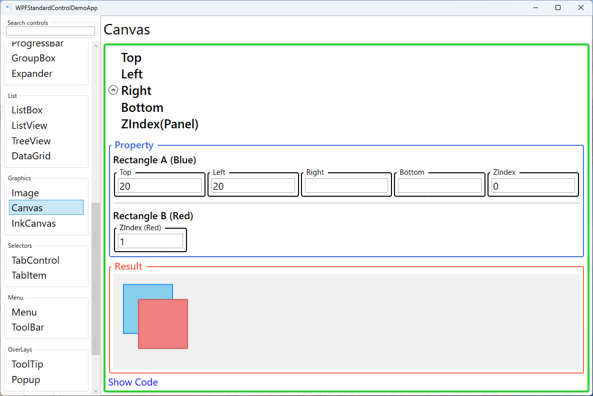
Canvas is a layout panel that uses absolute positioning. Child elements are placed at explicit coordinates using Canvas attached properties (Top, Left, Right, Bottom). It is ideal for drawing applications and animations requiring precise control.
Overview
The WPF Canvas panel is unique among WPF layout containers because it abandons the
automatic flow and relative sizing model used by Grid, StackPanel, and
DockPanel. Instead, every child element is positioned using explicit pixel coordinates
supplied through four attached properties: Canvas.Left, Canvas.Top,
Canvas.Right, and Canvas.Bottom. This makes Canvas the panel of choice
whenever you need precise, deterministic placement of visual elements.
Because Canvas does not perform any automatic measurement or arrangement of its children, it is
extremely lightweight and fast to render. Children retain their natural (desired) size unless you
explicitly set Width and Height. The Canvas itself reports a desired size
of zero by default, so it should typically be given an explicit size or stretched inside a parent
container — otherwise its children may be clipped or invisible.
Z-ordering — the stacking order when elements overlap — is controlled via the
Panel.ZIndex attached property. Elements with higher ZIndex values render
on top. Animations work naturally on Canvas children: animating the Canvas.Left or
Canvas.Top attached property using a DoubleAnimation smoothly moves an
element across the surface, making Canvas the go-to container for game-like or diagram UIs.
A practical tip: while Canvas is excellent for drawing surfaces, it is a poor choice for
general-purpose application UI because it does not adapt to window resizing or different DPI
settings. For resizable layouts, combine Canvas with a ViewBox wrapper to achieve
proportional scaling, or switch to a Grid-based layout where adaptive sizing is needed.
Screen Preview
Demonstrated Properties
The following properties are demonstrated interactively in the WPF Standard Control Demo App. Each property can be configured in real time within the app to observe its behavior.
| Property | Values | Description |
|---|---|---|
Canvas.Left |
double |
Use this when you need to place an element at a specific horizontal offset from the Canvas's left edge — for example, positioning a node in a diagram editor or a sprite in a game surface. The element is placed exactly that many device-independent pixels from the left edge. Pitfall: setting both Canvas.Left and Canvas.Right on the same element does not resize it; the element keeps its natural size and Left takes precedence, so the Right value is effectively ignored for positioning. |
Canvas.Top |
double |
The vertical counterpart to Canvas.Left. Together, Left and Top form the most common absolute-coordinate pair for placing elements on a Canvas. Setting Canvas.Top="30" places the element 30 device-independent pixels below the Canvas's top edge. Pitfall: if neither Canvas.Top nor Canvas.Bottom is set, the element defaults to the top edge (y = 0), which can cause elements to stack invisibly. |
Canvas.Right |
double |
Anchors an element to the right edge of the Canvas, useful for watermarks, fixed-position overlays, or elements that should stay in the bottom-right corner regardless of the Canvas's size. The element is placed so its right edge is the specified number of pixels from the Canvas's right edge. Pitfall: Canvas.Right does not work like CSS right in a stretched container — it is always measured from the Canvas's declared right boundary, so the Canvas must have an explicit width for Right to be meaningful. |
Canvas.Bottom |
double |
Anchors an element to the bottom edge of the Canvas. Combining Canvas.Right and Canvas.Bottom is a common pattern for placing a label or badge in the bottom-right corner of a drawing surface. Like Canvas.Right, this requires the Canvas to have an explicit Height to produce the intended result. Pitfall: setting Canvas.Top and Canvas.Bottom simultaneously does not stretch the element; the element retains its natural height and Top takes precedence. |
Panel.ZIndex |
int |
Use this when elements overlap and you need explicit control over which element renders on top — for instance, bringing a selected handle or tooltip above the drawing content. Higher values render on top of lower values. Pitfall: the default ZIndex is 0 for all children, so when you don't set it explicitly, the element that appears later in XAML (later in the child collection) is rendered on top. Don't rely on this implicit ordering; set ZIndex explicitly on any element whose stacking matters. |
XAML Example
The following XAML demonstrates absolute positioning and Z-ordering on a Canvas:
<Canvas Width="400" Height="300" Background="WhiteSmoke">

  <!-- Rectangle anchored to top-left -->
  <Rectangle Canvas.Left="20" Canvas.Top="20"
             Width="120" Height="80"
             Fill="SteelBlue" />

  <!-- Overlapping rectangle with higher Z-order -->
  <Rectangle Canvas.Left="80" Canvas.Top="60"
             Width="120" Height="80"
             Fill="Tomato"
             Panel.ZIndex="1" />

  <!-- Label anchored to the bottom-right corner -->
  <TextBlock Canvas.Right="8" Canvas.Bottom="4"
             Text="400 x 300"
             FontSize="11" Foreground="Gray" />

  <!-- Animated element (code-behind moves it) -->
  <Ellipse x:Name="Ball"
           Canvas.Left="160" Canvas.Top="120"
           Width="40" Height="40"
           Fill="Gold" />

</Canvas>
Common Use Cases
- Diagram editors: Network topology, flowchart, or UML diagram tools where nodes and connectors must be placed and moved at arbitrary coordinates.
- 2D game surfaces: Simple games where sprites are positioned and animated by modifying
Canvas.Left/Canvas.Topin a game loop or using WPF animations. - Custom drawing overlays: Annotation layers drawn on top of images or maps, such as bounding boxes in image-labelling tools.
- Drag-and-drop rearrangement: UIs where users drag items to arbitrary positions and the layout is persisted (e.g., desktop-icon-style dashboards).
- Splash and loading screens: Decorative or animated intro screens where elements fly in from fixed coordinates and do not need adaptive layout.
Tips and Best Practices
- Always give the Canvas an explicit size or stretch it inside a parent container. Its default desired size is (0, 0), which causes children to be clipped unless the canvas has room to render.
- Use
RenderTransformfor animations instead of animatingCanvas.Left/Canvas.Topwhen performance is critical. Transform-based animations can be GPU-accelerated by the WPF composition engine. - Combine with
Viewboxto achieve resolution-independent scaling of canvas-based drawings without rewriting coordinates for every target resolution or DPI setting. - Leverage
Panel.ZIndexdynamically in code to bring focused or hovered elements to the front, creating a natural layering interaction without rebuilding the visual tree. - Avoid Canvas for data-driven layouts. If the number of elements changes at runtime via data binding, prefer an
ItemsControlwith a CanvasItemsPaneltemplate, which properly recycles containers and supports virtualization. - Set
Background="Transparent"to capture mouse events. A Canvas withBackground=null(the default) does not participate in hit-testing, so mouse events pass through to underlying elements. SetBackground="Transparent"when you need the Canvas itself to handle clicks or pointer events.
Related Controls
- Grid — the most versatile layout panel; supports proportional, absolute, and auto-sized rows and columns.
- DockPanel — docks children to panel edges; ideal for main window chrome layouts.
- WrapPanel — flows children horizontally or vertically with automatic line-wrapping.
- UniformGrid — arranges children in a uniform grid without explicit row/column definitions.
Source Code
The source code for this demo screen is available on GitHub. Use the built-in code view buttons in the app to see the exact XAML for each property.