WPF Standard Control Demo App › ListView
ListView List
ListView is an advanced list control that extends ListBox with a pluggable view model. The most common view is GridView, which displays items in a tabular format with column headers that support resizing and reordering.
Overview
The WPF ListView control builds upon ListBox by introducing the
View property, which accepts a ViewBase object that defines how items are
rendered. The built-in GridView view renders items as a table with named column headers,
making ListView the go-to control for read-only data grids or simple file-explorer-style lists.
Custom views can also be implemented by subclassing ViewBase, enabling tile views,
card views, or any other presentation format.
When using GridView, columns are defined through the Columns property as a
collection of GridViewColumn objects. Each column specifies a Header for the
column title, a Width, and either a DisplayMemberBinding pointing to a data
property or a CellTemplate for custom cell rendering. The
AllowsColumnReorder property enables drag-and-drop column reordering, and columns can be
resized at runtime by dragging column dividers.
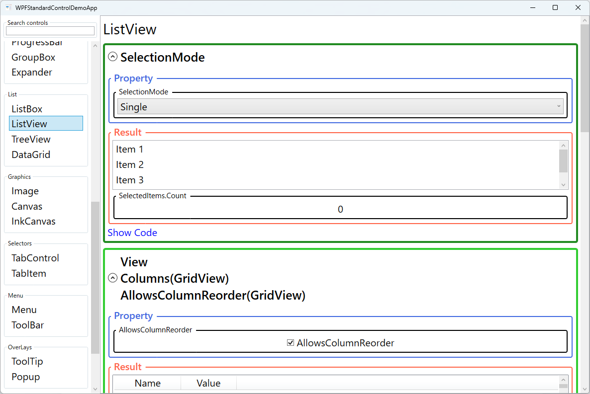
ListView inherits all selection features from ListBox, including the SelectionMode
property with Single, Multiple, and Extended options. The
SelectedItem and SelectedIndex bindings work identically to ListBox,
making it straightforward to migrate between the two controls as requirements evolve. The
IsSelected property on ListViewItem containers supports selection-aware
styling in item templates.
For large datasets, ListView combined with VirtualizingStackPanel and
ScrollViewer provides the performance characteristics needed to display thousands of rows
without excessive memory consumption. The ScrollViewer.HorizontalScrollBarVisibility and
ScrollViewer.VerticalScrollBarVisibility attached properties fine-tune scroll bar behavior
to match the target layout requirements.
Screen Preview
Demonstrated Properties
The following properties are demonstrated interactively in the WPF Standard Control Demo App. Each property can be configured in real time within the app to observe its behavior.
| Property | Values | Description |
|---|---|---|
SelectionMode (ListBox) |
Single / Multiple / Extended |
Inherited from ListBox, this controls how many items can be selected simultaneously. Extended mode with Shift- and Ctrl-click is commonly used in file-manager-style ListViews where multi-file operations are needed. Pitfall: in Multiple and Extended modes, use the SelectedItems collection (not SelectedItem) to retrieve all selected items. SelectedItem only returns the last selected item in multi-select modes. |
View |
ViewBase |
The pluggable view object that defines how list items are rendered. Setting this to a GridView instance activates tabular column display with column headers — suitable for read-only data tables such as file lists, employee rosters, and log viewers. Setting it to null falls back to a plain vertical list similar to ListBox. The View property accepts any ViewBase subclass; only GridView is provided by default, so complex custom layouts require a DataGrid instead. |
Columns (GridView) |
GridViewColumnCollection |
The collection of GridViewColumn objects that define each column's header, width, and cell binding or template. Use DisplayMemberBinding for plain-text columns and CellTemplate for columns that display buttons, images, or custom-formatted content. Pitfall: you cannot set both DisplayMemberBinding and CellTemplate on the same column — doing so throws an exception. Also, column-header click sorting is not built in; you must handle GridViewColumnHeader.Click and apply SortDescription to the ICollectionView manually. |
AllowsColumnReorder (GridView) |
bool |
When true, users can drag column headers to reorder the columns — an expected behavior in file-manager and data-grid UIs. The reordering affects display only; the underlying data bindings are unchanged. Pitfall: the column order is not automatically saved. To persist the layout across sessions, handle the ColumnReordered event and save the new column order to user settings. |
Width (GridViewColumn) |
double |
The width of an individual column in device-independent pixels. Setting Width="NaN" (the default when omitted, or Width="Auto" in XAML) auto-sizes the column to its content on load. Pitfall: Auto width is calculated once from the initially loaded content and then fixed. If data updates or virtualization is active, the column width does not re-expand automatically. For dynamically changing content, use a fixed pixel width or re-measure explicitly. |
SelectedIndex / SelectedItem (Selector) |
int / object |
Zero-based index and data object of the currently selected item. Two-way binding on SelectedItem is the recommended MVVM pattern for master-detail scenarios. Pitfall: if the backing ObservableCollection is rebuilt (e.g., re-assigned from the ViewModel), SelectedItem may become null even if an equivalent item exists in the new collection. Restore selection after collection updates by re-setting SelectedItem explicitly. |
IsSelected (ListBoxItem) |
bool |
An item container property that can be used in DataTrigger or Style setters to apply row-level visual changes (e.g., bold text, highlight color) to selected rows within the ListView. |
HorizontalScrollBarVisibility / VerticalScrollBarVisibility (ScrollViewer) |
Disabled / Auto / Hidden / Visible |
Attached properties that control the ListView's built-in scroll bars. For a table with many columns, enable HorizontalScrollBarVisibility="Auto" so columns remain accessible when the window is narrow. Pitfall: setting VerticalScrollBarVisibility="Disabled" inside a parent ScrollViewer disables virtualization in the ListView's internal panel, loading all rows into memory at once. |
XAML Example
The following XAML demonstrates a ListView with GridView columns, column reordering enabled, and selection binding:
<ListView ItemsSource="{Binding Orders}"
          SelectedItem="{Binding SelectedOrder}"
          SelectionMode="Single"
          ScrollViewer.HorizontalScrollBarVisibility="Auto"
          Margin="8">
  <ListView.View>
    <GridView AllowsColumnReorder="True">
      <GridViewColumn Header="Order ID"
                      DisplayMemberBinding="{Binding OrderId}"
                      Width="80" />
      <GridViewColumn Header="Customer"
                      DisplayMemberBinding="{Binding CustomerName}"
                      Width="160" />
      <GridViewColumn Header="Date"
                      DisplayMemberBinding="{Binding OrderDate, StringFormat=d}"
                      Width="100" />
      <GridViewColumn Header="Total"
                      DisplayMemberBinding="{Binding Total, StringFormat=C}"
                      Width="90" />
      <GridViewColumn Header="Status" Width="100">
        <GridViewColumn.CellTemplate>
          <DataTemplate>
            <TextBlock Text="{Binding Status}"
                       Foreground="{Binding Status,
                         Converter={StaticResource StatusColorConverter}}" />
          </DataTemplate>
        </GridViewColumn.CellTemplate>
      </GridViewColumn>
    </GridView>
  </ListView.View>
</ListView>
Common Use Cases
- File and folder browsers: Displaying files with Name, Size, Type, and Modified Date columns, with column reordering and resizing for user customization.
- Order and invoice lists: Business applications listing transactional records with sortable columns for date, amount, status, and customer information.
- Log viewers: Presenting application log entries in timestamped columns, often with color coding based on severity level using cell templates.
- Search results panels: Showing search hits in a list with columns for relevance score, title, source, and date, allowing users to sort and select results.
- Report tables: Lightweight read-only data tables in dashboard panels where full DataGrid editing features are not needed.
Tips and Best Practices
- Use
GridViewColumn.CellTemplatefor rich cells: For columns requiring icons, badges, or formatted content beyond plain text, define aDataTemplateinCellTemplateinstead of relying onDisplayMemberBinding. - Implement column sorting manually: Unlike
DataGrid, ListView/GridView does not sort automatically on header click. Handle theGridViewColumnHeader.Clickevent, determine the target property name, and apply aSortDescriptionto theICollectionViewobtained viaCollectionViewSource.GetDefaultView(ItemsSource). ToggleListSortDirection.Ascending/Descendingto support two-way sort. - Persist column order when
AllowsColumnReorderis enabled: Subscribe to theGridView.ColumnReorderedevent and save the new column order to user settings so the layout is restored on the next session. - Hide column headers with
ColumnHeaderContainerStyle: If you want a columnar layout without visible headers, setGridView.ColumnHeaderContainerStyleto a style that setsHeight="0"orVisibility="Collapsed". - Use
VirtualizingPanel.IsVirtualizing="True": This is on by default but can be accidentally disabled. Verify virtualization is active when binding to large collections to maintain scrolling performance. - Prefer ListView over DataGrid for read-only tables: If you don't need inline editing, sorting indicators, or row grouping, ListView is lighter and easier to style than the full
DataGrid.
Related Controls
Source Code
The source code for this demo screen is available on GitHub. Use the built-in code view buttons in the app to see the exact XAML for each property.