WPF Standard Control Demo App › ListBox
ListBox List
ListBox is a control that displays a list of items from which users can select one or multiple items. It supports single, multiple, and extended selection modes, and can be bound to data collections.
Overview
The WPF ListBox control presents a scrollable list of selectable items and inherits from
Selector, which itself extends ItemsControl. This means ListBox participates
in WPF's full data-binding infrastructure: you can bind its ItemsSource to any
IEnumerable, define a DataTemplate for rich visual item rendering, and use
DisplayMemberPath for simple string property display without a template.
Selection is one of ListBox's key differentiators from ComboBox. The
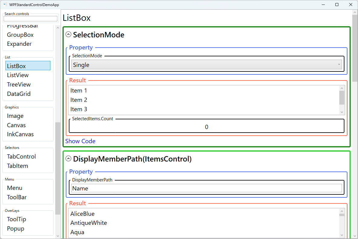
SelectionMode property offers three options: Single for single-item selection
(the default), Multiple for toggling individual items independently with a single click,
and Extended for contiguous range selection with Shift+click and
Ctrl+click for non-contiguous multi-selection. This flexibility makes ListBox suitable for
both simple pickers and complex multi-select scenarios.
The SelectedIndex, SelectedItem, and SelectedValue properties all
provide access to the current selection from different angles. SelectedIndex gives the
zero-based position; SelectedItem gives the actual data object; and
SelectedValue, combined with SelectedValuePath, extracts a specific property
from the selected item — for example, binding only the Id property of a complex object
without exposing the entire object to the view model.
ListBox wraps its items in a ScrollViewer, and the attached
ScrollViewer.HorizontalScrollBarVisibility and ScrollViewer.VerticalScrollBarVisibility
properties let you control scroll bar visibility without subclassing. Setting these to
Disabled removes the scrollbars entirely, Auto shows them only when needed,
and Visible always shows them.
Screen Preview
Demonstrated Properties
The following properties are demonstrated interactively in the WPF Standard Control Demo App. Each property can be configured in real time within the app to observe its behavior.
| Property | Values | Description |
|---|---|---|
SelectionMode |
Single / Multiple / Extended |
When to use: Use Extended when users need to select a range of items (like files in Explorer) using Shift-click and Ctrl-click. Use Multiple when users should be able to toggle individual items on/off with a single click — suitable for tag or category pickers.What happens: Extended supports Shift+click for contiguous range selection and Ctrl+click for non-contiguous multi-selection; all selected items are accumulated in SelectedItems. Multiple toggles each item's selection on every click without requiring any modifier key.Pitfalls: Users accustomed to Windows Explorer expect Extended behavior — Multiple mode, where clicking an already-selected item deselects it, can feel surprising and confusing to most users.
|
DisplayMemberPath (ItemsControl) |
string |
When to use: Use when items are complex objects but only a single text property needs to be displayed — for example, showing just the Name property of a country object.What happens: WPF internally generates a TextBlock bound to the specified property path for each item, eliminating the need to write an ItemTemplate for simple text-only lists.Pitfalls: DisplayMemberPath and ItemTemplate are mutually exclusive — setting both throws a runtime exception. As soon as you need icons, multiple fields, or any layout beyond a single text line, switch to an explicit ItemTemplate.
|
SelectedIndex (Selector) |
int |
When to use: Use to set an initial selection by position, implement keyboard-driven navigation, or programmatically advance through items (e.g., a "next" button). What happens: Setting the value triggers SelectionChanged and automatically updates SelectedItem in sync. Setting it to -1 explicitly clears the selection.Pitfalls: Setting an out-of-range index is silently ignored — no exception is thrown and no selection change occurs. Always validate the index against the collection size before setting it programmatically. |
SelectedItem (Selector) |
object |
When to use: The standard MVVM binding target for single-selection mode. Bind two-way to a ViewModel property to both read the current selection and set it programmatically (e.g., on navigation or initialization). What happens: When the user selects an item, the bound ViewModel property is updated with the actual data object. Setting the property from the ViewModel selects the matching item in the list. Pitfalls: Matching is done by reference equality, not by value equality. If the ViewModel creates a new instance of an object with the same data, it will not match any item in the list and the selection will appear to be cleared — even though the data looks identical. |
SelectedValuePath / SelectedValue (Selector) |
string / object |
When to use: Use for ID-based selection patterns — for example, binding only an integer Id rather than the full object. This is common when persisting the selection to a database or configuration file.What happens: SelectedValuePath (e.g., "Id") tells WPF which property to extract; SelectedValue then reflects that extracted value for the currently selected item. Setting SelectedValue causes WPF to find and select the matching item in ItemsSource.Pitfalls: SelectedValue only works after ItemsSource is populated. If you set SelectedValue before the items are loaded, the selection is silently lost. Always ensure the collection is bound before setting the initial selected value.
|
IsSelected (ListBoxItem) |
bool |
When to use: Use to manage selection state per item in the ViewModel — especially useful in multi-select scenarios where SelectedItems cannot be directly two-way bound. Define a Setter in ItemContainerStyle to bind this property to an IsSelected bool on each item's ViewModel.What happens: Setting the ViewModel property to true marks that item as selected in the list. Any change (user click or ViewModel update) flows both ways through the two-way binding.Pitfalls: The DataContext of the binding inside ItemContainerStyle is each individual item's ViewModel, not the page-level ViewModel. Binding to a property that doesn't exist on the item type fails silently — verify that each item class actually has the expected property.
|
HorizontalScrollBarVisibility / VerticalScrollBarVisibility (ScrollViewer) |
Disabled / Auto / Hidden / Visible |
Attached properties from ScrollViewer that control scroll bar display. Auto is the typical choice — scrollbars appear only when content overflows — while Disabled completely prevents scrolling for fixed-height lists. |
XAML Example
The following XAML demonstrates a data-bound ListBox with a custom DataTemplate and extended multi-selection:
<ListBox ItemsSource="{Binding Employees}"
         SelectionMode="Extended"
         SelectedItem="{Binding SelectedEmployee}"
         ScrollViewer.VerticalScrollBarVisibility="Auto"
         Margin="8">
  <ListBox.ItemTemplate>
    <DataTemplate>
      <StackPanel Orientation="Horizontal" Margin="4">
        <TextBlock Text="{Binding Name}"
                   FontWeight="SemiBold"
                   Width="140" />
        <TextBlock Text="{Binding Department}"
                   Foreground="#555"
                   Margin="8,0,0,0" />
      </StackPanel>
    </DataTemplate>
  </ListBox.ItemTemplate>
</ListBox>
Common Use Cases
- Settings option pickers: Displaying a list of configuration options where the user selects one or more items, such as a list of enabled plugins or export formats.
- File selection panels: Showing a list of files or records from which the user selects one or more for a batch operation like delete, export, or process.
- Navigation panels: Sidebar lists that show categories, tags, or sections, where selecting an item updates the main content area.
- Transfer list UIs: Dual-ListBox patterns where items are moved between "Available" and "Selected" lists using Add/Remove buttons.
- Filtered data views: Binding ListBox to a
CollectionViewwith filtering so the list dynamically narrows based on a search term entered in a linkedTextBox.
Tips and Best Practices
- Use
VirtualizingStackPanelfor large lists: By default, ListBox already uses a virtualizing panel, so only visible items are rendered. Avoid replacing it with a non-virtualizing panel for collections with hundreds of items. - Bind
SelectedItemtwo-way: SettingMode=TwoWayon theSelectedItembinding ensures that programmatic selection from the view model is reflected in the UI without additional event handling. - Use
ObservableCollectionas ItemsSource: Collections implementingINotifyCollectionChangedautomatically keep the ListBox in sync when items are added or removed. - Define keyboard shortcuts for selection: For Extended mode, document Ctrl+A (select all) in the UI so users know it is available — it works by default but is not obvious.
- Consider ListView for tabular data: If items have multiple columns, switch to
ListViewwithGridViewfor a proper columnar display with resizable headers. - Getting multi-selection in MVVM:
SelectedItemsis a read-only collection and cannot be two-way bound directly. The standard workaround is to add anIsSelectedproperty to each item's ViewModel and bind it viaItemContainerStyle. Alternatively, handle theSelectionChangedevent in code-behind and push changes into the ViewModel manually. - Scroll to a programmatically selected item: Changing
SelectedItemfrom the ViewModel does not automatically scroll the list to that item. You must calllistBox.ScrollIntoView(listBox.SelectedItem)explicitly — for example, in aSelectionChangedevent handler or after updating the binding.
Related Controls
Source Code
The source code for this demo screen is available on GitHub. Use the built-in code view buttons in the app to see the exact XAML for each property.