WPF Standard Control Demo App › DataGrid
DataGrid List
DataGrid is a powerful control for displaying tabular data with features like sorting, filtering, grouping, column resizing, and in-place editing. It automatically generates columns from data source properties or allows custom column definitions.
Overview
The WPF DataGrid is the most feature-rich data-presentation control in the WPF
standard library. It renders a two-dimensional table of rows and columns, directly analogous to a
spreadsheet or database table view. Columns can be auto-generated from the bound data source's
property reflection, or defined explicitly in XAML using typed column classes:
DataGridTextColumn, DataGridCheckBoxColumn,
DataGridComboBoxColumn, DataGridHyperlinkColumn, and the highly
flexible DataGridTemplateColumn for fully custom cell content.
Editing is built in: double-clicking or pressing F2 puts a cell into edit mode, where
the appropriate editor for the column type is shown. DataGridTextColumn shows a
TextBox; DataGridCheckBoxColumn shows a CheckBox; and
DataGridComboBoxColumn shows a ComboBox. Changes are committed on focus
loss or Enter, and cancelled with Escape. Row-level validation is supported
through IDataErrorInfo or INotifyDataErrorInfo, and error indicators
appear automatically in the row header.
Sorting is enabled by default for auto-generated columns and for explicitly defined columns when
CanUserSortColumns="True". Clicking a column header sorts ascending; clicking again
sorts descending; a third click reverts to unsorted. Grouping and filtering require a
CollectionViewSource wrapper in the ViewModel — the DataGrid renders group headers
automatically when the source view has group descriptions applied.
Performance is a key consideration for large datasets. Enable
EnableRowVirtualization="True" (the default) and
EnableColumnVirtualization="True" so that only visible cells are realized in the
visual tree. Frozen columns (FrozenColumnCount) allow a fixed number of leading
columns to remain visible during horizontal scrolling, which is essential for usability in
wide grids.
Screen Preview
Demonstrated Properties
The following properties are demonstrated interactively in the WPF Standard Control Demo App. Each property can be configured in real time within the app to observe its behavior.
| Property | Values | Description |
|---|---|---|
AutoGenerateColumns |
bool |
When to use: Useful during prototyping or in developer tools where you want to quickly visualize a data object without writing column definitions. What happens: WPF reflects all public read/write properties of the bound data objects and generates a text column for each, ordered alphabetically by property name. Pitfalls: In production UIs this is almost always wrong — it exposes all properties including sensitive ones (e.g., internal IDs, passwords), the column order is non-deterministic across .NET versions, and columns have no display-friendly headers. Always set AutoGenerateColumns="False" and define columns explicitly in production code.
|
IsReadOnly |
bool |
When to use: Use for display-only grids such as logs, reports, and audit trails where accidental edits would be harmful. What happens: Setting True disables cell editing across the entire grid. It also automatically sets CanUserAddRows to False, since adding a row implies editing it.Pitfalls: Individual column-level IsReadOnly overrides the grid-level setting — a column with IsReadOnly="False" remains editable even when the grid itself is read-only. Use this intentionally for mixed read/write grids, but be aware it can create unexpected edit behavior if set accidentally.
|
SelectionMode / SelectionUnit |
Single/Extended / Cell/FullRow/CellOrRowHeader |
When to use: Use Single + FullRow for master-detail screens where selecting a row loads its details in a side panel. Use Extended + Cell for spreadsheet-style editing where the user copies or fills ranges of cells.What happens: SelectionMode controls how many items can be selected (one or many); SelectionUnit controls what is selected (a whole row, a single cell, or a row when clicking the row header).Pitfalls: Combining SelectionUnit="Cell" with SelectionMode="Single" means only one cell at a time can be selected. Users who click on a row expecting row-level selection will find the behavior disorienting — choose this combination only when per-cell selection is the explicit requirement.
|
ColumnWidth / MaxColumnWidth / MinColumnWidth |
DataGridLength / double / double |
Sets the default width for all columns as a DataGridLength value (pixel, star, or auto), while MaxColumnWidth and MinColumnWidth clamp resizing. DataGridLength.SizeToCells auto-sizes to the widest cell value. |
CanUserAddRows / CanUserDeleteRows |
bool |
When to use: Enable when the grid serves as a direct data-entry surface and you want users to add or remove records in-place without a separate form. What happens: CanUserAddRows="True" displays a blank placeholder row at the bottom of the grid. When the user types into it, a new data object is created and added to the source collection. CanUserDeleteRows="True" lets users remove selected rows by pressing Delete.Pitfalls: CanUserAddRows requires the data model class to have a public parameterless constructor. Without it, WPF cannot instantiate a new object when the user starts typing in the placeholder row, and a runtime exception is thrown. The source collection must also implement IEditableCollectionView — ObservableCollection<T> wrapped in a ListCollectionView satisfies this requirement.
|
CanUserReorderColumns / CanUserResizeColumns / CanUserResizeRows / CanUserSortColumns |
bool |
Fine-grained user-interaction flags. Disable column reordering or resizing to enforce a fixed layout, or disable sorting if the data has a meaningful intrinsic order that should not be disturbed by the user. |
RowDetailsVisibilityMode / AreRowDetailsFrozen |
Collapsed/Visible/VisibleWhenSelected / bool |
RowDetailsVisibilityMode controls whether a row detail template is shown below each row. VisibleWhenSelected is the most common choice, expanding the selected row to show additional information defined in RowDetailsTemplate. |
GridLinesVisibility / HorizontalGridLinesBrush / VerticalGridLinesBrush |
None/Horizontal/Vertical/All / Brush / Brush |
Controls which grid lines are drawn and their colours. Setting GridLinesVisibility="None" and using alternating row backgrounds creates a modern, borderless table look popular in flat design applications. |
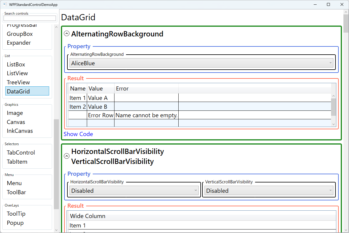
AlternatingRowBackground |
Brush |
When to use: Use in wide grids with many columns where zebra striping helps the eye track horizontally across a row without losing its place. What happens: Even-indexed rows (0, 2, 4…) use the standard RowBackground; odd-indexed rows use AlternatingRowBackground, creating the alternating pattern.Pitfalls: When row grouping is active, AlternatingRowBackground may not be applied correctly because group headers break the row index sequence. In grouped grids, control row coloring explicitly via a custom DataGridRow style instead.
|
FrozenColumnCount |
int |
When to use: Use when the grid has more columns than fit in the viewport and users need to always see an identifier (e.g., Name, Order ID) while scrolling through data columns. What happens: The specified number of leftmost columns are pinned and do not scroll horizontally. All remaining columns scroll normally to the right. Pitfalls: Only the leftmost N consecutive columns can be frozen. It is not possible to freeze a column in the middle of the column list — the frozen columns are always anchored to the left edge. |
HeadersVisibility |
None/Column/Row/All |
Controls which header areas are shown. Hiding the row header (Column only) saves horizontal space when row-level features like drag-reorder or row selection indicators are not needed. |
EnableRowVirtualization / EnableColumnVirtualization |
bool |
When to use: Enable row virtualization for any grid with more than a few dozen rows. Enable column virtualization for grids with many columns. Both are on by default for rows. What happens: With virtualization enabled, only the cells currently visible in the viewport are created in the visual tree. For thousands of rows this reduces memory use and initial render time dramatically. Pitfalls: Row virtualization and row grouping conflict — when both are active, group headers can flicker during scrolling. If you use grouping, test virtualization behavior carefully and consider disabling row virtualization for grouped views. |
RowBackground / RowHeight / MinRowHeight |
Brush / double / double |
Sets the default row background brush and the height of each row. MinRowHeight prevents rows from collapsing to zero when content is empty, maintaining visual consistency. |
RowStyle / CellStyle / ColumnHeaderStyle / ColumnHeaderTemplate |
Style / Style / Style / DataTemplate |
Apply uniform styling to all rows, cells, or column headers via Style resources. Use ColumnHeaderTemplate to embed custom header content such as a filter TextBox directly inside the column header area. |
XAML Example
The following XAML defines a DataGrid with explicit columns, alternating row colours, and frozen column:
<DataGrid ItemsSource="{Binding Employees}"
          AutoGenerateColumns="False"
          IsReadOnly="False"
          SelectionMode="Extended"
          SelectionUnit="FullRow"
          FrozenColumnCount="1"
          AlternatingRowBackground="#F5F5F5"
          GridLinesVisibility="Horizontal"
          CanUserAddRows="False"
          CanUserDeleteRows="True"
          EnableRowVirtualization="True">
  <DataGrid.Columns>
    <DataGridTextColumn Header="Name"
                        Binding="{Binding Name}"
                        Width="160"
                        IsReadOnly="True" />
    <DataGridTextColumn Header="Department"
                        Binding="{Binding Department}"
                        Width="140" />
    <DataGridCheckBoxColumn Header="Active"
                            Binding="{Binding IsActive}"
                            Width="60" />
    <DataGridTemplateColumn Header="Actions" Width="80">
      <DataGridTemplateColumn.CellTemplate>
        <DataTemplate>
          <Button Content="Edit"
                  Command="{Binding DataContext.EditCommand,
                    RelativeSource={RelativeSource AncestorType=DataGrid}}"
                  CommandParameter="{Binding}" />
        </DataTemplate>
      </DataGridTemplateColumn.CellTemplate>
    </DataGridTemplateColumn>
  </DataGrid.Columns>
</DataGrid>
Common Use Cases
- CRUD data management screens: Employee lists, product catalogues, or order management views where users view, add, edit, and delete records in-place.
- Financial and reporting tables: Read-only summary grids with alternating row colours, frozen identifier columns, and custom number formatting in cell templates.
- Configuration editors: Property-grid-style tables where rows represent settings and values are edited inline, often with a
DataGridComboBoxColumnfor enumerated options. - Log and event viewers: Read-only, auto-scroll grids displaying real-time event streams, leveraging row virtualisation to handle thousands of entries without performance degradation.
- Expandable row details: Master-detail layouts using
RowDetailsTemplateto show related child data below the selected row, avoiding a separate detail panel.
Tips and Best Practices
- Always define columns explicitly in production applications.
AutoGenerateColumnsexposes all public properties including internal ones, and column order depends on reflection order, which is not guaranteed. - Enable virtualisation (
EnableRowVirtualization="True") for any list that could contain more than a few dozen rows. Without it, the DataGrid instantiates visual elements for every row at load, causing sluggish startup for large datasets. - Use
ObservableCollection<T>as the ItemsSource so the grid automatically reflects adds and removes without a full refresh. For sorted or filtered views, wrap it in aCollectionViewSource. - Freeze identifier columns using
FrozenColumnCountwhen your grid has more columns than fit in the viewport. This simple setting dramatically improves horizontal-scroll usability. - Validate with
INotifyDataErrorInforather than exception-based validation. It provides per-property error messages that the DataGrid can display in tooltips without crashing the edit session. - Implement
INotifyPropertyChangedon data models — When users edit a cell in-place, the change is reflected in the bound property immediately. However, if the model does not implementINotifyPropertyChanged, other UI elements bound to the same property will not update until a full refresh occurs. - Call
CommitEditbefore collection operations — If you programmatically sort, filter, or delete rows while the user is in the middle of editing a cell, WPF may throw an exception or produce data corruption. Always calldataGrid.CommitEdit()(orCancelEdit()) to close any open edit session before modifying the underlying collection. - Use
RowDetailsTemplatefor expandable row details — Define aDataTemplateinRowDetailsTemplateto show additional related information beneath the selected row. SetRowDetailsVisibilityMode="VisibleWhenSelected"so the detail panel appears only for the active row, keeping the grid compact.
Related Controls
- ListView — a simpler list with a
GridViewmode; suitable when editing, sorting, and grouping are not needed. - TreeView — hierarchical data display; use when rows have a parent-child relationship.
- DataGrid — this page.
- ScrollViewer — the DataGrid embeds a ScrollViewer internally; useful to understand scroll behaviour customisation.
Source Code
The source code for this demo screen is available on GitHub. Use the built-in code view buttons in the app to see the exact XAML for each property.