WPF Standard Control Demo App › Menu
Menu Menu
Menu is a control that displays a hierarchical list of commands and options, typically displayed as a horizontal menu bar at the top of an application window. Each item can have submenus and supports keyboard shortcut display.
Overview
The WPF Menu control renders a horizontal strip of top-level menu items, each of which
can expand into a vertical drop-down containing nested MenuItem elements, separators, and
further submenus. Menu descends from MenuBase, which extends ItemsControl,
so its items are defined either inline as XAML children or bound via ItemsSource with an
appropriate HierarchicalDataTemplate.
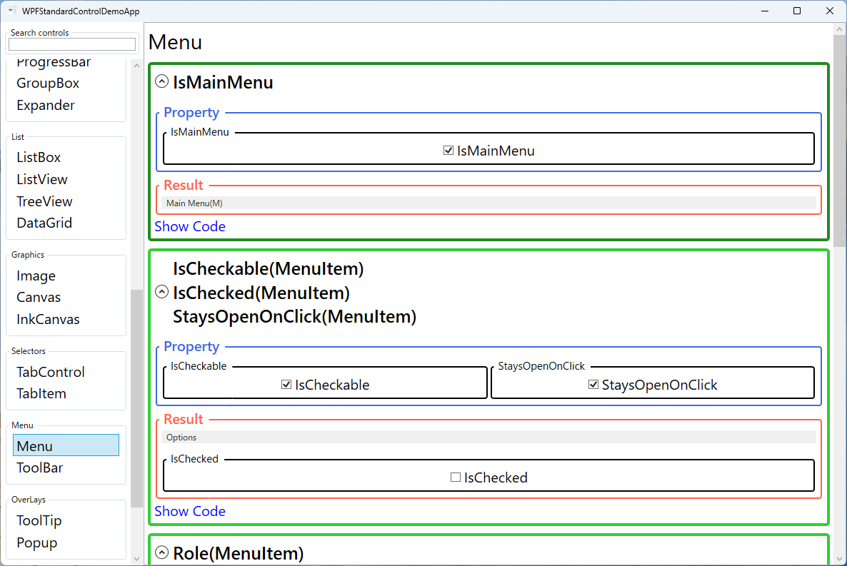
The IsMainMenu property, when set to true, registers the Menu with the
application's main menu infrastructure so that the F10 or Alt key activates the
menu bar. This is the expected behavior for top-level application menus. Each MenuItem
participates in WPF's command infrastructure through its Command property, which wires up
both the execution and the automatic enabled/disabled state management via ICommand.CanExecute.
The Role read-only property on MenuItem reports how the item is being used
within the hierarchy. TopLevelHeader items open drop-downs; TopLevelItem items
execute directly without a dropdown; SubmenuHeader items open nested submenus; and
SubmenuItem items are leaf commands. This role information is set automatically based on
the item's position in the hierarchy and is used by the default control template to render the correct
visual style for each level.
The InputGestureText property allows displaying a keyboard shortcut hint text (e.g., "Ctrl+S")
in the menu item's right margin, next to the command label. This is purely visual — it does not actually
bind the keyboard shortcut. The actual shortcut must be registered separately via
KeyBinding in the window's InputBindings collection or through the command's
registered gesture.
Screen Preview
Demonstrated Properties
The following properties are demonstrated interactively in the WPF Standard Control Demo App. Each property can be configured in real time within the app to observe its behavior.
| Property | Values | Description |
|---|---|---|
IsMainMenu |
bool |
When true, the Menu responds to F10 and Alt keystrokes to activate the menu bar, matching standard Windows application conventions. Only the primary application menu bar should have this set to true. Pitfall: IsMainMenu="True" combined without DockPanel.Dock="Top" placement may result in the menu not being positioned correctly at the top of the window. |
IsCheckable (MenuItem) |
bool |
Enables the menu item to function as a toggle with a check mark, used for view settings such as "Show Toolbar" or "Dark Mode". When true, clicking the item toggles the check mark automatically. Pitfall: if you do not bind IsChecked to the ViewModel, the checked state in the menu will drift out of sync with the underlying model state after clicks. |
IsChecked (MenuItem) |
bool |
The current checked state of a checkable menu item. Bind two-way to a ViewModel boolean property (e.g., IsChecked="{Binding IsToolbarVisible}") so the menu and the model stay synchronized. Pitfall: WPF does not provide automatic mutual-exclusion between multiple IsCheckable items. For radio-group behavior (only one item checked at a time), manage the exclusivity logic manually in the ViewModel. |
StaysOpenOnClick (MenuItem) |
bool |
When true, the menu remains open after the item is clicked. Useful for checkable items in a menu-based toolbar where users want to toggle multiple options without reopening the menu each time. |
Role (MenuItem) |
TopLevelItem / TopLevelHeader / SubmenuItem / SubmenuHeader (ReadOnly) |
A read-only enum that WPF sets automatically based on the item's position in the menu hierarchy. It drives the control template's visual variations (arrow indicators for headers, flat style for leaf items) without any developer configuration. |
Command (MenuItem) |
ICommand |
Binds an ICommand to the menu item for MVVM-based command invocation. The menu item is automatically grayed out when CanExecute returns false. Pitfall: CanExecute is evaluated each time the menu opens. If the method performs expensive work (e.g., a database query), the menu will appear sluggish. Keep CanExecute logic as lightweight as possible. |
Icon (MenuItem) |
object |
An optional icon displayed to the left of the menu item text, typically a 16×16 Image or vector icon. Icons greatly improve menu scannability by providing visual cues. Pitfall: setting a large image without explicit dimensions will distort the menu item layout; always constrain icon images with Width="16" Height="16". |
InputGestureText (MenuItem) |
string |
A display-only shortcut hint shown on the right side of the menu item, such as "Ctrl+S". This text is purely cosmetic and does not register the keyboard shortcut. Pitfall: forgetting to add a matching KeyBinding in Window.InputBindings results in the shortcut being displayed but non-functional, which is confusing for users. Always pair InputGestureText with a real KeyBinding. |
IsHighlighted / IsPressed / IsSubmenuOpen / IsSuspendingPopupAnimation (MenuItem) |
bool (most ReadOnly) |
Read-only state properties used by control templates and triggers to drive hover highlight, press depression, open submenu arrow, and popup animation suppression effects. These enable rich interactive visual feedback in custom menu styles. |
XAML Example
The following XAML demonstrates a typical application Menu bar with submenus, checkable items, and command bindings:
<Menu IsMainMenu="True" DockPanel.Dock="Top">

  <MenuItem Header="_File">
    <MenuItem Header="_New"
              Command="{Binding NewCommand}"
              InputGestureText="Ctrl+N">
      <MenuItem.Icon>
        <Image Source="pack://application:,,,/Icons/new.png"
               Width="16" Height="16" />
      </MenuItem.Icon>
    </MenuItem>
    <MenuItem Header="_Open..."
              Command="{Binding OpenCommand}"
              InputGestureText="Ctrl+O" />
    <MenuItem Header="_Save"
              Command="{Binding SaveCommand}"
              InputGestureText="Ctrl+S" />
    <Separator />
    <MenuItem Header="E_xit"
              Command="{Binding ExitCommand}" />
  </MenuItem>

  <MenuItem Header="_View">
    <MenuItem Header="Show _Toolbar"
              IsCheckable="True"
              IsChecked="{Binding IsToolbarVisible}" />
    <MenuItem Header="Show _Status Bar"
              IsCheckable="True"
              IsChecked="{Binding IsStatusBarVisible}"
              StaysOpenOnClick="True" />
  </MenuItem>

  <MenuItem Header="_Help">
    <MenuItem Header="_About"
              Command="{Binding AboutCommand}" />
  </MenuItem>

</Menu>
Common Use Cases
- Application menu bars: The primary navigation and command surface at the top of MDI and standard document applications, containing File, Edit, View, and Help menus.
- Context menus via ContextMenu: WPF's
ContextMenushares the sameMenuIteminfrastructure, so skills learned with Menu transfer directly to right-click context menus. - Settings and preferences: View-level toggles such as "Show Grid Lines", "Dark Mode", or "Auto Save" represented as checkable menu items in a View or Tools menu.
- Recently opened files list: A dynamically populated submenu under "File > Recent Files" built by binding
ItemsSourceto a recent-files collection in the view model. - Role-based feature access: Disabling or hiding menu items based on user permissions by binding
IsEnabledorVisibilityto permission properties in the view model.
Tips and Best Practices
- Use access keys consistently: Define underscore-prefixed access keys (e.g.,
_File,_Edit) for all top-level and submenu items to ensure full keyboard accessibility without a mouse. - Register KeyBindings separately:
InputGestureTextonly shows the shortcut label; register actual key bindings in theWindow.InputBindingscollection or viaRoutedUICommandwith registered gestures. Omitting this step produces visible-but-non-functional shortcuts. - Keep
CanExecutelightweight: TheCanExecutemethod is called each time the menu opens. Database queries or file I/O inCanExecutewill cause noticeable lag when the user opens a menu. Cache the availability state in the ViewModel and raiseCanExecuteChangedonly when it actually changes. - Use
Separatorto group related items: Visual separators between logical command groups (create/open/save vs. exit) improve menu scannability and match standard OS menu conventions. - Limit submenu depth: Keep menu hierarchies to two or at most three levels. Deeply nested submenus are difficult to navigate and a signal that the command should be moved to a dialog or toolbar instead.
Related Controls
- ContextMenu — uses the same
MenuItemitems and appears on right-click, sharing the full menu item feature set. - ToolBar — a companion control for frequently used commands, typically docked below the Menu bar.
- Popup — the underlying overlay mechanism used to display drop-down menu content.
Source Code
The source code for this demo screen is available on GitHub. Use the built-in code view buttons in the app to see the exact XAML for each property.