WPF Standard Control Demo App › ToolBar
ToolBar Menu
ToolBar is a container for displaying frequently used commands as buttons, toggle buttons, separators, and other controls in a horizontal or vertical strip. It supports overflow handling when items exceed available space, and multiple toolbars can be organized in a ToolBarTray that supports dragging and repositioning.
Overview
The WPF ToolBar control provides a compact command surface typically placed at the
top of an application window or document editor. It inherits from HeaderedItemsControl
and is almost always hosted inside a ToolBarTray, which manages multiple toolbars on
the same band, allows users to reorder them by dragging, and coordinates the overflow area.
When a ToolBar's items overflow its visible width, the excess items are automatically moved to an
overflow popup, which the user can open by clicking the chevron (>>) button at the right end
of the toolbar. The OverflowMode attached property on each item controls its overflow
behavior: AsNeeded (default) puts the item in overflow only when space is insufficient,
Never always keeps it visible, and Always always puts it in the overflow
panel.
ToolBar automatically applies a stripped-down style to common controls placed inside it. Buttons appear without their default border and background, giving a flat toolbar appearance. ToggleButtons and ComboBoxes also receive toolbar-specific styles. This behavior is driven by WPF's resource dictionary lookup, which applies different templates based on whether a control is inside a ToolBar.
The Band and BandIndex properties determine where a ToolBar is positioned
within its ToolBarTray. Band is the zero-based row index (for horizontal trays) and
BandIndex is the position within that row. Dragging a toolbar at runtime updates these
values, enabling persistent toolbar layout saving and restoration.
Screen Preview
Demonstrated Properties
The following properties are demonstrated interactively in the WPF Standard Control Demo App. Each property can be configured in real time within the app to observe its behavior.
| Property | Values | Description |
|---|---|---|
HasOverflowItems (ReadOnly) |
bool |
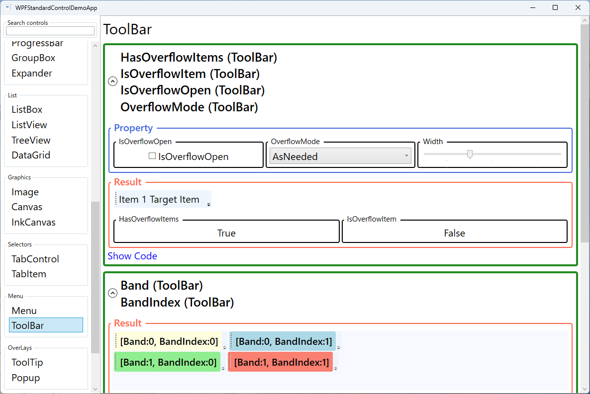
Indicates whether any items have been moved to the overflow popup because they did not fit in the visible area. Use this to conditionally show a custom overflow indicator or to disable overflow-sensitive commands. |
IsOverflowOpen |
bool |
Gets or sets whether the overflow popup is currently open. You can bind or set this programmatically to open the overflow panel — for example, after a guided tour step that highlights an overflow item. Pitfall: if all items are visible (no overflow), the overflow button itself is hidden and IsOverflowOpen="True" has no visible effect. |
OverflowMode (ToolBar attached) |
AsNeeded / Never / Always |
Applied to individual items inside the toolbar to control their overflow behavior. Set Never on critical commands (Save, Undo) to ensure they are always visible. Set Always on rarely used items to keep the main bar clean. Pitfall: too many Never items will cause buttons to overlap or get clipped when the window is made very narrow. Use this mode sparingly and only for the most essential commands. |
Band / BandIndex (ToolBar) |
int / int |
Determines placement within the ToolBarTray. Band is the row (0-based) and BandIndex is the position within that row. Save and restore these values to persist the user's toolbar layout across sessions. Pitfall: Band/BandIndex have no effect on a ToolBar that is not placed inside a ToolBarTray; drag-to-reorder also stops working without a tray. |
IsLocked (ToolBarTray) |
bool |
When true, prevents the user from dragging toolbars within the tray. Use this for fixed application layouts where toolbar reordering is not a supported feature. |
Orientation (ToolBarTray) |
Horizontal / Vertical |
Sets whether the ToolBarTray lays out toolbars horizontally (typical top/bottom placement) or vertically (side panel placement). The contained ToolBars are oriented accordingly. Pitfall: the Orientation of the ToolBarTray and its contained ToolBars must be consistent; a mismatch can cause unexpected layout behavior. |
XAML Example
A ToolBarTray with two toolbars — a main editing bar and a formatting bar:
<ToolBarTray DockPanel.Dock="Top" IsLocked="False">
  <ToolBar Band="0" BandIndex="0">
    <Button Command="ApplicationCommands.New" ToolTip="New">
      <Image Source="/Icons/new.png" Width="16" Height="16" />
    </Button>
    <Button Command="ApplicationCommands.Open" ToolTip="Open" />
    <Button Command="ApplicationCommands.Save" ToolTip="Save"
            ToolBar.OverflowMode="Never" />
    <Separator />
    <Button Command="ApplicationCommands.Cut" ToolTip="Cut" />
    <Button Command="ApplicationCommands.Copy" ToolTip="Copy" />
    <Button Command="ApplicationCommands.Paste" ToolTip="Paste" />
  </ToolBar>
  <ToolBar Band="1" BandIndex="0">
    <ToggleButton IsChecked="{Binding IsBold}" ToolTip="Bold"
                  ToolBar.OverflowMode="Never">B</ToggleButton>
    <ToggleButton IsChecked="{Binding IsItalic}" ToolTip="Italic">I</ToggleButton>
  </ToolBar>
</ToolBarTray>
Common Use Cases
- Application command bars — New/Open/Save/Print and Edit commands grouped in a standard application toolbar.
- Text formatting toolbars — Bold, Italic, Underline, font selector, and size picker in a document editor.
- Drawing tool palettes — Tool selection buttons for paint, select, zoom, and erase modes in a graphics application.
- Context-sensitive toolbars — Show different toolbars depending on the selected content type (table, image, text) by toggling toolbar visibility.
- Customizable user toolbars — Allow users to drag toolbars into their preferred positions and save the Band/BandIndex layout to user settings.
Tips and Best Practices
- Always host ToolBar inside ToolBarTray — Without a tray, overflow and drag-reorder features do not work. Even a single toolbar benefits from being inside a tray.
- Set OverflowMode="Never" on critical commands — Ensure Save, Undo, and other high-priority commands are always visible regardless of window width. Use this mode sparingly to avoid items overlapping when the window is very narrow.
- Use ToolTip on every item — Toolbar buttons typically show icons only; always add a
ToolTipso users can discover the action without hunting through menus. - Separate groups with Separator — Use
<Separator />to visually group related commands (file operations vs. edit operations vs. format commands). - Override background color carefully — ToolBar has a hard-coded grey background applied by its control template. Setting
Backgrounddirectly may have no effect; override it in aStyletargetingToolBaror replace theControlTemplateto match your application's color theme. - Avoid complex content in overflow items — Items in the overflow popup should be self-contained; avoid items that rely on adjacent items being visible.
Related Controls
- Menu — A full hierarchical menu bar alternative for commands; shows text labels rather than icons by default.
- Button — The most common item placed inside a ToolBar.
- ToggleButton — Used for persistent-state items (Bold, Italic) inside a toolbar.
Source Code
The source code for this demo screen is available on GitHub. Use the built-in code view buttons in the app to see the exact XAML for each property.