WPF Standard Control Demo App › Popup
Popup Overlays
Popup is a control that displays content in a separate window that floats above the main window. Unlike ToolTip, it does not automatically appear on hover and requires programmatic control. It is used as the base for many overlay controls.
Overview
The WPF Popup control renders its Child content in a separate top-level
window that floats above all other application content. Unlike AdornerLayer or
Canvas overlays, a Popup escapes the bounds of its parent window and can appear over
the taskbar and other application windows. It inherits from FrameworkElement and is
not a visual child of its placement target, which means it exists in a separate visual tree.
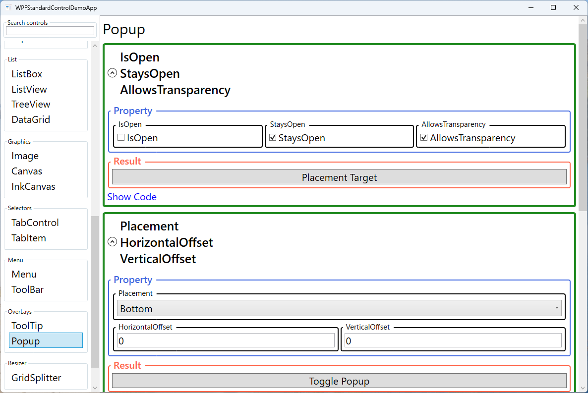
The visibility of a Popup is controlled by the IsOpen property. Setting it to
true shows the popup window; setting it to false hides it. This property
is commonly bound two-way to a view model boolean so the popup can be opened and closed
programmatically without event handlers. The StaysOpen property determines whether
the popup closes automatically when the user clicks outside it — setting it to false
enables light-dismiss behavior common in drop-down and flyout patterns.
The Placement property with the PlacementMode enum controls where the
popup appears relative to its PlacementTarget. Common values include
Bottom (below the target, like a drop-down), Right (to the right),
Mouse (near the cursor), and Absolute (at a fixed screen coordinate).
The HorizontalOffset and VerticalOffset properties allow fine-tuning the
exact position within the chosen placement mode.
The PopupAnimation property adds an opening animation to improve perceived performance
and polish. Fade opacity-animates the popup into view; Slide slides it in
from the placement direction; Scroll reveals it with a scroll effect. To use animations,
AllowsTransparency must be set to true. Popup is the foundational mechanism
behind ComboBox drop-downs, Menu pop-outs, ToolTip, and
ContextMenu in WPF.
Screen Preview
Demonstrated Properties
The following properties are demonstrated interactively in the WPF Standard Control Demo App. Each property can be configured in real time within the app to observe its behavior.
| Property | Values | Description |
|---|---|---|
IsOpen |
bool |
The primary visibility toggle for the Popup. Setting it to true shows the popup window immediately; false hides it. Binding this two-way to a ViewModel boolean is the standard MVVM pattern. Pitfall: Many developers bind IsOpen but find that clicking outside the popup does not close it. This is almost always because StaysOpen was not set to false — always pair IsOpen two-way binding with StaysOpen="False" to get the expected light-dismiss behavior. |
StaysOpen |
bool |
When false (default), the Popup implements light-dismiss behavior and closes automatically when the user clicks outside the popup bounds — IsOpen is set to false automatically. When true, the popup stays visible until IsOpen is explicitly set to false in code. Use true when the popup contains interactive controls the user needs to operate while keeping it open. Pitfall: Setting StaysOpen="True" without providing an explicit close button traps users with no way to dismiss the popup. |
AllowsTransparency |
bool |
Enables transparent backgrounds and rounded corners in the popup window by using a layered OS window. Required for PopupAnimation effects and for popups with drop shadows or non-rectangular shapes created via DropShadowEffect. Only enable it when animations or non-rectangular shapes are required, as transparent popup windows consume more GPU resources. |
Placement |
PlacementMode |
Determines the anchor point and direction for popup positioning relative to its PlacementTarget or the mouse cursor. Bottom places the popup directly below the target (ideal for drop-downs); Mouse places it near the cursor; Left/Right place it beside the target for flyout panels. Pitfall: Absolute ignores PlacementTarget entirely and uses screen coordinates, so if you use Absolute without also setting PlacementRectangle or HorizontalOffset/VerticalOffset, the popup appears at or near screen origin (0, 0). |
HorizontalOffset / VerticalOffset |
double |
Pixel offsets applied after the Placement position is calculated, allowing fine-grained control over the popup's final position. Positive values generally move the popup right/down. Pitfall: The exact direction depends on the Placement mode — for example, with Placement="Top" a positive VerticalOffset can move the popup in the opposite direction than expected. If the popup moves the wrong way, try reversing the sign. |
PopupAnimation |
None / Fade / Slide / Scroll |
The opening animation style for the popup window. Requires AllowsTransparency="True" to function. Fade provides the most subtle and polished effect; Slide matches the feel of native Windows dropdown controls. |
Child |
UIElement |
The single root UIElement that defines the popup's visual content. Typically a Border with a drop shadow wrapping a StackPanel, Grid, or other layout panel containing the actual popup UI. |
PlacementTarget |
UIElement |
The element used as the reference for placement calculations. When not set, the Popup uses its visual-tree parent. Pitfall: Inside a DataTemplate the visual parent is often an internal container, not the item you expect. Always set PlacementTarget explicitly in templates using ElementName or RelativeSource={RelativeSource TemplatedParent} to ensure the popup anchors to the correct element. |
PlacementRectangle |
Rect |
An optional rectangle in the coordinate space of the PlacementTarget that overrides the target's bounds for placement calculations. Required when using Placement="Absolute" to specify exact screen coordinates. Also useful for anchoring a popup to a specific cell within a larger control such as a DataGrid row. |
XAML Example
The following XAML demonstrates a Popup used as a custom tooltip-style information flyout, opened by a button click:
<StackPanel Margin="16">

  <Button x:Name="infoButton"
          Content="Show Info"
          Width="100" Height="32"
          Click="OnShowInfo" />

  <Popup x:Name="infoPopup"
         PlacementTarget="{Binding ElementName=infoButton}"
         Placement="Bottom"
         HorizontalOffset="0"
         VerticalOffset="4"
         StaysOpen="False"
         AllowsTransparency="True"
         PopupAnimation="Fade"
         IsOpen="{Binding IsInfoOpen, Mode=TwoWay}">
    <Border Background="White"
            BorderBrush="#CCCCCC"
            BorderThickness="1"
            CornerRadius="4"
            Padding="12">
      <Border.Effect>
        <DropShadowEffect Color="#888888"
                          BlurRadius="8"
                          Opacity="0.3"
                          ShadowDepth="2" />
      </Border.Effect>
      <StackPanel Width="220">
        <TextBlock Text="Information"
                   FontWeight="Bold"
                   Margin="0,0,0,6" />
        <TextBlock Text="{Binding InfoMessage}"
                   TextWrapping="Wrap" />
      </StackPanel>
    </Border>
  </Popup>

</StackPanel>
Common Use Cases
- Custom dropdown panels: Used internally by
ComboBoxandMenu; replicated in custom controls that need a drop-down panel (e.g., a date range picker or color picker flyout). - Rich tooltips: A Popup with
StaysOpen="False"andPlacement="Mouse"as an alternative toToolTipwhen the tooltip content needs interactive elements like links or buttons. - Notification banners: Transient overlays that appear near the corner of the screen to show success or error messages, automatically closing after a timer sets
IsOpentofalse. - Inline editors: Clicking a cell in a read-only list opens a Popup with an editable form for that item, combining the compactness of a list view with the richness of a form.
- Auto-complete suggestions: A Popup positioned below a
TextBoxthat shows aListBoxof matching suggestions as the user types, implementing a custom auto-complete control.
Tips and Best Practices
- Always set
PlacementTargetexplicitly: Without it, the Popup uses the visual tree parent for placement, which can produce unexpected positions when the Popup is declared inside templates or data templates. - Use
StaysOpen="False"for light-dismiss overlays: This matches the user expectation that clicking away from a drop-down or flyout closes it, following standard OS overlay conventions. - Set
AllowsTransparencyonly when needed: Transparent popup windows consume more GPU resources. Only enable it when animations or non-rectangular shapes are required. - Handle
Closedevent for cleanup: When the Popup is dismissed via light-dismiss (StaysOpen="False"), update the view model boolean so the state stays in sync and the popup can be reopened correctly. - Avoid putting too much content in a Popup: Popups are temporary overlay surfaces. Heavy content should use a dialog or a side panel instead, as Popup windows are separate OS windows with limited accessibility tree integration.
Related Controls
- ToolTip — a simpler overlay that appears automatically on hover; Popup is more powerful but requires manual show/hide management.
- ComboBox — uses Popup internally for its drop-down list.
- Menu — uses Popup for rendering drop-down menus and submenus.
- ContextMenu — a light-dismiss Popup-based menu that appears on right-click.
Source Code
The source code for this demo screen is available on GitHub. Use the built-in code view buttons in the app to see the exact XAML for each property.