WPF Standard Control Demo App › PasswordBox
PasswordBox Inputs
PasswordBox is a specialized input control for entering passwords. Text is masked with a password character and the content is managed as a SecureString for security purposes. Unlike TextBox, it does not support data binding on the Password property directly.
Overview
The WPF PasswordBox control is purpose-built for secure password entry. Unlike
TextBox, which stores its content as a plain string, PasswordBox internally
manages input through a SecureString. This means the password data is encrypted in memory
using the Windows Data Protection API and is not accessible as a plain string through normal memory
inspection techniques, reducing the window of exposure for sensitive credentials.
The visible content of PasswordBox is always masked by the PasswordChar character (default:
●), so users see a row of identical symbols regardless of what they type. The actual
password can only be retrieved through the Password property, which returns a plain
string, or through the SecurePassword property, which returns the
SecureString directly. For maximum security in production applications, avoid converting
SecurePassword to a plain string; instead, pass it directly to APIs that accept
SecureString.
One notable limitation of PasswordBox is that the Password property does not support
standard WPF data binding — it is deliberately excluded from the binding system to prevent accidental
exposure of credentials through XAML or log traces. In MVVM scenarios, developers commonly work around
this using attached properties, a PasswordChanged event handler in code-behind, or a
behavior that safely transfers the value to the view model without storing it as a plain string in a
property.
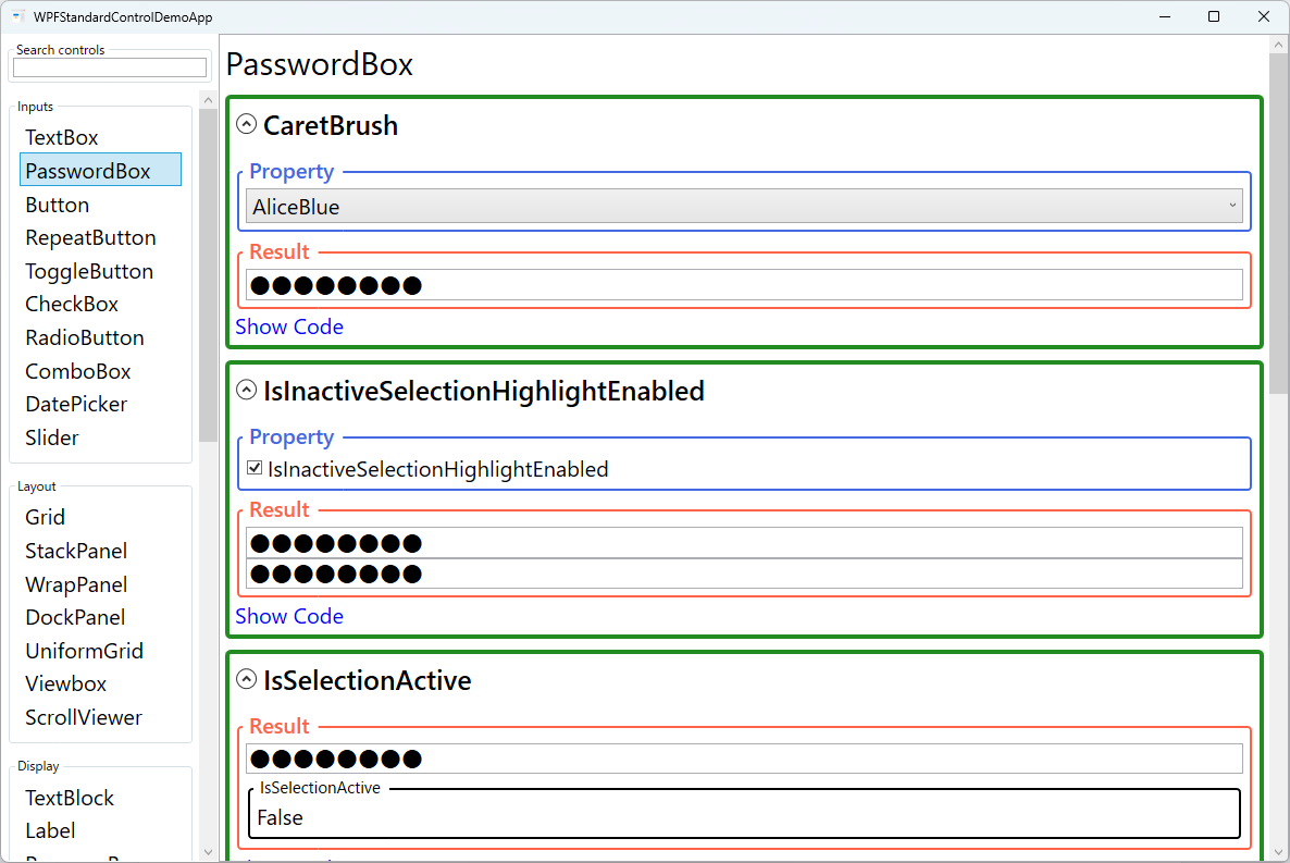
PasswordBox supports selection-related properties such as SelectionBrush,
SelectionOpacity, and CaretBrush, allowing you to customize the appearance
of the text cursor and selection highlight to match your application theme. The
IsInactiveSelectionHighlightEnabled property controls whether the selection highlight
remains visible when the control loses focus, providing a visual cue for the last active field.
Screen Preview
Demonstrated Properties
The following properties are demonstrated interactively in the WPF Standard Control Demo App. Each property can be configured in real time within the app to observe its behavior.
| Property | Values | Description |
|---|---|---|
PasswordChar |
char (default: ●) |
Use this when your application's design calls for a different masking symbol — for example, an asterisk (*) for a more Western-style login screen, or a custom glyph for a branded UI. Each typed character is replaced in the display by this symbol, and the count of symbols reveals the password length. The default bullet ● is widely recognized as a password mask. Pitfall: PasswordChar is a DependencyProperty, but dynamically changing it at runtime (e.g., toggling between styles) should be done from code-behind rather than through a binding, because binding a security-related property can expose it to indirect logging or debugging access. |
MaxLength |
int (0 = unlimited) |
Set this when a password policy enforces a maximum character count — for example, capping at 128 characters to align with your authentication service. Once the limit is reached, further input is silently blocked with no error message shown. The default value 0 imposes no limit. Pitfall: MaxLength is a UI-layer restriction only. It is straightforward to bypass from outside the control (e.g., by calling the Password setter directly). Always enforce the same limit on the server side and never treat client-side input restrictions as a security guarantee. |
CaretBrush |
Brush |
Use this when a custom theme or high-contrast background makes the default black caret invisible — for example, on a dark-themed login form where the PasswordBox has a dark background. Setting a white or light-colored CaretBrush keeps the insertion point clearly visible. Pitfall: CaretBrush is only honored by the aero2 WPF theme present on Windows 10 and later. On older Windows themes the property is silently ignored, so test caret visibility in your target OS environments if your application must support legacy systems. |
SelectionBrush |
Brush |
Use this when the OS default selection highlight color does not integrate well with your application's color scheme — for example, to match a corporate accent color. The specified brush is used to render the selection background when the user selects password characters. Combine it with SelectionOpacity to maintain a readable contrast between the mask characters and the highlight. Pitfall: choosing an overly bright, fully opaque selection color on a dark theme can reduce the visibility of the masked characters beneath it — adjust SelectionOpacity so users can still see the selected region clearly. |
SelectionOpacity |
double (0.0–1.0) |
Use this to fine-tune how transparent the selection highlight is so the mask characters remain partially visible beneath it, reassuring the user that text is present. The default value is 0.4, which provides a semi-transparent highlight. Lower values make the highlight more transparent; higher values make it more opaque. Pitfall: setting SelectionOpacity to 0 makes the selection completely invisible, which is a significant accessibility regression — users will not be able to tell that anything is selected. Always keep it at 0.2 or above. |
IsInactiveSelectionHighlightEnabled |
bool |
Use this in scenarios such as a side-by-side password confirmation form where you want the selection highlight to persist after focus leaves the control, so the user can see which region was selected while reviewing the other field. When True, the selection highlight remains visible even when the PasswordBox does not have keyboard focus. The default is False. Pitfall: enabling this in a standard login form with multiple fields can leave stale selection highlights visible across multiple controls simultaneously, which looks confusing to users. Keep the default False unless you have a specific reason to retain the highlight after focus change. |
IsSelectionActive |
bool (ReadOnly) |
This read-only property is True when the PasswordBox has an active text selection. Use it in a DataTrigger to conditionally reveal a "Clear" button or another selection-aware UI element only when the user has selected something. Because it is read-only, it cannot be set from XAML or code — only observed. |
XAML Example
The following XAML demonstrates a styled PasswordBox in a login form with a PasswordChanged handler:
<StackPanel Margin="32" Width="280">

  <Label Content="_Username:" Target="{Binding ElementName=userBox}" />
  <TextBox x:Name="userBox"
           Text="{Binding Username, UpdateSourceTrigger=PropertyChanged}"
           Margin="0,0,0,12" Height="32" Padding="6,4" />

  <Label Content="_Password:" Target="{Binding ElementName=passBox}" />
  <PasswordBox x:Name="passBox"
               PasswordChar="●"
               MaxLength="128"
               CaretBrush="Black"
               SelectionBrush="#0078D4"
               SelectionOpacity="0.4"
               PasswordChanged="OnPasswordChanged"
               Margin="0,0,0,16" Height="32" Padding="6,4" />

  <Button Content="Sign In"
          Command="{Binding SignInCommand}"
          IsDefault="True"
          Height="36" />

</StackPanel>
Common Use Cases
- Login dialogs: The primary use case — a username/password form at application startup or in a sign-in dialog where credentials must be hidden from shoulder surfers.
- Password change forms: Current password and new password fields in an account settings dialog, with MaxLength enforcing corporate password policies.
- API key or token entry: Masked input for sensitive configuration values such as API keys, access tokens, or license keys that should not be visible in plain text.
- PIN entry panels: Numeric-only password input with a short MaxLength, often combined with a custom
PasswordCharsuch as a star or circle. - Secure configuration dialogs: Database connection string passwords or encryption key input fields in application setup wizards.
Tips and Best Practices
- Never bind
Passwordto a plain string ViewModel property: ThePasswordproperty is intentionally excluded from the WPF binding system to prevent credentials from being stored in plain text in a bindable property. Use thePasswordChangedevent or an attached behavior to transfer the value. If you must pass it to a ViewModel, hash it immediately and discard the plain-text string. - Use
SecurePasswordinstead ofPasswordwhere possible: Retrieve theSecureStringvia theSecurePasswordproperty and pass it directly to APIs that acceptSecureString, so the password is never materialized as a plainstringin managed memory. - Clear the PasswordBox after authentication: Call
passwordBox.Clear()immediately after completing the authentication flow to remove the password from the control's internal state as quickly as possible. - Use two PasswordBoxes for password confirmation: In a password change form, place two PasswordBoxes and compare their values in the
PasswordChangedevent of each. Show a real-time error message and disable the submit button until the values match. - Implement show/hide toggle carefully: The standard PasswordBox has no built-in reveal option. A common approach overlays a
TextBoxand aPasswordBoxin the same location and toggles theirVisibility. Always make it clear to the user that the password is briefly visible in plain text when the reveal toggle is on, and clear the TextBox when they switch back. - Add a Label for accessibility: Place a
Labelwith aTargetbinding next to every PasswordBox so screen readers can announce the field's purpose. SettingAutomationProperties.LabeledByorAutomationProperties.Nameprovides additional context for assistive technologies. - Align
MaxLengthwith server-side validation: TheMaxLengthproperty is a convenience for users, not a security boundary. Always validate the password length on the server too, and never rely on client-side UI controls as your only enforcement mechanism.
Related Controls
Source Code
The source code for this demo screen is available on GitHub. Use the built-in code view buttons in the app to see the exact XAML for each property.