WPF Standard Control Demo App › Label
Label Display
Label is a content control that displays text and supports access keys (mnemonics). Unlike TextBlock, it can receive focus and is designed to be paired with other controls using the Target property for keyboard navigation.
Overview
The WPF Label control extends ContentControl and adds two critical features
over a plain TextBlock: access key (mnemonic) support and focus delegation via the
Target property. Access keys are defined by prefixing an underscore before a character in
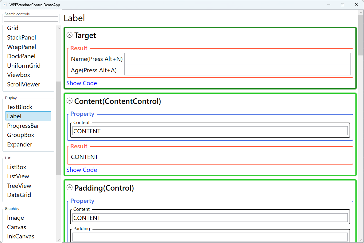
the Content string — for example, _Name: makes Alt+N the keyboard
shortcut for this label. When pressed, focus automatically transfers to the control specified by
Target.
This focus delegation makes Label the preferred choice over TextBlock when labeling form
fields. By setting Target="{Binding ElementName=firstNameTextBox}", pressing the label's
access key moves keyboard focus directly to the associated TextBox. This is a fundamental
accessibility requirement for desktop applications and allows users who rely on keyboard navigation to
quickly jump between form fields without using the mouse.
Like all ContentControl descendants, Label's Content property accepts any
object, not just strings. You can embed images, icons, or complex layouts within a Label. The control's
typography properties — FontFamily, FontSize, FontWeight,
FontStyle, and FontStretch — cascade to child text elements and provide
consistent styling options.
The HorizontalContentAlignment and VerticalContentAlignment properties control
how the content is positioned within the Label's bounds. For simple text labels in form layouts, the
default Left/Top alignment is typical, but Right alignment is
common for labels in a two-column form grid where the label column is right-aligned next to input fields.
Screen Preview
Demonstrated Properties
The following properties are demonstrated interactively in the WPF Standard Control Demo App. Each property can be configured in real time within the app to observe its behavior.
| Property | Values | Description |
|---|---|---|
Target |
UIElement |
Use this whenever you place a Label next to an input control so that keyboard users can press Alt+the access key to jump directly to that field without touching the mouse. When the access key is pressed, WPF moves keyboard focus to the element specified here. Prefer {x:Reference nameBox} over {Binding ElementName=nameBox} because x:Reference is validated at compile time and will catch typos in the element name immediately. Pitfall: Target only works when the Label and the target control share the same FocusScope. Controls inside a ToolBar or Menu maintain their own focus scope, so a Label outside those containers cannot target an element inside them. |
Content (ContentControl) |
object |
Use this to display field description text and optionally define a keyboard shortcut character for the field. Prefix any character in the string with _ to make it an access key — for example _Email: registers Alt+E as the shortcut. When the user presses Alt, the underscore prefix character is revealed as an underline beneath the access key character. To display a literal underscore character, use a double underscore __. Note: the Target property only controls where focus moves on key press; the access key underline and Alt-key behavior are visible even without a Target set. |
Padding (Control) |
Thickness |
Adds internal spacing between the Label's border and its content. The WPF default padding for Label is 5,0,0,0 (5px left, 0 on other sides). Adjust this when building compact form layouts or when using a larger font size where the default spacing feels too tight or too loose. Pitfall: setting Padding to 0 on all sides pushes the text flush against the border, which looks cramped. If you change the font size, review the Padding as well to keep the visual proportions correct. |
FontWeight / FontStyle / FontStretch / FontSize / FontFamily (Control) |
various |
These typography properties control the visual appearance of the label text and are all inherited from ancestor elements. Setting them on a shared parent panel or in an application-level Style keeps the form consistent without repeating the same values on every Label. Bold labels are common for required fields; italic for optional or hint labels; larger sizes for section headers. Pitfall: not all fonts support all FontWeight values. If you request Light or ExtraBold and the font doesn't include that weight, WPF substitutes the nearest available weight silently. Always verify the font and weight combination renders as intended. |
Background / Foreground (Control) |
Brush |
Foreground sets the text color and is the most commonly customized brush property for Label. Use a dimmed gray foreground for disabled or hint labels, and red for required-field indicators. For theme-aware apps, use {DynamicResource ControlTextBrush} or your own theme brush rather than a hard-coded color, so the label automatically adapts to light and dark themes. Pitfall: hard-coding colors such as Black or White will make labels unreadable when the OS theme changes or when the user enables high-contrast mode. |
BorderBrush / BorderThickness (Control) |
Brush / Thickness |
Optional border properties seldom used by default but available when a Label needs a visible frame. Adding a bottom-only border can create an underline-style label that doubles as a visual section separator in a form. Keep border usage minimal to avoid visual noise in dense form layouts. |
HorizontalContentAlignment / VerticalContentAlignment (Control) |
Left/Center/Right/Stretch / Top/Center/Bottom/Stretch |
Controls where the content is placed within the Label's allocated space. Right-aligning labels in the first column of a two-column form grid aligns the label text flush against the adjacent input control, producing a clean professional form appearance. The default is Left / Top. |
XAML Example
The following XAML demonstrates Label usage with access keys and Target bindings in a form layout:
<Grid Margin="16">
  <Grid.ColumnDefinitions>
    <ColumnDefinition Width="120" />
    <ColumnDefinition Width="*" />
  </Grid.ColumnDefinitions>
  <Grid.RowDefinitions>
    <RowDefinition Height="Auto" />
    <RowDefinition Height="Auto" />
    <RowDefinition Height="Auto" />
  </Grid.RowDefinitions>

  <!-- Label with access key _N targeting the TextBox -->
  <Label Grid.Row="0" Grid.Column="0"
         Content="_Name:"
         Target="{Binding ElementName=nameBox}"
         HorizontalContentAlignment="Right" />
  <TextBox Grid.Row="0" Grid.Column="1"
           x:Name="nameBox" Margin="4" />

  <Label Grid.Row="1" Grid.Column="0"
         Content="_Email:"
         Target="{Binding ElementName=emailBox}"
         HorizontalContentAlignment="Right" />
  <TextBox Grid.Row="1" Grid.Column="1"
           x:Name="emailBox" Margin="4" />

  <Label Grid.Row="2" Grid.Column="0"
         Content="_Role:"
         Target="{Binding ElementName=roleCombo}"
         HorizontalContentAlignment="Right" />
  <ComboBox Grid.Row="2" Grid.Column="1"
            x:Name="roleCombo" Margin="4" />

</Grid>
Common Use Cases
- Form field labels: Paired with
TextBox,ComboBox, orDatePickercontrols in data-entry forms, providing accessible keyboard shortcuts to jump to each field. - Required field indicators: Displaying an asterisk or using a red foreground to visually mark mandatory fields in registration or configuration forms.
- Section headings within GroupBox: Used inside
GroupBoxheaders or as sub-section titles within larger form panels. - Status and descriptor text: Displaying read-only descriptive text next to values in property panels or detail views where the label provides context for the adjacent value.
- Toolbar and panel labels: Labeling icon buttons or sliders in tool panels with short descriptive names that also serve as access-key shortcuts.
Tips and Best Practices
- Always set
Targetin forms: Without aTarget, access keys have no effect on focus. Every Label next to an input control should have itsTargetset for proper keyboard accessibility. - Use
x:Referenceinstead ofElementName: PreferTarget="{x:Reference nameBox}"overTarget="{Binding ElementName=nameBox}".x:Referenceis validated at compile time, so a typo in the element name becomes a build error rather than a silent runtime failure. - Use
TextBlockfor non-interactive text: If you do not need access keys or focus delegation,TextBlockis lighter and more flexible. Label inherits the fullContentControlstack, which adds overhead not needed for simple read-only text. - Escape literal underscores with double underscore: To display an actual underscore character in a Label's content, write
__(two underscores). A single underscore is always interpreted as the access-key prefix. - Right-align labels in two-column forms: Setting
HorizontalContentAlignment="Right"on all labels in the first column produces a cleaner layout where label text aligns flush against the input field column. - Be aware of FocusScope boundaries: The
Targetproperty only works when the Label and the target control are in the same focus scope. Controls inside aToolBarorMenuhave their own isolated focus scope, so a Label defined outside cannot move focus to a control inside them. - Ensure sufficient color contrast: Label foreground colors must meet WCAG AA contrast ratio requirements (at least 4.5:1 against the background) to satisfy accessibility guidelines for desktop applications.
Related Controls
Source Code
The source code for this demo screen is available on GitHub. Use the built-in code view buttons in the app to see the exact XAML for each property.