WPF Standard Control Demo App › GroupBox
GroupBox Display
GroupBox is a bordered container with a header that visually groups related controls. It is commonly used to organize form elements into logical sections.
Overview
The WPF GroupBox control provides a titled border that visually encloses a related set of
child controls. It descends from HeaderedContentControl, which itself extends
ContentControl, giving GroupBox both a Header area and a main
Content area. The border and header work together to communicate visual hierarchy to users,
making it immediately clear which controls belong to the same functional group.
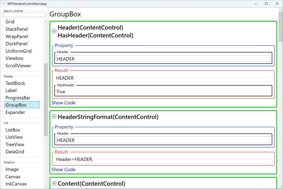
The Header property accepts any object, not just a string. You can place an icon, a
CheckBox, or a fully styled StackPanel inside the header area to create rich
group titles. When the header is a string, the HeaderStringFormat property lets you apply
standard .NET format strings — for example, displaying a numeric count within the header text without
any code-behind.
GroupBox is frequently used to partition large forms into sections such as "Personal Information", "Shipping Address", and "Payment Details". This grouping reduces cognitive load and improves usability because users can scan form sections at a glance. Accessibility tools such as screen readers also benefit from the explicit grouping, as they can announce the group header when focus moves inside the container.
In MVVM applications, GroupBox integrates naturally by binding its Header property to a
view model string and its Content property to a nested view or data template. The
HasHeader read-only property reports whether a non-null header has been set, which can be
used in data triggers to conditionally adjust the layout when headers are absent.
Screen Preview
Demonstrated Properties
The following properties are demonstrated interactively in the WPF Standard Control Demo App. Each property can be configured in real time within the app to observe its behavior.
| Property | Values | Description |
|---|---|---|
Header (HeaderedContentControl) |
object |
The content displayed in the group header area, typically rendered at the top of the border. Accepts any object including strings, images, or composite panels for rich group titles. Use a CheckBox in the header to let users enable or disable the entire group at once — a common pattern in installer UIs. Pitfall: Multi-line text cannot be set directly as a string header; place a TextBlock with TextWrapping="Wrap" inside the header instead. To customise header font or style, use a HeaderTemplate or Style rather than setting properties directly. |
HasHeader (HeaderedContentControl) |
bool (ReadOnly) |
A read-only boolean that returns true when the Header property is set to a non-null value. Use it in control template triggers or data triggers to adjust the visual state of the header region when no header is provided — for example, collapsing the header area height to zero in a borderless variation. |
HeaderStringFormat |
string |
A composite format string applied to the header content when it is a simple data value. For example, HeaderStringFormat="Section: {0}" prepends a label to a bound numeric or string value without any code-behind. Useful for dynamically titled groups whose header text is data-driven. |
Content (ContentControl) |
object |
The main body content of the GroupBox, typically a Grid or StackPanel containing child controls. GroupBox can host only a single child element, so always use a layout panel as the root when placing multiple controls. Child controls automatically inherit the GroupBox's DataContext, so ViewModel bindings work without additional wiring. |
Padding (Control) |
Thickness |
The space between the GroupBox border and its inner content area. Increasing padding prevents child controls from appearing cramped against the border edges. Pitfall: Some themes may not correctly apply Padding to a GroupBox. If padding has no visible effect, add a Margin to the root panel inside Content to achieve the same result. |
FontWeight / FontStyle / FontStretch / FontSize / FontFamily (Control) |
various |
Typography properties inherited from Control that affect the header text rendering. These cascade down to child controls unless explicitly overridden, so setting FontSize on the GroupBox changes text size across the entire group. Define font properties in a shared Style resource to keep typography consistent application-wide. |
Background / Foreground (Control) |
Brush |
Background fills the content area behind the child controls and can be used to add a subtle tint that visually separates the group. Foreground sets the default text colour for the header and cascades to child text elements. Pitfall: Setting a non-transparent Background affects all child controls that inherit it, which may alter the look of nested controls unexpectedly — test thoroughly when applying background colours. |
BorderBrush / BorderThickness (Control) |
Brush / Thickness |
BorderBrush sets the colour of the surrounding border; BorderThickness controls its width on each side independently. Use a thicker border or an accent colour to visually emphasise a high-priority group. Define border styles in a Style resource rather than per-control to maintain visual consistency across the application. |
XAML Example
The following XAML demonstrates a typical GroupBox usage for a settings form section:
<GroupBox Header="Personal Information"
          Margin="16" Padding="12"
          FontSize="14"
          BorderBrush="#0078D4"
          BorderThickness="1.5">
  <Grid>
    <Grid.RowDefinitions>
      <RowDefinition Height="Auto" />
      <RowDefinition Height="Auto" />
      <RowDefinition Height="Auto" />
    </Grid.RowDefinitions>
    <Grid.ColumnDefinitions>
      <ColumnDefinition Width="120" />
      <ColumnDefinition Width="*" />
    </Grid.ColumnDefinitions>

    <Label Grid.Row="0" Grid.Column="0" Content="First Name:" />
    <TextBox Grid.Row="0" Grid.Column="1" Margin="4"
             Text="{Binding FirstName, UpdateSourceTrigger=PropertyChanged}" />

    <Label Grid.Row="1" Grid.Column="0" Content="Last Name:" />
    <TextBox Grid.Row="1" Grid.Column="1" Margin="4"
             Text="{Binding LastName, UpdateSourceTrigger=PropertyChanged}" />

    <Label Grid.Row="2" Grid.Column="0" Content="Email:" />
    <TextBox Grid.Row="2" Grid.Column="1" Margin="4"
             Text="{Binding Email, UpdateSourceTrigger=PropertyChanged}" />
  </Grid>
</GroupBox>
Common Use Cases
- Form section dividers: Wrapping related input fields (name, address, phone) in separate GroupBoxes to provide clear visual separation on complex data-entry forms.
- Option panels: Grouping radio buttons or checkboxes that represent mutually exclusive or related configuration choices, such as "Output Format" or "Sort Order".
- Settings dialogs: Organizing application preferences into labeled sections like "Appearance", "Network", and "Advanced" within a tabbed settings window.
- Dashboard widgets: Wrapping charts or summary statistics in titled frames so users can identify each widget at a glance.
- Wizard steps: Using a GroupBox per step in a multi-step form to clearly indicate which fields belong to the current wizard stage.
Tips and Best Practices
- Keep group size manageable: A GroupBox with more than six or seven child controls becomes hard to scan. Consider splitting large groups into tabs or accordion panels using
Expander. - Use a rich header for interactive groups: Placing a
CheckBoxin the header allows users to enable or disable the entire group at once, a common pattern in installer UIs. - Avoid default border color on dark themes: The default
BorderBrushmay have poor contrast on dark backgrounds. Always test GroupBox visibility in all application themes and set an explicit brush if needed. - Bind
Headerfor localization: Rather than hard-coding header strings, bind to localized string resources so the header automatically updates when the UI language changes. - Do not nest GroupBoxes too deeply: More than two levels of nested GroupBoxes creates visual clutter. Prefer using a flat layout with distinct section headings via
TextBlockseparators instead.
Related Controls
- Expander — a collapsible container similar to GroupBox, but with a toggle to show or hide its content.
- Border — a lightweight bordered container without a header, useful for simple visual framing.
- Label — often paired with GroupBox children to provide accessible field labels with mnemonic support.
- Grid — the most common layout panel used inside GroupBox to arrange child controls in rows and columns.
Source Code
The source code for this demo screen is available on GitHub. Use the built-in code view buttons in the app to see the exact XAML for each property.