WPF Standard Control Demo App › Expander
Expander Display
Expander is a container that can be expanded and collapsed by the user. It shows a header at all times, and the content area is revealed or hidden when the toggle button is clicked.
Overview
The WPF Expander control is a HeaderedContentControl that wraps any
content in a collapsible section. It always displays a clickable header — which can contain plain
text or any complex WPF element — and shows or hides the content area based on the
IsExpanded state. When collapsed, only the header is visible, conserving vertical
(or horizontal, depending on ExpandDirection) space.
Internally, the default Expander template uses a ToggleButton as the header clickable
area and a ContentPresenter inside a collapsible region animated with a
DoubleAnimation on height or width. This means the expand/collapse transition is
smoothly animated by default in the standard WPF theme. Custom templates can replace this
animation with any transition style that suits the application's design language.
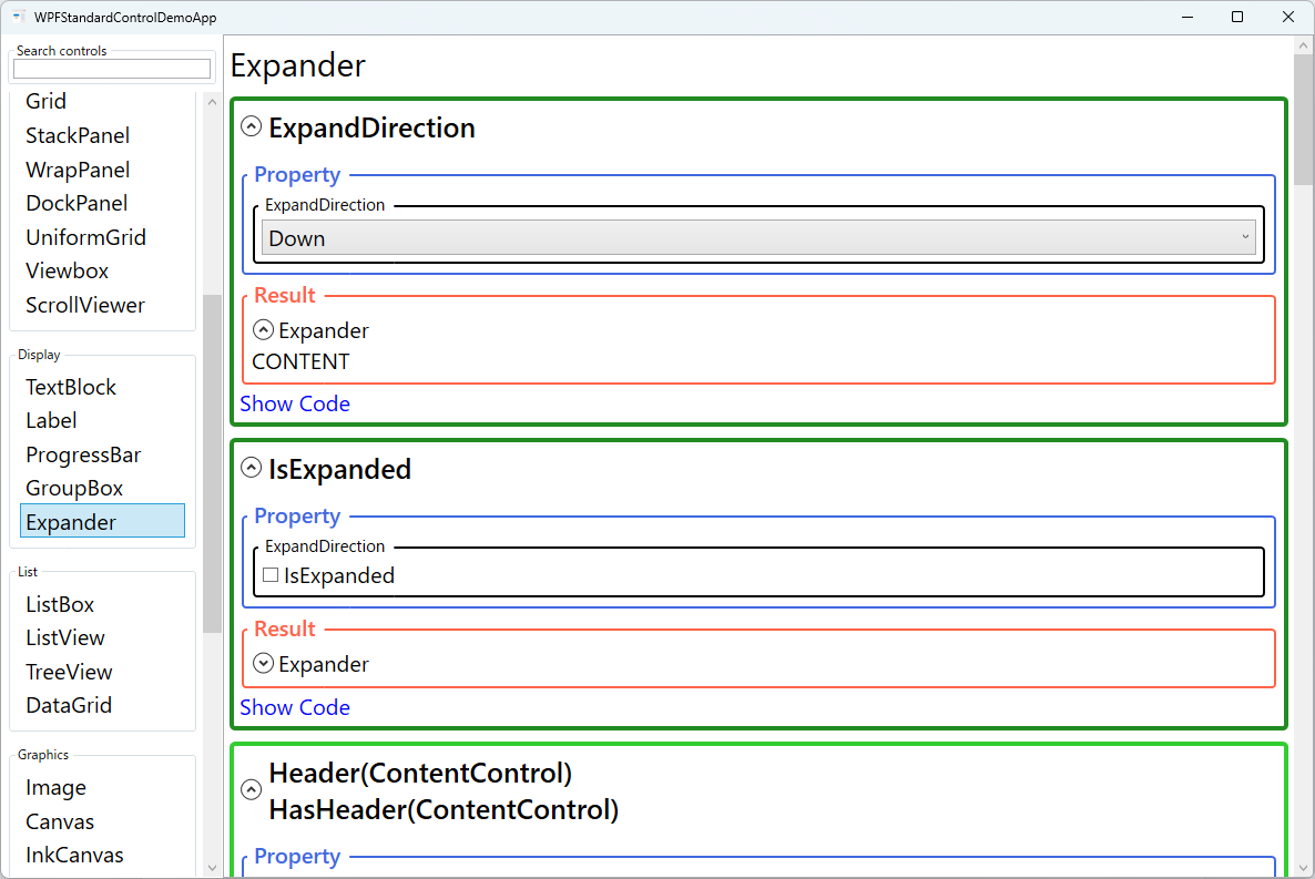
The ExpandDirection property determines how the content area grows relative to the
header. Down (default) expands the content below the header — the typical behaviour
for accordion-style vertical lists. Up reveals content above the header, useful for
panels anchored to the bottom of a window. Left and Right create
horizontal sliding panels, which can be used for sidebars or tool windows that expand in-line.
Because Expander inherits from ContentControl, its content can be any UIElement,
including complex nested layouts with forms, lists, or other interactive controls. The
IsExpanded property is bindable, making it easy to programmatically control
expansion state from a ViewModel — for example, automatically expanding an error section when
validation fails, or collapsing all sections except the active step in a wizard flow.
Screen Preview
Demonstrated Properties
The following properties are demonstrated interactively in the WPF Standard Control Demo App. Each property can be configured in real time within the app to observe its behavior.
| Property | Values | Description |
|---|---|---|
IsExpanded |
bool |
Gets or sets whether the content area is currently visible. Changing this property fires the Expanded or Collapsed routed events, which you can handle for additional logic. Bind two-way to a ViewModel boolean to programmatically control expansion state — for example, auto-expanding a section when validation fails, or restoring the last-opened section from user settings. Pitfall: Content is created at initialization time, not lazily on first expand. A data-bound DataGrid or heavy UI inside a collapsed Expander will render and consume resources immediately even before the user opens it. |
ExpandDirection |
Down / Up / Left / Right |
Determines the direction in which the content panel grows relative to the header. Down is the most common choice for accordion-style vertical lists. Up is useful for panels anchored to the bottom of a window (content grows upward). Left and Right create horizontal expanding panels for sidebars. Pitfall: With Left or Right, the header area orientation changes and the default arrow indicator or text layout may look unexpected. Plan for a custom ControlTemplate or Style when using horizontal directions. |
Header / HasHeader (HeaderedContentControl) |
object / bool (ReadOnly) |
Sets the content shown in the always-visible header area. Assign a plain string for a simple text header, or assign any UIElement for rich headers with icons, item counts, or status badges. HasHeader is a read-only flag that is true whenever Header is non-null. Pitfall: Setting Header to null does not fully remove the header area — the toggle button region remains visible. To completely hide the header you need a custom ControlTemplate. |
Content (ContentControl) |
object |
The content displayed inside the expandable panel. Can be any WPF element — from a simple TextBlock to a full data-entry Grid. The content is not unloaded when collapsed — it remains in the logical tree and stays hidden. Pitfall: Heavy content (data queries, complex bindings) executes at startup, before the user ever opens the Expander. For content that is expensive to initialize, use a lazy-loading pattern: hold a flag in the ViewModel and switch to the real DataTemplate only when IsExpanded first becomes true. |
Padding / FontWeight / FontStyle / FontSize / FontFamily (Control) |
Thickness / FontWeight / FontStyle / double / FontFamily |
Standard Control typography and spacing properties that affect both the header and content areas. Setting FontWeight="Bold" on the Expander makes header text bold, distinguishing section titles from body content in forms. |
Background / Foreground (Control) |
Brush |
Sets the background brush for the entire Expander area and the foreground (text/icon) colour for the header. Customising these lets Expanders blend into or stand out from their container, e.g. using a tinted background to visually group related form sections. Note that the Background colour cascades to child controls that inherit it. |
BorderBrush / BorderThickness (Control) |
Brush / Thickness |
Controls the colour and width of the border drawn around the Expander. Setting a prominent BorderBrush and BorderThickness creates a card-like appearance, which is useful for visually distinguishing collapsible sections in dense settings dialogs. Define these in a shared Style resource to keep all Expanders visually consistent across the application. |
XAML Example
The following XAML shows a stacked accordion-style settings panel using multiple Expanders:
<StackPanel Margin="16" Spacing="4">

  <Expander Header="General Settings" IsExpanded="True">
    <StackPanel Margin="8,4,0,8" Spacing="6">
      <CheckBox Content="Start application on login"
                IsChecked="{Binding StartOnLogin}" />
      <CheckBox Content="Show notifications"
                IsChecked="{Binding ShowNotifications}" />
    </StackPanel>
  </Expander>

  <Expander Header="Appearance" IsExpanded="False">
    <StackPanel Margin="8,4,0,8" Spacing="6">
      <ComboBox Width="160"
                ItemsSource="{Binding Themes}"
                SelectedItem="{Binding SelectedTheme}"
                HorizontalAlignment="Left" />
    </StackPanel>
  </Expander>

  <!-- Expander expanding upward (anchored to bottom) -->
  <Expander Header="Advanced" ExpandDirection="Down"
             FontWeight="SemiBold"
             BorderBrush="#DDD" BorderThickness="1">
    <TextBlock TextWrapping="Wrap" Margin="8"
               Text="Advanced settings affect application performance and stability." />
  </Expander>

</StackPanel>
Common Use Cases
- Accordion settings panels: A vertical stack of Expanders representing settings categories (General, Appearance, Advanced), where the user expands only the section they need.
- Optional form sections: A collapsible "Additional Information" section at the bottom of a data-entry form that most users do not need but that power users can expand.
- FAQ lists: A list of question-header Expanders where the answer content is hidden until the user clicks to expand, saving vertical space on help and documentation screens.
- Wizard steps: Each step of a multi-step form inside its own Expander, with the ViewModel controlling
IsExpandedto reveal the current step and collapse completed ones. - Sidebar tool palettes: Expandable groups of tools or properties in a horizontal
ExpandDirection="Right"configuration, mimicking IDE-style collapsible tool sections.
Tips and Best Practices
- Bind
IsExpandedto ViewModel properties to persist and restore expansion state across sessions. Saving each section's state to user settings gives a polished, professional experience. - Use rich
Headercontent to convey section status. Embedding aTextBlockshowing an item count, a warning icon, or a completion checkmark in the header tells users what to expect before expanding. - Lazy-load heavy content — Because content is created at initialization (not on first expand), avoid placing heavyweight controls inside Expanders that start collapsed. Use a ViewModel flag to switch from a lightweight placeholder
DataTemplateto the real UI only whenIsExpandedfirst becomestrue. This significantly improves startup performance. - Smooth expand/collapse animation — The default Expander template does not animate height. To add a smooth open/close transition, animate the
Heightproperty of aRowDefinitioninside aGrid(animating from0toAutodirectly is not supported; use a numeric target height or aGridLengthanimation helper). - Consider mutual exclusion in accordion patterns. Implement a ViewModel that collapses all sections when one is expanded, preventing the page from becoming excessively tall when the user opens multiple sections at once.
- Test keyboard navigation. The Expander header is focusable and responds to Space and Enter to toggle expansion. Verify that all content inside is reachable via Tab when expanded, and that focus moves correctly when the section collapses.
Related Controls
- GroupBox — a non-collapsible bordered group with a header; use when content should always be visible but still visually grouped.
- TabControl — organises content into tabs instead of collapsible sections; better when all sections can be open simultaneously.
- TreeView — hierarchical collapsible nodes; use when items have a parent-child data relationship rather than a flat section structure.
- ScrollViewer — wrap a stack of Expanders in a ScrollViewer so the page remains scrollable when many sections are expanded simultaneously.
Source Code
The source code for this demo screen is available on GitHub. Use the built-in code view buttons in the app to see the exact XAML for each property.