WPF Standard Control Demo App › Grid
Grid Layout
Grid is the most powerful and commonly used layout panel in WPF. It arranges child elements in rows and columns, making it ideal for creating complex, structured layouts. It supports proportional, absolute, and auto-sized rows and columns.
Overview
The WPF Grid panel is the cornerstone of WPF layout design. By defining explicit rows
through RowDefinition elements and columns through ColumnDefinition elements,
you create a flexible coordinate system in which every child element can be precisely placed using the
attached properties Grid.Row and Grid.Column. Three sizing modes give you full
control over how space is distributed: Auto shrinks a row or column to fit its largest
child; a fixed pixel value gives an absolute size; and the star (*) unit distributes
remaining space proportionally, similar to CSS flex-grow.
Star sizing is Grid's most powerful feature. A column defined as 2* receives twice the
remaining space as a column defined as 1*. Combining star columns with auto-sized columns
and fixed-width spacers makes it straightforward to build forms where labels are auto-sized and input
fields grow to fill available width. When the window is resized, star-sized cells adapt
proportionally without any code changes.
Children can span multiple rows or columns using Grid.RowSpan and
Grid.ColumnSpan. This enables complex compositional layouts — a banner spanning all
columns, a navigation tree spanning all rows on the left, and a grid of content cells filling the
remaining area. Multiple children can also occupy the same cell, layering like a Canvas
within that cell's bounds, with Panel.ZIndex controlling their visual stacking order.
The SharedSizeGroup mechanism on ColumnDefinition lets columns in
different Grids (within a common IsSharedSizeScope parent) synchronise their widths.
This is the standard technique for aligning label columns in a vertically stacked list of form rows,
where each row is its own Grid — without it, labels in different rows would be independently sized
and misaligned.
Screen Preview
Demonstrated Properties
The following properties are demonstrated interactively in the WPF Standard Control Demo App. Each property can be configured in real time within the app to observe its behavior.
| Property | Values | Description |
|---|---|---|
Grid.Column (attached) |
int |
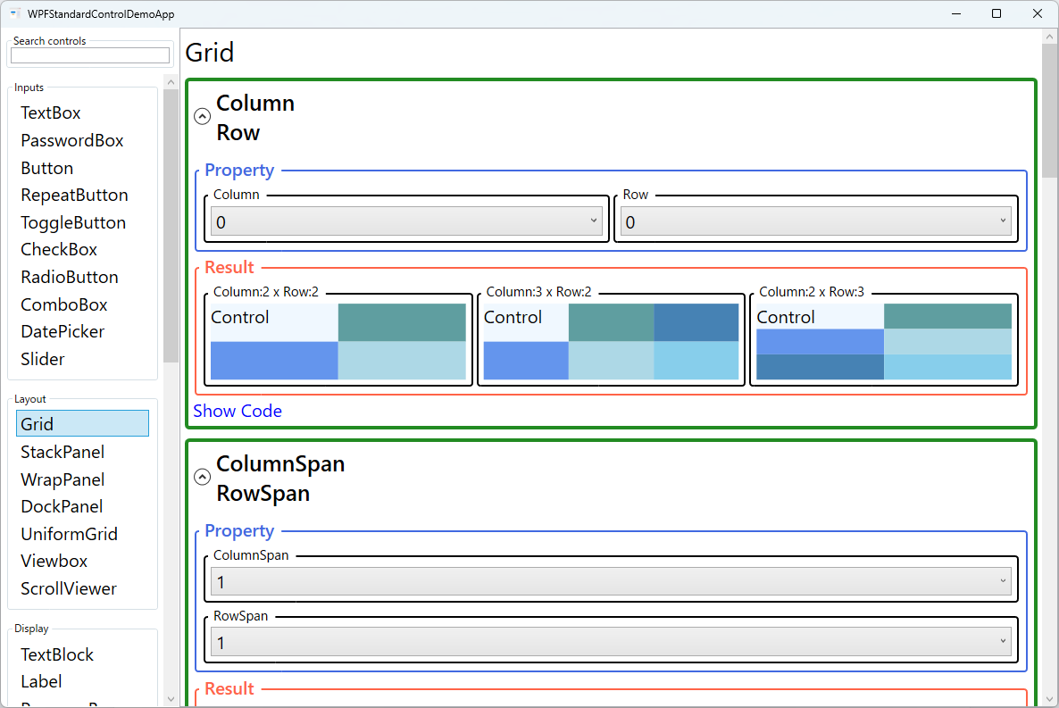
Use this when you have a Grid with multiple columns and need to place a child in a specific column. The element is rendered in the cell at the given zero-based column index. Pitfall: the default is 0, so every child that omits Grid.Column is placed in column 0. When a Grid has multiple children without explicit column assignments, they all pile up in the first cell and render on top of each other. Always double-check that no element is missing its column assignment. |
Grid.Row (attached) |
int |
Use this to place a child in a specific row of a multi-row Grid. Combined with Grid.Column, it gives cell-precise placement without absolute pixel coordinates. Pitfall: the default is also 0, so omitting Grid.Row causes the element to overlap with other row-0 elements. When adding children to a Grid, always set both Grid.Row and Grid.Column explicitly to avoid silent overlapping. |
Grid.ColumnSpan (attached) |
int |
Use this when a header banner, footer button bar, or large content block should stretch across multiple columns. The element occupies the specified number of consecutive columns starting from its Grid.Column position. Pitfall: if the span value exceeds the number of defined columns, the Grid silently clamps it to the maximum available columns rather than throwing an error. The element may appear narrower than expected — always verify that the span does not exceed the column count. |
Grid.RowSpan (attached) |
int |
Use this to let a single element occupy a rectangular block of cells spanning multiple rows, such as a tall image or preview panel alongside a narrow column of metadata fields. The element stretches over the specified number of consecutive rows. Pitfall: like ColumnSpan, a value that exceeds the defined row count is silently clamped. Check that the span value is consistent with the actual number of RowDefinition entries. |
ShowGridLines |
bool |
Use this during development and debugging to make cell boundaries visible. Setting it to True draws dashed lines along all row and column dividers, making it easy to verify that cells are sized as intended. Pitfall: ShowGridLines uses a special internal rendering mechanism that looks different from a real Border control. Do not use it as a substitute for actual grid-line borders in a production UI — always set it back to False before shipping. |
Grid.IsSharedSizeScope (attached) / SharedSizeGroup (ColumnDefinition) |
bool / string |
Use this when you have multiple Grid instances stacked vertically (e.g., each form row is its own Grid inside an ItemsControl) and want their label columns to align with each other. Set Grid.IsSharedSizeScope="True" on a common ancestor element, then assign the same SharedSizeGroup string name to corresponding ColumnDefinition elements. All columns sharing the same group name within the scope synchronise their widths automatically, keeping labels perfectly aligned across rows without any code-behind logic. |
Width / MinWidth / MaxWidth (ColumnDefinition) |
GridLength / double / double |
Use these when defining column sizing strategy — for example, Auto for a label column and * for an input column. Auto sizes to the widest content; a pixel value sets an absolute width; * distributes remaining space proportionally (2* gets twice the share of 1*). MinWidth and MaxWidth cap how far the column can shrink or grow. Pitfall: when a Grid is placed inside a ScrollViewer (horizontal scroll enabled) or a StackPanel, the container gives the Grid infinite width, causing *-sized columns to collapse to zero. If your star columns appear invisible, check whether the Grid is inside an unbounded-width container. |
Height / MinHeight / MaxHeight (RowDefinition) |
GridLength / double / double |
The vertical counterpart to the ColumnDefinition width properties. Use Height="Auto" for rows that contain variable-height content such as wrapped text or expandable controls, and Height="*" for the main content row that should fill remaining vertical space. Pitfall: placing a Grid with Auto rows inside a ScrollViewer can produce unexpected behaviour — the Auto rows grow without bound as content expands, and the scroll bar may not appear because the Grid reports its full desired height to the ScrollViewer. If you need vertical scrolling, ensure the ScrollViewer has a bounded height available. |
Background (Panel) |
Brush |
Use this when you want the entire Grid area — including empty space between cells — to respond to mouse events such as clicks or hover. Setting Background="Transparent" makes the whole panel hit-testable without painting any visible colour. Pitfall: leaving Background as null (the default) disables hit-testing on the panel background; clicks and MouseEnter events pass straight through to whatever is behind the Grid. If your Grid does not react to mouse events in empty areas, the missing Background is almost always the cause — set it to Transparent, not just a visible colour. |
Panel.ZIndex (attached) |
int |
Use this when multiple children share the same Grid cell and you need to control which one appears on top. Higher values render in front of lower values. A typical use case is a loading spinner or modal overlay placed in the same cell as the main content, with a high ZIndex so it covers the content when visible. Pitfall: ZIndex only affects draw order among siblings within the same parent panel. Setting a high ZIndex on a child inside a nested Grid will not make it appear above elements in an outer Grid. |
XAML Example
The following XAML demonstrates a form layout with auto-sized labels, star-sized inputs, and a spanning footer button:
<Grid Margin="16">
  <Grid.ColumnDefinitions>
    <ColumnDefinition Width="Auto" MinWidth="80" />
    <ColumnDefinition Width="8" />   <!-- spacer -->
    <ColumnDefinition Width="*" />
  </Grid.ColumnDefinitions>
  <Grid.RowDefinitions>
    <RowDefinition Height="Auto" />
    <RowDefinition Height="8" />
    <RowDefinition Height="Auto" />
    <RowDefinition Height="8" />
    <RowDefinition Height="Auto" />
    <RowDefinition Height="16" />
    <RowDefinition Height="Auto" />
  </Grid.RowDefinitions>

  <TextBlock Grid.Row="0" Grid.Column="0" Text="First Name"
             VerticalAlignment="Center" />
  <TextBox   Grid.Row="0" Grid.Column="2"
             Text="{Binding FirstName}" />

  <TextBlock Grid.Row="2" Grid.Column="0" Text="Last Name"
             VerticalAlignment="Center" />
  <TextBox   Grid.Row="2" Grid.Column="2"
             Text="{Binding LastName}" />

  <TextBlock Grid.Row="4" Grid.Column="0" Text="Email"
             VerticalAlignment="Center" />
  <TextBox   Grid.Row="4" Grid.Column="2"
             Text="{Binding Email}" />

  <!-- Full-width submit button spanning all columns -->
  <Button Grid.Row="6" Grid.Column="0" Grid.ColumnSpan="3"
          Content="Submit" HorizontalAlignment="Right"
          Width="100"
          Command="{Binding SubmitCommand}" />
</Grid>
Common Use Cases
- Data-entry forms: Two-column form layouts with auto-sized label columns and star-sized input columns, ensuring labels stay compact while inputs fill the available width.
- Application shells: Multi-region layouts combining a header row, a content row with sidebar and main area, and a footer row — replacing nested DockPanels with a single flat Grid.
- Dashboard tiles: A Grid with equal star-sized columns and rows creating a uniform tile grid for KPI cards, charts, or widget panels in reporting screens.
- Overlapping overlays: Placing a loading spinner or modal overlay in the same cell as the main content, using
Panel.ZIndexandVisibilitybinding to show it on demand. - Responsive image + metadata layouts: A two-column Grid where the left cell holds a fixed-width thumbnail and the right star-sized cell holds multi-line text, growing with the available space.
Tips and Best Practices
- Use spacer rows/columns (fixed-pixel empty definitions) instead of
Marginon every child to create consistent spacing. This keeps individual element XAML clean and makes spacing adjustments a single-edit operation. - Prefer
Autorows for variable-height content like wrapped text or dynamic lists. Using a fixed height can cause content to be clipped or leave empty space as the window is resized. - Leverage
SharedSizeGroupwhen building repeating form rows as separate item templates. SetGrid.IsSharedSizeScope="True"on the common ancestor and assign the same group name to correspondingColumnDefinitionelements. Without it, label columns in each row size independently, producing misaligned, jagged-looking forms. - Avoid deeply nested Grids. Nesting Grids inside other Grids increases the number of layout measure and arrange passes, which can degrade UI responsiveness. Before adding a nested Grid, consider whether
ColumnSpanandRowSpancan achieve the same result within a single flat Grid. - Use
ShowGridLines="True"temporarily during development to verify that row and column boundaries align with your intentions. Remove it before shipping — it is for debugging only and affects visual appearance in all themes. - Be aware of
ColumnDefinition/RowDefinitionomission. A Grid with no row/column definitions acts as a single 1×1 cell. All children overlap each other. This is useful for intentional layered layouts, but is a common source of accidental overlap bugs when definitions are forgotten.
Related Controls
- DockPanel — simpler edge-based layout; ideal for main window chrome with fewer regions.
- GridSplitter — adds user-resizable dividers between Grid rows or columns.
- StackPanel — single-axis linear stacking; use for simple lists of uniform-height items inside a Grid cell.
- UniformGrid — auto-calculates equal-sized cells; useful for icon grids or button palettes without explicit row/column definitions.
Source Code
The source code for this demo screen is available on GitHub. Use the built-in code view buttons in the app to see the exact XAML for each property.