WPF Standard Control Demo App › ToolTip
ToolTip Overlays
ToolTip is a small popup that appears when the user hovers over a UI element, providing contextual help or additional information. It supports plain text or rich custom content, and can be extensively customized for positioning, timing, appearance, and accessibility.
Overview
The WPF ToolTip control is a floating popup associated with any
FrameworkElement via the ToolTip attached property. Setting
ToolTip="some text" on any element is the simplest usage; WPF automatically wraps
the string in a ToolTip control. For richer content, set ToolTip to a full
ToolTip element with custom child content.
ToolTip timing is managed by ToolTipService static properties. The
InitialShowDelay controls how long the user must hover before the tip appears
(default: 400 ms). ShowDuration limits how long the tip stays visible before
auto-dismissing (default: 5000 ms). BetweenShowDelay is the window after a tip
closes during which a new tip on a different element shows immediately (default: 100 ms).
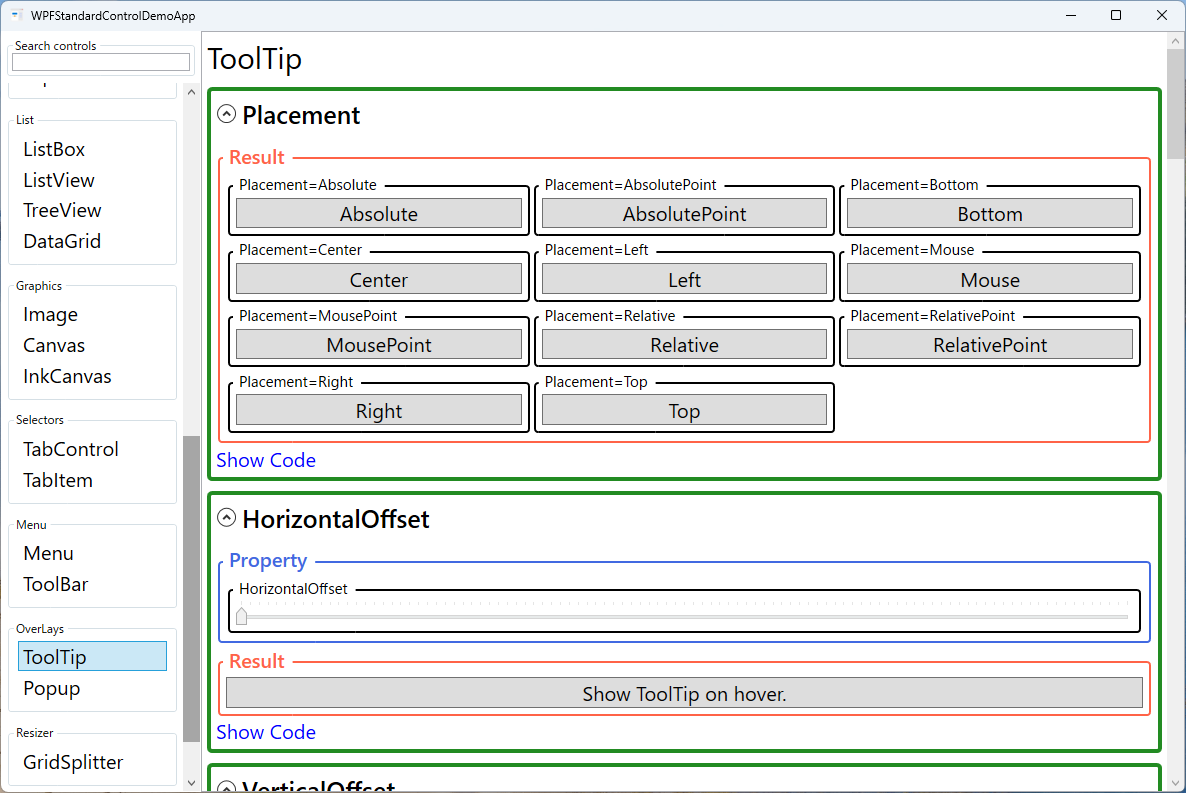
The Placement property gives precise control over where the popup appears relative
to its target element or the mouse cursor. Mouse (default) positions the tip near
the cursor; Bottom and Top position it relative to the target element's
bounding box. Absolute and AbsolutePoint use screen coordinates for
programmatic placement. HorizontalOffset and VerticalOffset fine-tune
the position after the base placement is applied.
Keyboard accessibility is supported through ShowsToolTipOnKeyboardFocus. When
true, the tooltip appears when the element receives keyboard focus, not just mouse
hover. This is essential for making tooltip-based help available to keyboard-only users and
screen-reader users navigating with Tab.
Screen Preview
Demonstrated Properties
The following properties are demonstrated interactively in the WPF Standard Control Demo App. Each property can be configured in real time within the app to observe its behavior.
| Property | Values | Description |
|---|---|---|
ToolTip |
string or ToolTip element |
Sets the tooltip content on any FrameworkElement. Use the string form (ToolTip="Save document") for simple text — WPF wraps it in a ToolTip control automatically. Use the <ToolTip> element form when you need icons, formatted text, or multiple children. Note that the string form re-creates the ToolTip object on every hover; for complex content shown frequently, declare a ToolTip resource (e.g., via StaticResource) to avoid repeated object allocation. |
Placement |
Mouse / MousePoint / Absolute / AbsolutePoint / Relative / RelativePoint / Bottom / Top / Left / Right / Center / Custom |
Determines where the tooltip popup appears. Mouse (default) follows the cursor; Bottom places it below the target element's bounding box; Absolute uses explicit screen coordinates. Pitfall: When using Absolute, you must also set PlacementRectangle — without it, the tooltip appears near screen origin (0, 0) instead of near your control. |
HorizontalOffset / VerticalOffset |
double |
Fine-tune the tooltip position by shifting it horizontally or vertically from the base placement point. Positive values move right/down; negative values move left/up. Use these to nudge the tip away from the cursor or to prevent it from obscuring important UI elements near the control. |
PlacementTarget |
UIElement |
The element relative to which element-based placement modes (Bottom, Top, Left, Right, Center) are calculated. Defaults to the element that owns the ToolTip. Override when the tooltip should appear relative to a different element — for example, anchoring a field hint to a label rather than the input box itself. |
PlacementRectangle |
Rect |
An explicit rectangle in the coordinate space of PlacementTarget used as the reference area for placement. Required when using Placement="Absolute" to position the tooltip at specific screen coordinates. Useful when you want the tip to appear relative to a specific region within the target rather than its entire bounds. |
ShowsToolTipOnKeyboardFocus |
bool |
When true, the tooltip appears when the element receives keyboard focus (Tab navigation), not only on mouse hover. Essential for accessibility — always enable this on toolbar buttons and icon-only controls. Without it, keyboard-only and screen-reader users cannot discover tooltip content. |
HasDropShadow |
bool |
Adds a drop shadow to the tooltip popup window, giving it visual depth and helping it stand out against complex backgrounds. When AllowsTransparency is enabled, the shadow renders with smooth transparency. Default is determined by the system theme. |
InitialShowDelay (ToolTipService) |
int (ms, default: 400) |
The delay in milliseconds before the tooltip appears after the user starts hovering. The default 400 ms matches Windows system settings and prevents tips from flashing during casual cursor movement. For professional tools where quick lookup is important, 100–200 ms is a good compromise. Pitfall: Setting this to 0 causes tooltips to appear instantly and flash on every mouse movement, which disrupts normal UI interaction and should generally be avoided. |
ShowDuration (ToolTipService) |
int (ms, default: 5000) |
How long the tooltip remains visible before auto-closing. Default is 5000 ms (5 seconds). Increase this for tooltips with lengthy explanations that users need time to read — a value of 10000 ms or more suits complex help text. Set to Int32.MaxValue to keep the tooltip visible indefinitely, but use this sparingly since users often expect tooltips to auto-dismiss. |
BetweenShowDelay (ToolTipService) |
int (ms, default: 100) |
The time window after a tooltip closes during which hovering over another element immediately shows its tooltip without waiting for InitialShowDelay. This "hot zone" effect makes scanning adjacent toolbar buttons feel snappy. Pitfall: Setting this to 0 means every hover triggers an immediate tooltip, which becomes overwhelming in dense UIs with many tooltipped controls. Keep the value at 50–100 ms for a comfortable experience. |
ShowOnDisabled (ToolTipService) |
bool |
When true, the tooltip displays even when the control is disabled (IsEnabled="False"). Use this to explain why an action is unavailable — for example, "Select an item before deleting" on a greyed-out Delete button. Pitfall: This property must be set directly on the disabled control itself; setting it on a container (StackPanel, Grid) has no effect. To apply it to many controls at once, use a Style. |
XAML Example
Simple string tooltip and a rich custom tooltip with an icon and description:
<!-- Simple string tooltip -->
<Button Content="Save" ToolTip="Save the current document (Ctrl+S)"
        ToolTipService.InitialShowDelay="300" />

<!-- Rich custom tooltip with icon and multi-line text -->
<Button Content="Analyze">
  <Button.ToolTip>
    <ToolTip Placement="Bottom" HasDropShadow="True"
             ShowsToolTipOnKeyboardFocus="True">
      <StackPanel Orientation="Horizontal">
        <Image Source="/Icons/analyze.png" Width="24" Height="24"
               Margin="0,0,8,0" />
        <StackPanel>
          <TextBlock Text="Analyze Data" FontWeight="Bold" />
          <TextBlock Text="Run the analysis pipeline on selected rows."
                     Foreground="Gray" />
        </StackPanel>
      </StackPanel>
    </ToolTip>
  </Button.ToolTip>
</Button>
Common Use Cases
- Toolbar button labels — Provide text labels for icon-only toolbar buttons so users can discover actions without hunting through menus.
- Form field hints — Show format instructions (e.g., "Enter date as YYYY-MM-DD") when a TextBox receives focus.
- Truncated text expansion — Show the full text of a trimmed TextBlock (with TextTrimming="WordEllipsis") when the user hovers over it.
- Data detail popups — In charts or data visualizations, show data-point details (value, timestamp, category) in a richly formatted tooltip on hover.
- Disabled control explanations — Explain why a control is disabled by showing a tooltip even when
IsEnabled="False"(requiresToolTipService.ShowOnDisabled="True").
Tips and Best Practices
- Always set tooltips on icon-only buttons — Icon meanings are not universally understood; a tooltip makes every icon self-documenting.
- Enable ShowsToolTipOnKeyboardFocus — Many users navigate with keyboard only; ensure tooltips are accessible without a mouse.
- Set ShowOnDisabled for disabled controls — Add
ToolTipService.ShowOnDisabled="True"directly on the disabled control (not its parent) to explain why an action is currently unavailable. - Keep content concise — Tooltips should supplement, not replace, visible UI labels. Long paragraphs in tooltips are often missed or ignored.
- DataBinding inside ToolTip — When the
ToolTipproperty is set as a plain string, the ToolTip control does not automatically inherit the parent element'sDataContext. If you need data binding inside a tooltip, declare it as a<ToolTip>element and use{Binding RelativeSource=...}or explicitly setDataContexton the ToolTip element. - ToolTip in virtualized lists — Tooltips on items inside a virtualized
ListBoxorDataGridwork correctly because the item'sDataContextis set to the data object. However, avoid triggering heavy operations (image loading, database queries) on hover, as virtualization recycles containers and lightweight tooltip content is essential. - Test placement near screen edges — WPF automatically repositions tooltips to stay on screen, but verify complex custom placements do not clip near monitor edges or with multi-monitor setups.
Related Controls
Source Code
The source code for this demo screen is available on GitHub. Use the built-in code view buttons in the app to see the exact XAML for each property.