WPF Standard Control Demo App › RepeatButton
RepeatButton Inputs
RepeatButton is a button that continuously fires Click events while it is held down. It is particularly useful for implementing increment/decrement buttons or scroll controls where repeated action is needed without releasing the mouse button.
Overview
The WPF RepeatButton control extends the standard ButtonBase with
auto-repeat behavior. While a regular Button fires its Click event exactly
once per mouse-press-release cycle, RepeatButton fires Click repeatedly at a configurable
rate for as long as the mouse button (or touch contact) is held down. This makes it the natural choice
for controls that need continuous incremental updates.
The repeat timing is governed by two properties: Delay and Interval. When the
button is first pressed, the initial Click fires immediately. WPF then waits for
Delay milliseconds before starting the repeat sequence. After that initial pause, subsequent
Click events fire every Interval milliseconds until the button is released.
Both default to 250 ms, matching standard Windows system repeat settings.
RepeatButton is the building block for the scroll arrows inside ScrollBar and the
up/down arrows in Slider. When you need to build a custom numeric input spinner or a
custom scroll control, RepeatButton provides the repeat-fire mechanism out of the box without any
timer code in your ViewModel.
Like all ButtonBase-derived controls, RepeatButton supports the Command and
CommandParameter properties for MVVM binding, allowing the repeated action to be
encapsulated in an ICommand implementation. The command is executed on each repeated
Click event, enabling clean separation of UI logic.
Screen Preview
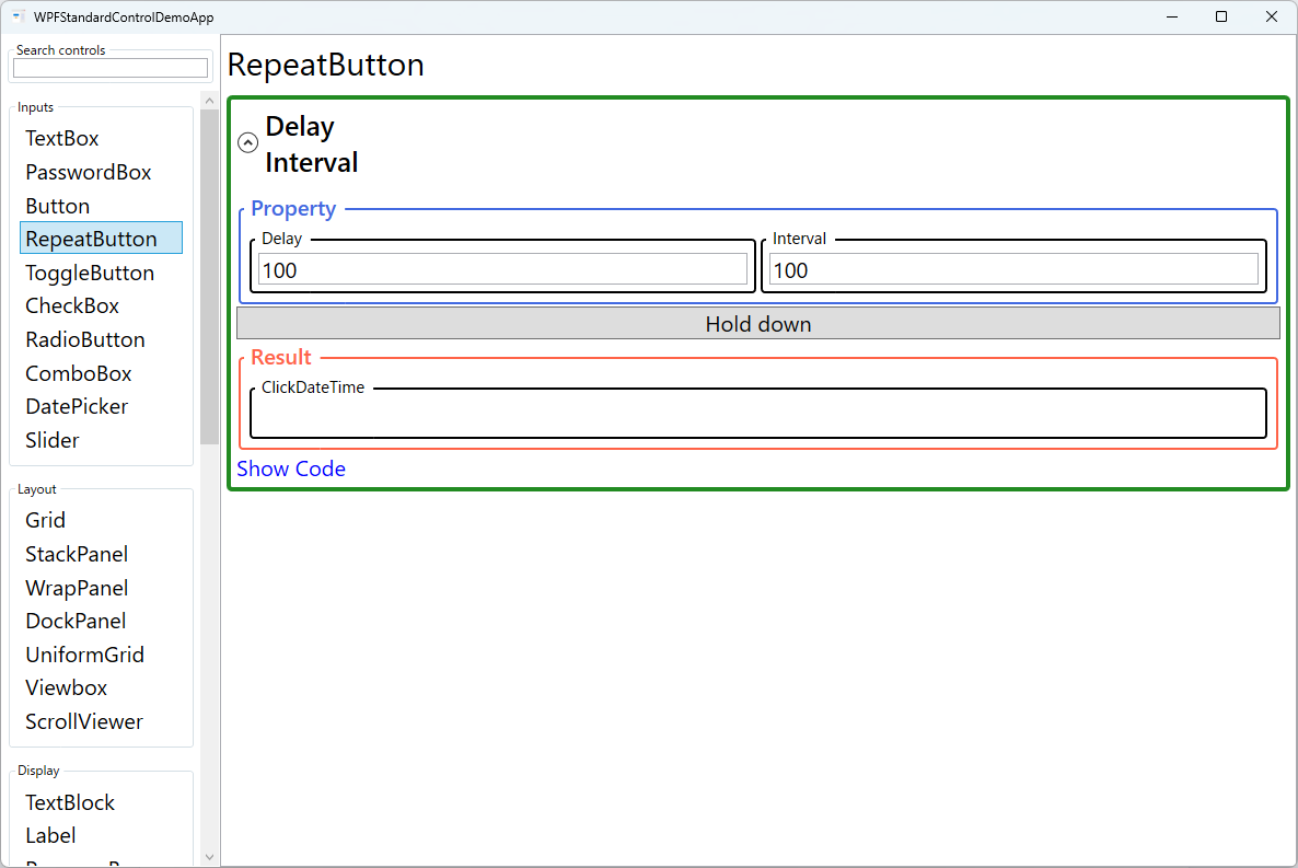
Demonstrated Properties
The following properties are demonstrated interactively in the WPF Standard Control Demo App. Each property can be configured in real time within the app to observe its behavior.
| Property | Values | Description |
|---|---|---|
Delay |
int (ms, default: 250) |
Use this to tune how quickly the repeat sequence starts after the initial press, giving users a natural "intentional hold" window before the button fires repeatedly. Increasing the value (e.g., 400–500 ms) reduces accidental over-increments when users just want a single click. Decreasing it makes the repeat feel more immediate. Pitfall: Setting Delay to an extremely short value (below 50 ms) can cause the repeat sequence to begin so quickly that on slower or heavily loaded machines the initial single-click intent is skipped entirely and the value jumps by multiple steps. Aim for 200–500 ms to match natural user expectations. |
Interval |
int (ms, default: 250) |
Use this to control how fast the value changes once the repeat sequence is running. A shorter interval (e.g., 100 ms) produces faster acceleration, good for coarse adjustments like page scrolling. A longer interval (e.g., 300–500 ms) is better for fine-grained inputs like pixel-level positioning. Delay and Interval work together — Delay governs the initial pause and Interval governs the ongoing rate. Pitfall: Setting Interval below 50 ms means the command can fire 20+ times per second. If the Click handler or ICommand performs non-trivial work (UI redraws, database writes, heavy calculations), the UI thread will become overloaded. Keep the handler lightweight and consider throttling if you need to support very short intervals. |
XAML Example
A simple numeric spinner using two RepeatButtons to increment and decrement a value:
<StackPanel Orientation="Horizontal">
  <RepeatButton Content="▼" Width="24" Delay="300" Interval="100"
               Command="{Binding DecrementCommand}" />
  <TextBox Width="60" Text="{Binding Value}" TextAlignment="Center" />
  <RepeatButton Content="▲" Width="24" Delay="300" Interval="100"
               Command="{Binding IncrementCommand}" />
</StackPanel>
Common Use Cases
- Numeric spinners — Increment or decrement a numeric value continuously while the arrow button is held.
- Custom scroll controls — Provide up/down or left/right scroll arrows that scroll content as long as the button is pressed.
- Volume and zoom controls — Allow users to hold a button to smoothly raise or lower a value.
- Game-style controls — Implement continuous-fire actions in mini-games or interactive demos embedded in a WPF app.
- Carousel navigation — Advance slides or items rapidly when the next/previous button is held down.
Tips and Best Practices
- Match Delay and Interval to the operation granularity — For fine-grained inputs (e.g., pixel-level adjustments), use a longer Interval (200–500 ms). For coarse operations (e.g., page scrolling), shorter intervals (50–100 ms) feel more responsive.
- Cap values in the ViewModel — RepeatButton fires Click rapidly; ensure your bound property or command clamps the value to its valid range to prevent overflow or underflow.
- Use Command instead of Click event — Binding to an ICommand keeps the repeat logic decoupled from the view and is easier to unit-test.
- Mouse vs touch behavior — RepeatButton's Delay and Interval govern mouse hold-down behavior. On touch devices, the long-press recognition timing may differ from mouse input. Test on real touch hardware to verify that your Delay and Interval values feel natural for touch users, and adjust if the repeat starts too early or too late.
- Throttle heavy processing for short intervals — When Interval is very short, the command can fire dozens of times per second. If each execution performs expensive work, the UI thread stalls. Keep the command handler to a simple property update and apply throttling (e.g., accumulate changes and flush on a timer) if the downstream processing is costly.
- Accessibility — Add a meaningful
AutomationProperties.Name(e.g., "Increment quantity") so screen readers can announce the button's purpose rather than just its visual label. - Visual feedback — Consider updating the display value on every repeat tick so users see the number changing in real time, reinforcing that the button is working.
Related Controls
- Button — Single-fire click; use when repeat behavior is not needed.
- Slider — Uses RepeatButton internally for its track; better for direct drag-based value selection.
- ScrollViewer — Uses RepeatButton in its default scroll-bar template for the arrow buttons.
Source Code
The source code for this demo screen is available on GitHub. Use the built-in code view buttons in the app to see the exact XAML for each property.