WPF Standard Control Demo App › Button
Button Inputs
Button is the most commonly used command trigger control in WPF. It fires a Click event when pressed and supports command binding via the ICommand interface. Button inherits from ButtonBase, which provides ClickMode and Command-related properties.
Overview
The WPF Button control is the primary mechanism for triggering user actions in desktop
applications. It descends from ButtonBase, which itself extends ContentControl,
meaning a Button can host any arbitrary content — text, images, icons, or complex panel layouts — not just
a simple label. This flexibility makes it easy to create richly styled action buttons that match your
application's visual design.
One of Button's most important features for MVVM (Model-View-ViewModel) architectures is its built-in
support for the ICommand interface through the Command property. When a command
is bound, WPF automatically disables the button whenever ICommand.CanExecute returns
false, and re-enables it when conditions change. This eliminates the need for manual
enabled/disabled logic in code-behind and keeps UI state synchronized with application state.
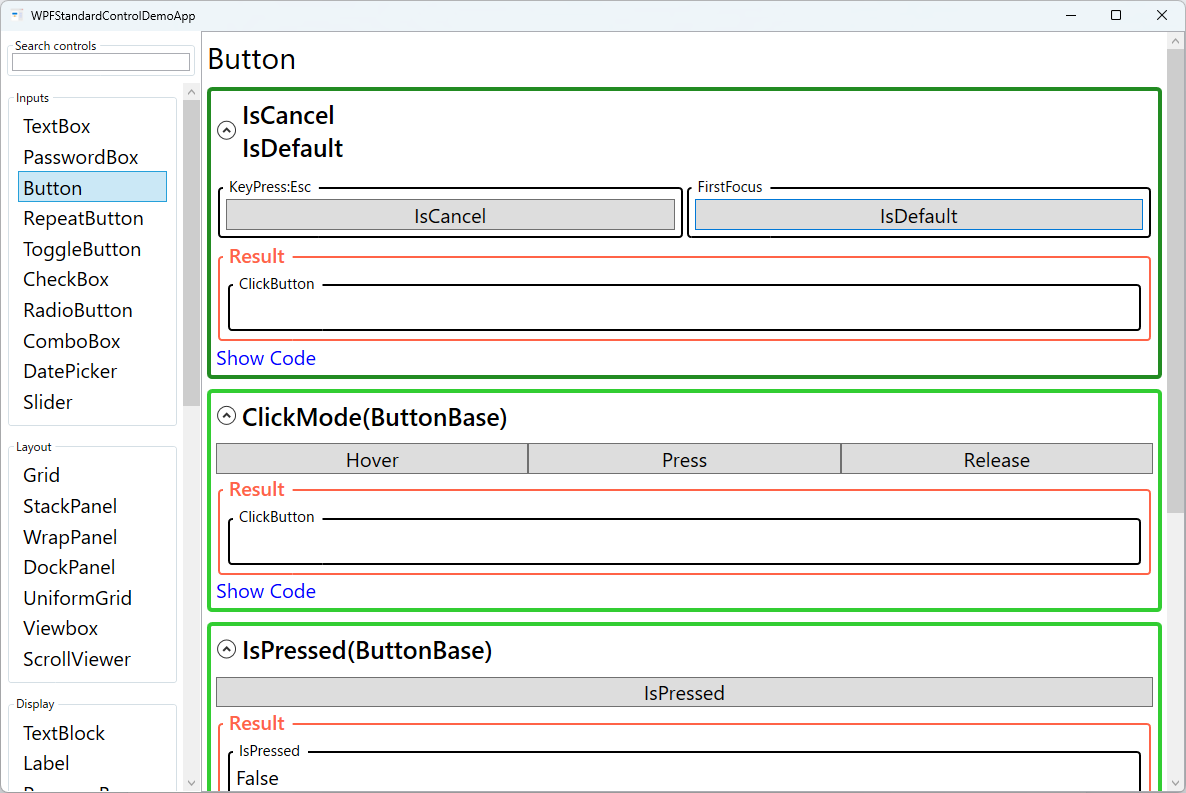
The ClickMode property inherited from ButtonBase controls exactly when the
Click event fires. The default Release mode fires on mouse-button release,
matching standard desktop conventions. Press mode fires immediately on mouse-down, useful
for rapid-fire scenarios. Hover mode fires when the pointer merely moves over the button,
enabling touchless interaction patterns.
Two special boolean properties — IsDefault and IsCancel — simplify dialog
implementation. Setting IsDefault="True" makes the button respond to the Enter
key when no other element captures it, while IsCancel="True" binds the button to the
Escape key. Together they let developers build keyboard-accessible dialogs with minimal code.
Screen Preview
Demonstrated Properties
The following properties are demonstrated interactively in the WPF Standard Control Demo App. Each property can be configured in real time within the app to observe its behavior.
| Property | Values | Description |
|---|---|---|
IsCancel |
bool |
Use this on a "Cancel" button in a dialog when you want the Escape key to dismiss the window without the user needing to click. When True, pressing Escape triggers this button's Click regardless of where focus is. Combined with Window.DialogResult = false, it implements the standard cancel pattern. Pitfall: This property only works within a Window scope — it has no effect inside a UserControl or Page. Also, setting IsCancel="True" on more than one button in the same Window can cause unexpected conflicts; keep it to one per Window. |
IsDefault |
bool |
Use this on the primary action button (e.g., "OK" or "Search") in a dialog or form so users can confirm with Enter without tabbing to the button. When True, pressing Enter triggers this button's Click as long as the focused element does not consume the key itself. Pitfall: Only one button per Window should have IsDefault="True". Also, when a multi-line TextBox with AcceptsReturn="True" has focus, Enter inserts a new line and the IsDefault button is never fired. |
ClickMode (ButtonBase) |
Release / Press / Hover |
Controls when the Click event fires relative to the mouse interaction. Release (default) fires when the mouse button is released — it also allows the user to cancel by dragging off the button before releasing. Press fires immediately on mouse-down, making it suitable for game controls or drag-start triggers where instant response is required. Hover fires as soon as the cursor enters the button bounds, which is useful for ribbon-style menus that open on hover. Pitfall: Hover mode can fire accidentally when the mouse merely passes over the button. Limit its use to intentional hover-activation patterns and always provide clear visual feedback so users know the button is activated. |
IsPressed (ButtonBase) |
bool (ReadOnly) |
Use this inside a custom ControlTemplate to drive pressed-state visuals — for example, a scale-down animation or background color change while the button is held. A DataTrigger in the template can watch this value to apply the effect. Pitfall: Mouse clicks reliably set IsPressed, but pressing Space on a focused button may not update it consistently. For keyboard-only visual feedback, rely on FocusVisualStyle or a separate keyboard-focused state rather than IsPressed alone. |
Command (ButtonBase) |
ICommand |
Use this in MVVM applications to bind a ViewModel's ICommand to the button, eliminating click-handling code in code-behind. WPF automatically disables the button when CanExecute returns false and re-enables it when conditions change. The re-evaluation is triggered by CommandManager.RequerySuggested, which fires on UI interactions like focus changes. Pitfall: If CanExecute performs expensive work (database queries, slow computations), it will block the UI thread every time WPF re-evaluates it. Keep CanExecute fast by checking only a cached flag, and update that flag when state actually changes. |
CommandParameter (ButtonBase) |
object |
Use this when multiple buttons share the same command but need to pass different context values — for example, CommandParameter="{Binding SelectedItem}" to pass the currently selected item to a shared Delete command. The parameter is received by both Execute and CanExecute. When set via a normal Binding, the parameter updates automatically as the source changes. Pitfall: If you use Mode=OneTime or assign a static value directly, the parameter will not update when the underlying data changes. Always verify that the binding mode matches the dynamic or static nature of the value you intend to pass. |
XAML Example
The following XAML demonstrates typical Button usage, including command binding and keyboard shortcuts:
<StackPanel Margin="16" Spacing="8">

  <!-- Basic button with Click event handler -->
  <Button Content="Click Me"
          Width="120" Height="32"
          Click="OnButtonClick" />

  <!-- MVVM command binding with a parameter -->
  <Button Content="Save"
          Command="{Binding SaveCommand}"
          CommandParameter="{Binding CurrentItem}"
          IsDefault="True" />

  <!-- Cancel button responding to Escape key -->
  <Button Content="Cancel"
          Command="{Binding CancelCommand}"
          IsCancel="True" />

  <!-- Button with icon content -->
  <Button Width="140" Height="36">
    <StackPanel Orientation="Horizontal" Spacing="6">
      <Image Source="/Icons/save.png" Width="16" Height="16" />
      <TextBlock Text="Save File" VerticalAlignment="Center" />
    </StackPanel>
  </Button>

</StackPanel>
Common Use Cases
- Dialog actions: "OK", "Cancel", "Apply", and "Save" buttons in modal dialogs, leveraging
IsDefaultandIsCancelfor keyboard accessibility. - Toolbar commands: Icon-and-label buttons in toolbars that trigger document operations such as New, Open, Save, Print, or Undo/Redo.
- Form submission: A primary action button at the bottom of a data-entry form that validates input and submits the record to a backend service.
- Navigation triggers: Buttons that switch views or pages inside a navigation host, often bound to relay commands in the main view model.
- Contextual actions in lists: Edit or Delete buttons placed inside
DataGridorListViewrow templates, passing the row item asCommandParameter.
Tips and Best Practices
- Prefer ICommand over Click events in MVVM applications. Use
RelayCommandorDelegateCommandimplementations to keep logic out of code-behind and improve testability. - Set meaningful Content — avoid generic labels like "Button1". Clear, action-oriented labels such as "Save Document" improve usability and accessibility for screen-reader users.
- Use
IsEnabledsparingly; instead, rely onICommand.CanExecuteto automatically manage the enabled state, which ensures the UI reacts instantly to state changes without manual wiring. - Any WPF element can be Button content — Button inherits from
ContentControl, so you can nestStackPanel,Image,TextBlock, or any other element as theContent. This makes icon-and-label buttons straightforward to build without custom templates. - Set
AutomationProperties.Namefor icon-only buttons — When the button'sContentis an image or icon with no text, screen readers have nothing to announce. Always addAutomationProperties.Name="Save"(or similar) so visually impaired users understand the button's purpose. - Avoid deep nesting in Button content. If the content template grows complex, consider extracting it into a
DataTemplateor a custom style resource to keep XAML maintainable. - Test keyboard navigation in every dialog. Verify that
IsDefaultandIsCancelbehave as expected when focus is on text boxes, combo boxes, or other interactive controls within the same dialog.
Related Controls
- RepeatButton — fires Click repeatedly while held down; useful for increment/decrement spinners.
- ToggleButton — base class for CheckBox and RadioButton; maintains an on/off checked state.
- CheckBox — a two- or three-state toggle control derived from ToggleButton.
- RadioButton — a mutually exclusive toggle within a group, also derived from ToggleButton.
Source Code
The source code for this demo screen is available on GitHub. Use the built-in code view buttons in the app to see the exact XAML for each property.