WPF Standard Control Demo App › ScrollViewer
ScrollViewer Layout
ScrollViewer is a container that provides scrolling functionality for content that is larger than its visible area. It supports both horizontal and vertical scrolling with configurable scroll bar visibility, logical (item-based) and physical (pixel-based) scrolling modes.
Overview
The WPF ScrollViewer wraps a single child element and clips it to the visible area,
exposing scroll bars when the child is larger than the available space. It is built into many controls —
ListBox, DataGrid, TreeView, and TextBox all use
ScrollViewer internally — so understanding its properties lets you fine-tune scrolling behavior across
all of these controls through attached properties.
The VerticalScrollBarVisibility and HorizontalScrollBarVisibility properties
accept four values: Disabled (scrolling not allowed), Hidden (scrolling
allowed but bar hidden), Auto (bar appears only when needed), and Visible
(bar always shown). Auto is the most common choice for dynamic content, while
Disabled is useful when you want to clip content without offering scroll access.
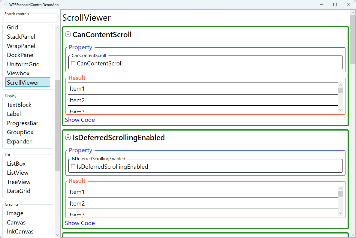
The CanContentScroll property controls whether scrolling moves by logical units (items)
or physical units (pixels). When true, the content's IScrollInfo
implementation drives the scrolling — for a VirtualizingStackPanel this means
item-by-item scrolling. When false, scrolling is always pixel-based. Pixel scrolling
produces smoother animations but requires all items to be measured, which can hurt performance with
large virtualized lists.
For performance-sensitive scenarios with large data sets, IsDeferredScrollingEnabled
defers content updates until the user stops dragging the scroll thumb. This prevents expensive layout
recalculations on every drag pixel, significantly improving responsiveness for virtualized lists with
complex item templates.
Screen Preview
Demonstrated Properties
The following properties are demonstrated interactively in the WPF Standard Control Demo App. Each property can be configured in real time within the app to observe its behavior.
| Property | Values | Description |
|---|---|---|
VerticalScrollBarVisibility |
Disabled / Auto / Hidden / Visible |
Controls vertical scroll bar display. Use Auto for dynamic content that may or may not overflow — the bar appears only when needed. Use Disabled when you want horizontal-only scrolling and need to prevent any vertical scroll. Hidden allows programmatic or touch scrolling without showing the bar. Pitfall: Visible always reserves scroll bar space even when content fits, which shifts your layout width — in most cases Auto is the better choice. |
HorizontalScrollBarVisibility |
Disabled / Auto / Hidden / Visible |
Controls horizontal scroll bar display with the same four options as the vertical bar. Most controls default to Disabled, clipping content horizontally. Pitfall: To enable horizontal scrolling in a ListBox or TextBox, you must set ScrollViewer.HorizontalScrollBarVisibility as an attached property directly on the control, not on a wrapping ScrollViewer. The control's built-in ScrollViewer takes precedence, so a surrounding ScrollViewer setting has no effect. |
CanContentScroll |
bool |
When true, scrolling jumps by logical units (items) as defined by the panel's IScrollInfo — for a VirtualizingStackPanel this means item-by-item scrolling with full virtualization. When false, scrolling is pixel-based and smooth. Pitfall: Setting CanContentScroll="False" on an ItemsControl destroys UI virtualization — all items are rendered at once regardless of VirtualizingPanel.IsVirtualizing. On lists with thousands of items this causes severe memory and performance degradation. |
IsDeferredScrollingEnabled |
bool |
When true, the viewport content updates only when the user releases the scroll thumb rather than on every drag movement. For large data sets (thousands of DataGrid rows), this eliminates the continuous re-render during drag and dramatically improves responsiveness. Tradeoff: The user cannot see intermediate content while dragging, which can make it harder to navigate to a specific position. Enable only when data volume genuinely warrants it. |
ComputedVerticalScrollBarVisibility / ExtentHeight / ViewportHeight / ScrollableHeight / VerticalOffset / ContentVerticalOffset |
ReadOnly |
Read-only diagnostic properties. ExtentHeight is the total content height; ViewportHeight is the visible area height; ScrollableHeight is the difference; VerticalOffset is the current scroll position. Pitfall: Reading these values during or before layout completes returns stale data. Always read them after the Loaded event or via Dispatcher.BeginInvoke to ensure layout has finished. |
ComputedHorizontalScrollBarVisibility / ExtentWidth / ViewportWidth / ScrollableWidth / HorizontalOffset / ContentHorizontalOffset |
ReadOnly |
Horizontal counterparts of the vertical read-only properties. Useful for binding scroll-position indicators or implementing synchronized scrolling between two panels. Subject to the same stale-value pitfall as the vertical equivalents. |
XAML Example
ScrollViewer wrapping a large image with auto-show scroll bars and deferred scrolling:
<ScrollViewer VerticalScrollBarVisibility="Auto"
              HorizontalScrollBarVisibility="Auto"
              CanContentScroll="False"
              IsDeferredScrollingEnabled="True">
  <Image Source="large-map.png" Stretch="None" />
</ScrollViewer>

<!-- Customizing scrolling behavior on a ListBox via attached properties -->
<ListBox ScrollViewer.VerticalScrollBarVisibility="Hidden"
         ScrollViewer.CanContentScroll="False"
         ItemsSource="{Binding Items}" />
Common Use Cases
- Large image viewer — Wrap a full-resolution image in a ScrollViewer to allow panning when the image exceeds the window size.
- Long form layouts — Place a StackPanel with many form fields inside ScrollViewer to handle resizable or small windows gracefully.
- Log or output panels — Display a TextBox or ItemsControl with many lines, auto-scrolling to the bottom when new entries arrive.
- Customizing control scrolling — Use ScrollViewer attached properties on ListBox, TreeView, or DataGrid to override the default scroll bar behavior.
- Performance optimization — Enable IsDeferredScrollingEnabled on a DataGrid with thousands of rows to keep the UI responsive during scroll-thumb dragging.
Tips and Best Practices
- Avoid nesting ScrollViewers — Nested scrollable regions confuse users and cause layout measurement issues. Instead, use a single outer ScrollViewer and size inner panels explicitly.
- Keep CanContentScroll=true for virtualized panels — Pixel scrolling forces all items to be realized, defeating UI virtualization and causing memory and performance issues with large lists.
- Use ScrollToBottom() for reliable bottom-scrolling — Calling
ScrollToVerticalOffset(double.MaxValue)is unreliable because values beyond the actual maximum are silently ignored. UseScrollToBottom()orScrollToVerticalOffset(scrollViewer.ScrollableHeight)instead for dependable scroll-to-end behavior. - Nested ScrollViewer mouse-wheel routing — An inner ScrollViewer consumes mouse-wheel events, preventing them from reaching the outer ScrollViewer. If you need the outer ScrollViewer to also scroll, handle
PreviewMouseWheelon the inner ScrollViewer and manually re-raise the event on the outer one. - Keyboard scrolling — ScrollViewer responds to arrow keys, Page Up/Down, Home, and End, providing full keyboard navigation out of the box without extra code.
- Touch and mouse-wheel — WPF's ScrollViewer handles mouse-wheel and touch-pan gestures automatically; you do not need to wire these events manually.
Related Controls
- ListBox — Contains a ScrollViewer internally; use ScrollViewer attached properties to customize it.
- DataGrid — Also uses ScrollViewer internally for both row and column scrolling.
- StackPanel — A common child of ScrollViewer for vertically or horizontally stacked content.
- Viewbox — An alternative for scaling content to fit, rather than scrolling.
Source Code
The source code for this demo screen is available on GitHub. Use the built-in code view buttons in the app to see the exact XAML for each property.