WPF Standard Control Demo App › TabControl
TabControl Selectors
TabControl is a container that organizes content into multiple pages, each represented by a TabItem. Users switch between pages by clicking on the tab headers. It is the primary control for tabbed interfaces such as settings dialogs, workspace panels, and multi-view editors.
Overview
The WPF TabControl derives from Selector, which derives from
ItemsControl. This means its items collection can be populated directly with
TabItem elements in XAML or data-bound via ItemsSource with an
ItemTemplate and ContentTemplate. Only the content of the currently
selected tab is rendered, keeping memory usage low for tabs with complex layouts.
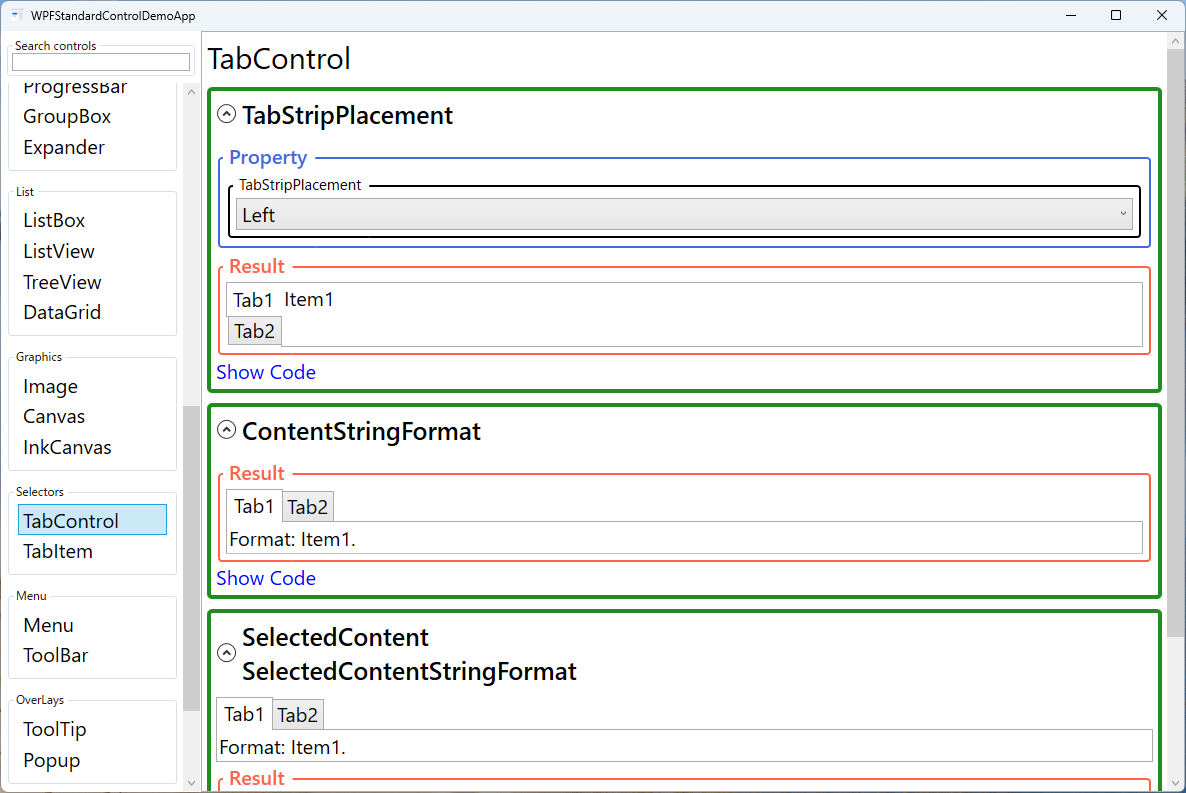
The TabStripPlacement property controls which edge of the control hosts the tab
headers. Top (default) is the most familiar; Left and Right
produce vertical tab strips suitable for settings panels with many categories. Bottom
placement is less common but sometimes used in code editors or browser-style interfaces.
When binding to a collection, use the SelectedItem or SelectedIndex
properties (inherited from Selector) to track and control the active tab in the
ViewModel. Setting SelectedIndex to an integer is useful for programmatic tab
navigation, while SelectedItem works naturally with object collections.
TabControl supports lazy content loading through the ContentTemplate approach.
Because only the active tab's content is measured and rendered, large or expensive views
(such as charts or data grids) inside inactive tabs are not created until the user first selects
them, significantly improving initial load performance.
Screen Preview
Demonstrated Properties
The following properties are demonstrated interactively in the WPF Standard Control Demo App. Each property can be configured in real time within the app to observe its behavior.
| Property | Values | Description |
|---|---|---|
TabStripPlacement |
Top / Bottom / Left / Right |
When to use: Use Left for Outlook-style navigation panels or settings dialogs that have many categories — vertical strips scale better when there are more than five or six tabs. Use Top (the default) for standard dialogs with a small number of pages.What happens: The tab header strip moves to the specified edge of the control. With Left or Right, headers stack vertically. Content area layout adjusts accordingly.Pitfalls: When using Left or Right, header text remains horizontally oriented but is displayed in a vertical list, so each header occupies its natural text width. With many long-named tabs the strip can become very wide; set MinWidth or MaxWidth on the item container style to control this.
|
SelectedIndex / SelectedItem |
int / object |
When to use: Bind two-way to the ViewModel to control the active tab programmatically — for example, in a wizard where a "Next" button advances to the next step, or a navigation service that opens a specific tab by name. What happens: Setting SelectedIndex switches the active tab to the specified zero-based position. Setting it to -1 deselects all tabs and leaves the content area empty. Setting SelectedItem selects the matching tab item object.Pitfalls: Out-of-range index values are silently ignored — no exception and no selection change. Similarly, setting SelectedItem to an object not present in ItemsSource does nothing. Always verify the value is valid before applying it.
|
ItemsSource |
IEnumerable |
When to use: Use when the set of tabs is determined at runtime from a ViewModel collection — for example, a list of open documents or a dynamic set of configuration categories. What happens: Each item in the collection is wrapped in a TabItem container. Define HeaderTemplate to control how the tab header looks for each data object, and ContentTemplate for the tab's content area.Pitfalls: ItemsSource and static TabItem children in XAML are mutually exclusive. If you set ItemsSource, you cannot also add TabItem elements directly in the XAML markup — doing so throws a runtime exception.
|
Header / IsEnabled (TabItem) |
object / bool |
When to use: Use IsEnabled="False" to restrict access to a tab based on user permissions or wizard prerequisites — the tab appears grayed out and is not clickable.What happens: Setting IsEnabled="False" grays out the tab header so users cannot click it. Header accepts any WPF element, enabling rich labels with icons or badges.Pitfalls: IsEnabled="False" only prevents user interaction — it does not prevent programmatic access. Code can still switch to a disabled tab by setting SelectedIndex or SelectedItem. If access control is a security requirement, enforce it on the content side as well.
|
ContentStringFormat |
string |
A format string applied to the selected content when it is a simple type displayed as text. Follows the same pattern as String.Format, e.g., "Value: {0}". Used when ContentTemplate is not defined and content is a string or number. |
SelectedContent (ReadOnly) |
object |
The content object of the currently selected tab. Read-only; reflects which TabItem is active. Bind to this in the ViewModel if other parts of the UI need to react to the currently displayed content. |
XAML Example
A settings dialog with left-positioned tabs and MVVM-bound tab switching:
<TabControl TabStripPlacement="Left"
            SelectedIndex="{Binding ActiveTabIndex, Mode=TwoWay}">
  <TabItem Header="General">
    <StackPanel Margin="16">
      <CheckBox Content="Enable auto-save" IsChecked="{Binding AutoSave}" />
    </StackPanel>
  </TabItem>
  <TabItem Header="Appearance">
    <StackPanel Margin="16">
      <Label Content="Theme:" />
      <ComboBox ItemsSource="{Binding Themes}"
                SelectedItem="{Binding SelectedTheme}" />
    </StackPanel>
  </TabItem>
  <TabItem Header="Advanced">
    <TextBlock Text="Advanced settings here." Margin="16" />
  </TabItem>
</TabControl>
Common Use Cases
- Settings dialogs — Group application preferences into logical categories (General, Appearance, Network, etc.) using tabs.
- Multi-document editors — Display open documents as tabs, with the active document shown in the content area.
- Dashboard panels — Separate different views (Overview, Details, History) into tabs within a single window region.
- Wizard alternatives — Provide non-sequential access to configuration sections, letting users jump directly to any step.
- Tool windows — Dock multiple tool panels (Properties, Output, Errors) into a tab strip to save vertical space.
Tips and Best Practices
- Bind SelectedIndex or SelectedItem for navigation control — Programmatic tab switching from the ViewModel requires a two-way binding on one of these properties.
- Use data binding for dynamic tabs — Bind
ItemsSourcewithHeaderTemplateandContentTemplateto create tabs from a collection rather than hard-coding TabItems. - Do not put a TabControl inside a ScrollViewer for tab-header scrolling — TabControl does not natively scroll tab headers; consider a custom control or limit the number of tabs to fit the available space.
- Tab content is always created on first activation — By default all TabItem content is instantiated when the TabControl loads, so expensive views inside inactive tabs still consume memory and startup time. To defer initialization, trigger data loading in the ViewModel when
SelectedIndexchanges, or use aContentTemplatewith aDataTemplatewhose content is created on demand. - Keyboard tab switching with Ctrl+Tab — Users can cycle through tabs with Ctrl+Tab (forward) and Ctrl+Shift+Tab (backward) by default. If this conflicts with an inner control (e.g., a text editor), suppress it in a
KeyDownhandler by settinge.Handled = true. - Custom HeaderTemplate for close buttons and badges — When using
ItemsSource, define aHeaderTemplatewith aDataTemplatecontaining a close button or notification badge. Bind the close button's command usingRelativeSourceto reference the parent ViewModel, since the header'sDataContextis the individual tab item object.
Related Controls
Source Code
The source code for this demo screen is available on GitHub. Use the built-in code view buttons in the app to see the exact XAML for each property.