WPF Standard Control Demo App › TabItem
TabItem Selectors
TabItem is an individual page within a TabControl. It consists of a header (always visible as the tab strip entry) and a content area (shown only when the tab is selected). TabItem gives each page its own header label, icon, and content.
Overview
The WPF TabItem control inherits from HeaderedContentControl, which
provides two key areas: the Header (the visible tab label or custom header content)
and the Content (the panel or view shown when this tab is selected). Both areas accept
any WPF UIElement, allowing rich headers with icons and badges and complex content areas.
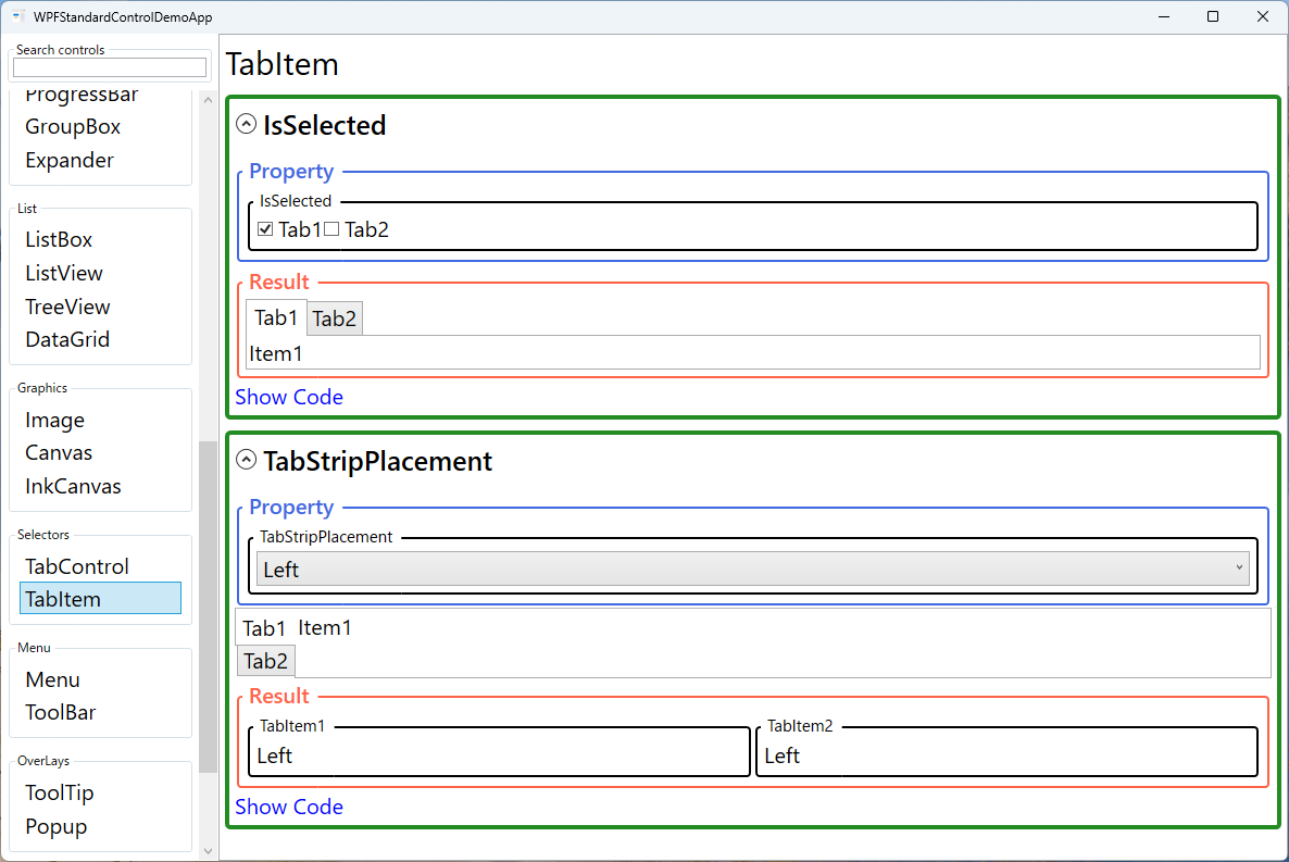
The IsSelected property indicates whether this tab is the currently active one. When
set to true programmatically, the parent TabControl switches to this tab
and deselects the previously active one. This property can be two-way bound to a ViewModel boolean
if per-tab activation state tracking is needed, though binding TabControl.SelectedIndex
or SelectedItem at the container level is usually simpler.
The read-only TabStripPlacement property reflects the placement inherited from the
parent TabControl, allowing individual tab items or their templates to adapt their
visual layout based on whether the strip is on the top, bottom, left, or right edge.
TabItem's visual state system includes states for Normal, MouseOver,
Selected, Unselected, Disabled, and Focused,
all of which can be targeted in a custom ControlTemplate to produce fully branded
tab appearances.
Screen Preview
Demonstrated Properties
The following properties are demonstrated interactively in the WPF Standard Control Demo App. Each property can be configured in real time within the app to observe its behavior.
| Property | Values | Description |
|---|---|---|
Header (HeaderedContentControl) |
object |
When to use: Use a plain string for simple tabs. Use a StackPanel or other UIElement when you need icons, close buttons, or notification badges in the tab strip.What happens: A string value is automatically wrapped in a TextBlock. Any UIElement is rendered directly inside the tab header area, giving you full layout control.Pitfalls: Long or dynamically changing header content causes the tab's width to vary, which can shift the positions of adjacent tabs and make the tab strip feel jumpy. Set a fixed Width or MinWidth on the TabItem via ItemContainerStyle to prevent this.
|
IsSelected |
bool |
When to use: Use when you need per-tab activation tracking from the ViewModel — for example, in wizard-style flows where a specific step must be activated on navigation, or for deep-link scenarios where a URL parameter indicates which tab to open. What happens: Setting true activates this tab: the content area switches to this tab's content and the previously active tab is deselected. Bind two-way to a ViewModel bool to keep the ViewModel in sync with user clicks.Pitfalls: The parent TabControl enforces exclusive selection internally. If you set multiple TabItems' IsSelected to true simultaneously, only the last one to be processed wins. Prefer managing selection via TabControl.SelectedIndex or SelectedItem at the container level to avoid coordination issues.
|
IsEnabled (Control) |
bool |
When to use: Use to enforce access rules — disable a tab until a prerequisite is met (e.g., a wizard step is completed) or based on user role/permissions. What happens: Setting False grays out the tab header; clicks on it are ignored. Bind to a ViewModel boolean to enable or disable the tab dynamically as conditions change.Pitfalls: IsEnabled="False" only blocks user interaction — code can still navigate to a disabled tab by setting TabControl.SelectedIndex. If access control is security-sensitive, also guard the content itself (e.g., show a "Not authorized" message or collapse the content).
|
Content (ContentControl) |
object |
When to use: Set to a Grid, StackPanel, or any layout panel containing the tab page's controls. For heavy content (data grids, charts, large forms) consider deferring initialization.What happens: The content is displayed in the main content area of the TabControl when this tab is selected and hidden when another tab is selected. Once created, the content remains in memory for the lifetime of the TabControl.Pitfalls: All tab content is initialized when the TabControl loads, not lazily on first selection. If initialization performs expensive work (database queries, file I/O), it will slow down application startup even for tabs the user never opens. Implement lazy loading by triggering data fetch in the ViewModel when IsSelected first becomes true.
|
TabStripPlacement (ReadOnly) |
Dock |
Read-only property that reflects the parent TabControl's TabStripPlacement setting. Templates can bind to this to rotate tab content or headers based on the strip's edge placement. |
XAML Example
TabItem with a custom header including an icon and a close button:
<TabControl>
  <TabItem IsSelected="{Binding IsFirstTabActive, Mode=TwoWay}">
    <TabItem.Header>
      <StackPanel Orientation="Horizontal">
        <Image Source="/Icons/document.png" Width="16" Height="16" Margin="0,0,4,0" />
        <TextBlock Text="Document" />
        <Button Content="✕" Width="16" Height="16"
                Command="{Binding CloseTabCommand}"
                Margin="4,0,0,0" />
      </StackPanel>
    </TabItem.Header>
    <Grid Margin="16">
      <TextBlock Text="Document content here." />
    </Grid>
  </TabItem>
  <TabItem Header="Settings">
    <StackPanel Margin="16">
      <CheckBox Content="Option 1" />
    </StackPanel>
  </TabItem>
</TabControl>
Common Use Cases
- Simple labeled pages — Set
Headerto a string for a standard text tab label. - Icon tabs — Use a
StackPanelin the Header with an Image and TextBlock for icon-plus-label headers. - Closeable tabs — Add a small close button to the Header template for document-style closeable tabs.
- Badge notifications — Overlay a count badge on the Header to show unread items or pending actions in that tab.
- Conditional tab access — Bind
IsEnabledto a ViewModel property to prevent users from accessing a tab until prerequisite steps are completed.
Tips and Best Practices
- Use the Header property for labels, not Content — Content is the page body; Header is the tab strip label. Confusing the two is a common mistake for WPF beginners.
- Lazy content initialization — Although TabItem content appears not to load until the tab is selected, the default behavior actually initializes all tab content when the TabControl is first rendered. For tabs with heavy initialization work, explicitly defer loading by watching
IsSelectedbecometruefor the first time and triggering the actual data fetch from the ViewModel at that point. - Avoid binding IsSelected on all tabs simultaneously — Managing multiple IsSelected bindings can cause conflicts; prefer binding SelectedIndex or SelectedItem at the TabControl level.
- Use HeaderTemplate for uniform styling across all tabs — When using
ItemsSourceto generate tabs dynamically, define aHeaderTemplateon theTabControlso all tab headers share the same structure (e.g., icon + label + optional badge). This is more maintainable than setting individualHeadercontent on eachTabItem. - Test keyboard navigation — Users navigate between tabs with Ctrl+Tab (forward) and Ctrl+Shift+Tab (backward); verify the tab order is logical.
Related Controls
- TabControl — The parent container that manages TabItem selection and layout.
- Expander — An alternative for collapsible sections within a single view.
- GroupBox — A bordered container for grouping related controls, similar to a tab page but without tabs.
Source Code
The source code for this demo screen is available on GitHub. Use the built-in code view buttons in the app to see the exact XAML for each property.