WPF Standard Control Demo App › TextBlock
TextBlock Display
TextBlock is a lightweight, non-interactive control for displaying text. It is the primary read-only text element in WPF, supporting rich inline formatting, text trimming, wrapping, and flow document elements. Unlike Label, it does not participate in tab focus and has no border or padding by default.
Overview
The WPF TextBlock is the go-to control for displaying static or data-bound text
in the UI. It derives from FrameworkElement directly (not from Control),
which gives it a smaller visual footprint than label-based controls. This makes it the recommended
choice for high-density UIs such as list item templates and data grids where thousands of text
elements may be created.
TextBlock supports rich inline text formatting through the Inlines collection. By
mixing Run, Bold, Italic, Underline,
Hyperlink, and LineBreak inline elements, you can produce formatted
paragraphs in a single TextBlock without using a full FlowDocument. Inline content
and the Text property are mutually exclusive — when you add inline elements, the
Text property reflects the concatenated plain text.
The TextTrimming property adds ellipsis characters when text overflows its bounds,
giving users a visual cue that content has been cut. CharacterEllipsis trims mid-word,
while WordEllipsis trims at a word boundary for a cleaner result. Combined with a
fixed width and a ToolTip showing the full text, this pattern is ubiquitous in list
and grid cells.
The LineHeight and LineStackingStrategy properties give fine-grained
control over the vertical spacing of lines in a multi-line TextBlock. Setting a custom
LineHeight overrides the font's natural leading; LineStackingStrategy
determines whether the height is applied to the block's lines uniformly
(BlockLineHeight) or based on each line's maximum glyph height
(MaxHeight).
Screen Preview
Demonstrated Properties
The following properties are demonstrated interactively in the WPF Standard Control Demo App. Each property can be configured in real time within the app to observe its behavior.
| Property | Values | Description |
|---|---|---|
Text |
string |
Use this property for plain data-bound text — the standard pattern is a OneWay binding to a ViewModel string property so the display updates automatically when the property changes. It is the simplest way to show dynamic text. Pitfall: the Text property and inline child elements (such as <Bold> or <Run>) are mutually exclusive. If you add inline elements in XAML, setting Text simultaneously will throw an exception. When you need both dynamic binding and rich formatting, use <Run Text="{Binding ...}" /> inside the Inlines collection instead. |
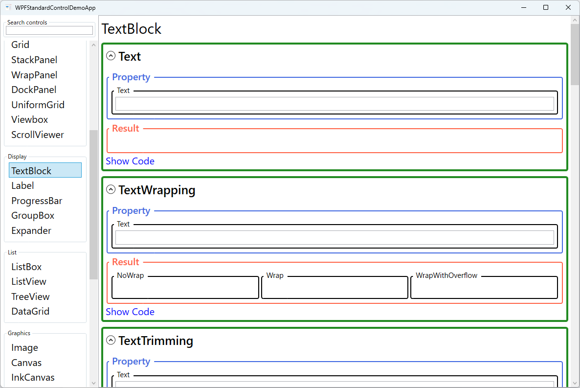
TextWrapping |
NoWrap / Wrap / WrapWithOverflow |
Use Wrap for description text, tooltips, and paragraphs that must stay within a fixed column width. WrapWithOverflow wraps at word boundaries but lets individual long tokens — such as URLs or file paths — overflow rather than be clipped. NoWrap (the default) keeps all text on one line. Pitfall: using NoWrap without constraining the width causes the TextBlock to grow beyond its parent container and break the layout. If you use NoWrap, always set MaxWidth on the TextBlock or place it inside a width-constrained column, and pair it with TextTrimming to handle overflow gracefully. |
TextTrimming |
None / CharacterEllipsis / WordEllipsis |
Use this for list cells and grid columns where the available width is fixed and long text must be shortened to fit. CharacterEllipsis cuts at the character level and appends "…"; WordEllipsis preserves whole words for a cleaner result. Pitfall: TextTrimming does nothing unless the TextBlock has a width constraint — either an explicit Width / MaxWidth, or placement in a container that limits the available width (such as a Grid column). Always pair trimming with a ToolTip binding to the full text so users can read the complete content on hover. |
TextAlignment |
Left / Right / Center / Justify |
Use Center for dialog titles and instruction text, Right for currency and numeric values in table cells, and Justify for long prose paragraphs that should span the full column width. The default Left is appropriate for most body text. Pitfall: Justify on short lines or single-word text can produce large, unnatural gaps between words because WPF distributes all whitespace to fill the line — limit Justify to multi-line paragraphs with enough content per line. |
Padding |
Thickness |
Adds internal spacing between the TextBlock's boundary and its text content, and also expands the hit-test area for mouse events. Useful when you set a Background to create a badge or chip appearance without wrapping in a Border. Pitfall: do not confuse Padding (inner spacing, between text and the control edge) with Margin (outer spacing, between the control and neighboring elements). Use Padding for internal breathing room and Margin for layout spacing. |
FontWeight |
Thin / ExtraLight / Light / Normal / Medium / SemiBold / Bold / ExtraBold / Black |
Sets the stroke weight (thickness) of the rendered font. Bold is the most common alternative to Normal for headings and emphasis. Font properties are inherited from ancestor elements, so setting FontWeight on a parent panel applies it to all TextBlocks inside. Pitfall: not all fonts include every weight variant. If a requested weight is unavailable, WPF silently substitutes the nearest available weight, which may not match the intended design. Always verify the font and weight combination renders as expected. |
FontStyle |
Normal / Italic / Oblique |
Italic uses the font's dedicated italic face when one is available; Oblique algorithmically slants the regular face when no italic face exists. Most fonts only provide Normal and Italic. Use italic for supplementary or descriptive text that needs visual distinction from the surrounding body text. |
FontStretch |
Normal / Condensed / Expanded / etc. |
Controls the horizontal stretch factor of the font glyphs, ranging from UltraCondensed to UltraExpanded. Condensed variants are useful for fitting labels into narrow columns. As with FontWeight, the font must contain the specific stretch variant or WPF will scale the nearest available face, which may look blurry. |
FontSize |
double |
The text size in WPF device-independent units (1/96 inch per unit). A value of 12 is approximately 9 points. FontSize is also inherited from parent elements, so setting it once on a window or resource style propagates throughout the tree. Bind to a user-configurable resource when supporting dynamic font scaling for accessibility. |
FontFamily |
string |
Specifies the typeface to use — a font family name such as "Segoe UI", a comma-separated fallback list, or a URI to a font file embedded in the application. Define shared font families in application-level resources for consistency. Pitfall: hard-coding a font that is not installed on the user's machine causes WPF to fall back to a generic font (typically Times New Roman or Arial), which can break your layout's spacing assumptions. |
Background |
Brush |
Fills the TextBlock's entire bounding area including padding. Use this to create highlighted badges, colored labels, or emphasis spans. A non-transparent Background also makes the TextBlock intercept mouse events (hit-testing), which is required for hover effects. Note that Background is transparent by default, meaning the TextBlock is click-through to elements beneath it. |
Foreground |
Brush |
Sets the text color. Any WPF brush is valid — use SolidColorBrush for flat colors or LinearGradientBrush for gradient effects. Foreground is inherited from parent elements, so setting it on a panel propagates to all child TextBlocks. Pitfall: hard-coding a color such as Black or White will make text unreadable when the user switches between light and dark themes. Use system theme brushes ({DynamicResource ControlTextBrush}) or your application's theme brushes so the color adapts automatically. |
LineHeight / LineStackingStrategy |
double / BlockLineHeight / MaxHeight |
Use these when you need uniform row heights in a data grid or when mixing multiple font sizes in one TextBlock. LineHeight specifies the exact pixel height of each line, overriding the font's natural leading. BlockLineHeight applies that fixed height uniformly to every line; MaxHeight uses the tallest glyph in each individual line, which behaves more naturally for mixed-size text. Pitfall: setting LineHeight smaller than the font size causes lines to overlap, making text unreadable. Always set LineHeight to at least 1.2× the font size. |
XAML Example
TextBlock with rich inline formatting and text trimming with tooltip fallback:
<!-- Plain bound text with wrapping -->
<TextBlock Text="{Binding Description}"
           TextWrapping="Wrap"
           FontSize="14"
           Foreground="#333333"
           LineHeight="22" />

<!-- Trimmed text with tooltip showing full content -->
<TextBlock Text="{Binding LongTitle}"
           TextTrimming="WordEllipsis"
           ToolTip="{Binding LongTitle}"
           Width="200" />

<!-- Inline formatting -->
<TextBlock>
  <Run Text="Status: " />
  <Bold><Run Text="Active" Foreground="Green" /></Bold>
  <Run Text=" (last checked 5 min ago)" Foreground="Gray" />
</TextBlock>
Common Use Cases
- List item labels — Display item names, descriptions, or metadata in DataTemplate cells with controlled wrapping and trimming.
- Status bars and notifications — Show short status messages at the bottom of the window, dynamically bound to a ViewModel property.
- Formatted paragraphs — Use inline elements to mix bold, italic, hyperlinks, and colored spans in a single text block.
- Headings and titles — Apply larger FontSize and FontWeight="Bold" for section headers and window titles.
- Tooltips with formatted content — Nest a TextBlock inside a ToolTip for multi-line, formatted tooltip text beyond a plain string.
Tips and Best Practices
- Prefer TextBlock over Label for read-only text — TextBlock derives from
FrameworkElementand is significantly lighter thanLabel, which inherits the fullContentControlstack. Use Label only when you need access-key (mnemonic) support with aTargetbinding. - TextTrimming requires a width constraint —
TextTrimmingonly activates when the TextBlock has a bounded width — either via an explicitWidth/MaxWidth, or by being inside a width-constrained layout container such as a Grid column. Without a constraint, the TextBlock grows to fit its content and trimming never fires. - Always pair TextTrimming with a ToolTip — When trimming text with
CharacterEllipsisorWordEllipsis, bind the ToolTip to the same source as the text — for exampleToolTip="{Binding Text, RelativeSource={RelativeSource Self}}"— so users can always hover to read the full content regardless of whether trimming is active. - Use Run elements for partial text coloring — Set individual
Foregroundcolors onRunelements within theInlinescollection to highlight specific words or segments in different colors. Note that once you use inline elements theTextproperty becomes read-only; the entire text must be composed fromRunand other inline elements. - Centralize font settings in parent elements or resources — When multiple TextBlocks share the same font configuration, set
FontFamily,FontSize, andForegroundon a common parent panel or in aStyleresource inApp.xaml. This way, you can update the whole application's typography from a single location. - Use LineHeight for consistent row heights in tables — Setting a uniform
LineHeightacross all TextBlocks in a data grid or list ensures rows align precisely even when their text content varies in glyph height.
Related Controls
Source Code
The source code for this demo screen is available on GitHub. Use the built-in code view buttons in the app to see the exact XAML for each property.