WPF Standard Control Demo App › ToggleButton
ToggleButton Inputs
ToggleButton is a button that maintains its pressed state between clicks, toggling between checked and unchecked. It is the direct base class for CheckBox and RadioButton, and is commonly used to build on/off switches, bold/italic toolbar buttons, and custom toggle selectors.
Overview
The WPF ToggleButton control extends ButtonBase by adding a persistent
state — IsChecked — that alternates between true and false on
each click. This makes it fundamentally different from a regular Button, which fires an
action but retains no state. ToggleButton is the super-class shared by CheckBox and
RadioButton, meaning all three share the same state-management infrastructure.
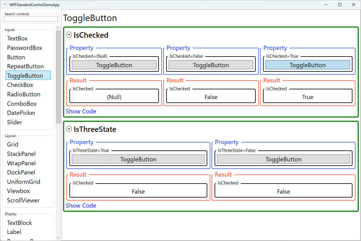
The IsChecked property is nullable (bool?). When IsThreeState
is true, clicking cycles through false → true →
null (indeterminate) → false. The indeterminate state is useful for
representing mixed states, such as a "Select all" toggle when only some items in a list are
checked. When IsThreeState is false (default), null can
only be set programmatically and clicking toggles between false and true.
ToggleButton fires three events in addition to the standard Click: Checked
(when transitioning to true), Unchecked (when transitioning to
false), and Indeterminate (when transitioning to null).
In MVVM, you typically ignore these events and bind IsChecked two-way to a
bool? ViewModel property instead.
Because ToggleButton is a ContentControl, you can place any content inside it —
text, icons, images, or complex panels. This makes it ideal for building icon toggle buttons in
toolbars (bold, italic, underline formatting), theme switchers (dark/light mode), and custom
switch controls by replacing the default control template.
Screen Preview
Demonstrated Properties
The following properties are demonstrated interactively in the WPF Standard Control Demo App. Each property can be configured in real time within the app to observe its behavior.
| Property | Values | Description |
|---|---|---|
IsChecked |
bool? (Null / False / True) |
Use this with a two-way binding to synchronize the button's on/off state with a ViewModel property. true renders the pressed/active visual, false the normal visual, and null renders an indeterminate appearance (a partially-pressed look in the default template). Pitfall: If the ViewModel property is a plain bool (non-nullable) and IsThreeState is enabled, binding will fail with a ConvertBack error when the user cycles to the null state. Always use bool? when three-state mode is active. |
IsThreeState |
bool |
Use this for rare scenarios where three distinct states — such as "Auto / On / Off" — need to be expressed through a single button. When True, each click cycles through false → true → null → false. Pitfall: For the vast majority of toggle use cases (on/off switching), two states are sufficient and clearer to users. If you do enable three-state mode, you must define distinct visuals for each state in the ControlTemplate; without clear visual differentiation, users cannot tell what the null state means. |
ClickMode (ButtonBase) |
Release / Press / Hover |
ToggleButton inherits ClickMode from ButtonBase. The default Release is appropriate for almost all toggle scenarios. Press toggles the state immediately on mouse-down, which can be useful for "hold to preview" interactions where the toggled state is only active while the button is physically depressed. Hover toggles on mouse-enter and is rarely suitable for ToggleButton since accidental hover would flip the state unexpectedly. |
Command / CommandParameter (ButtonBase) |
ICommand / object |
Use this to execute a ViewModel command on each click. CommandParameter can pass any context value to Execute and CanExecute. Pitfall: The CommandParameter does not automatically include the new IsChecked value after the click. If the command handler needs to know the resulting state, bind IsChecked directly to the ViewModel and read it there, or use Interaction.Triggers with an EventTrigger on the Checked/Unchecked events to pass the state through a separate mechanism. |
XAML Example
ToggleButton used as a dark-mode switch and as formatting toolbar buttons:
<!-- On/off switch style toggle -->
<ToggleButton Content="Dark Mode"
              IsChecked="{Binding IsDarkMode, Mode=TwoWay}" />

<!-- Toolbar formatting buttons -->
<ToolBar>
  <ToggleButton IsChecked="{Binding IsBold, Mode=TwoWay}" ToolTip="Bold">
    <TextBlock Text="B" FontWeight="Bold" />
  </ToggleButton>
  <ToggleButton IsChecked="{Binding IsItalic, Mode=TwoWay}" ToolTip="Italic">
    <TextBlock Text="I" FontStyle="Italic" />
  </ToggleButton>
</ToolBar>

<!-- Three-state select-all -->
<ToggleButton Content="Select All" IsThreeState="True"
              IsChecked="{Binding AllItemsSelected, Mode=TwoWay}" />
Common Use Cases
- Toolbar formatting buttons — Bold, Italic, Underline buttons in text editors that stay pressed while formatting is active.
- Feature toggles — Enable/disable features or modes (dark mode, auto-save, grid snap) with a single persistent button.
- Select-all controls — Use three-state mode to show checked/unchecked/indeterminate based on whether all, some, or no items in a list are selected.
- On/Off switches — Replace the default template with a custom pill-shaped switch for a modern toggle appearance.
- Filter toggles — Toggle category filters in a search/filter panel, where the active filters remain visually pressed.
Tips and Best Practices
- Bind IsChecked two-way — Always use Mode=TwoWay for the IsChecked binding so the ViewModel can programmatically set the initial state.
- Checked/Unchecked events vs Command — When you need to react to state transitions, prefer binding
IsCheckedtwo-way and detecting the change in the ViewModel's property setter rather than handlingChecked/Uncheckedevents in code-behind. If a Command is required, useInteraction.Triggerswith anEventTriggeron those events to forward them to a Command without code-behind. - Use DataTrigger in ControlTemplate for custom visuals — When replacing the ControlTemplate, add a
DataTriggerthat binds toIsCheckedand applies distinct background color, transform, or content for each state. This keeps the visual logic self-contained in XAML rather than scattered across event handlers. - Use visual states for custom styling — ToggleButton's control template includes Checked, Unchecked, and Indeterminate visual states; target these in your template to show distinct visuals for each state.
- Prefer CheckBox for standard on/off options — ToggleButton looks like a button; CheckBox visually communicates "optional setting." Use ToggleButton where the button metaphor fits, such as toolbars and toggles.
- GroupName does not apply to ToggleButton directly — GroupName is a RadioButton-level property. If you need mutual exclusion between ToggleButtons, use RadioButton with a custom template instead.
- Test accessibility — Screen readers announce ToggleButton state as "pressed" or "not pressed"; ensure the label clearly conveys what is being toggled.
Related Controls
- CheckBox — ToggleButton subclass styled as a traditional checkbox; better for settings and option lists.
- RadioButton — ToggleButton subclass with mutual exclusion within a GroupName.
- Button — Stateless click trigger; use when no persistent state is needed.
Source Code
The source code for this demo screen is available on GitHub. Use the built-in code view buttons in the app to see the exact XAML for each property.