WPF Standard Control Demo App › CheckBox
CheckBox Inputs
CheckBox is a toggle control that allows users to select or deselect an option. It inherits from ToggleButton and supports three states when IsThreeState is enabled: checked, unchecked, and indeterminate (null).
Overview
The WPF CheckBox control extends ToggleButton, giving it a persistent
checked state that users can toggle between True (checked) and False
(unchecked) with a single click. The checked state is exposed through the nullable boolean property
IsChecked, which integrates seamlessly with WPF data binding. Binding IsChecked
to a bool property in your ViewModel creates a two-way link that keeps the UI and business
logic in sync without any code-behind.
When IsThreeState is set to True, a third state — indeterminate, represented
by null — becomes available. The indeterminate state is visually rendered as a filled or
dash-mark inside the box, signalling that the underlying value is neither definitively on nor off. This
is the standard pattern for "select all / select some / select none" scenarios, such as a parent node in
a hierarchical checklist where only some children are selected.
Like all ContentControl descendants, a CheckBox can contain any WPF element as its label —
not just plain text. You can embed TextBlock elements with rich typography, inline images,
or even interactive controls. The content is rendered to the right of the checkbox glyph by default, but
this can be overridden through ContentTemplate and ControlTemplate customisation.
CheckBox raises Checked, Unchecked, and Indeterminate routed events
that bubble up the visual tree, allowing parent containers to handle state changes without subscribing
to individual checkboxes. This is particularly useful in dynamic lists where checkboxes are generated
at runtime.
Screen Preview
Demonstrated Properties
The following properties are demonstrated interactively in the WPF Standard Control Demo App. Each property can be configured in real time within the app to observe its behavior.
| Property | Values | Description |
|---|---|---|
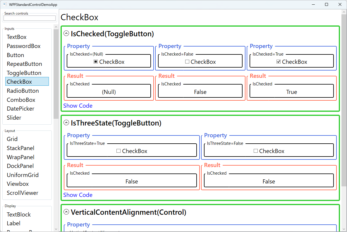
IsChecked (ToggleButton) |
bool? (Null / False / True) |
Use this with a two-way binding to keep a ViewModel property in sync with the checkbox state. Binding to a bool? property preserves all three states — true (checked), false (unchecked), and null (indeterminate). Binding to a plain bool property works for simple two-state checkboxes; WPF automatically converts null ↔ false in that case. Pitfall: If you enable IsThreeState="True" but bind to a bool (non-nullable) property, WPF's ConvertBack will fail when the user cycles to the null state, causing a binding error. Always use bool? binding when three-state mode is active. |
IsThreeState (ToggleButton) |
bool |
Use this to implement a "Select All" checkbox that reflects whether all, some, or none of the items in a list are selected. When True, each click cycles through false → true → null (indeterminate) → false; the null state is rendered visually as a dash or partially-filled glyph. This is the standard pattern for parent nodes in hierarchical checklists. Pitfall: Setting IsThreeState="True" requires a bool? binding. Using a plain bool binding will produce a ConvertBack failure when the indeterminate state is reached. |
VerticalContentAlignment (Control) |
Top / Center / Bottom / Stretch |
Use this when the checkbox label wraps to multiple lines or contains a tall panel, to control how the checkbox glyph aligns vertically with that content. Center centers the glyph alongside the entire label height, which looks natural for multi-line text. Top aligns the glyph to the top of the label. Pitfall: The default value is Top. For short single-line labels this is fine, but for long wrapping labels the glyph sticks to the top edge and the alignment looks unnatural. Set VerticalContentAlignment="Center" whenever the label spans more than one line. |
XAML Example
The following XAML demonstrates common CheckBox patterns including data binding and three-state usage:
<StackPanel Margin="16" Spacing="8">

  <!-- Simple two-state checkbox bound to a bool property -->
  <CheckBox Content="Enable notifications"
            IsChecked="{Binding IsNotificationsEnabled}" />

  <!-- Three-state checkbox for partial selection -->
  <CheckBox Content="Select All"
            IsThreeState="True"
            IsChecked="{Binding SelectAllState}" />

  <!-- Rich content label with an image -->
  <CheckBox IsChecked="{Binding IsDarkMode}">
    <StackPanel Orientation="Horizontal" Spacing="6">
      <Image Source="/Icons/moon.png" Width="16" Height="16" />
      <TextBlock Text="Dark mode" VerticalAlignment="Center" />
    </StackPanel>
  </CheckBox>

  <!-- Multi-line label aligned to top of glyph -->
  <CheckBox VerticalContentAlignment="Top"
            IsChecked="{Binding AcceptsTerms}">
    <TextBlock TextWrapping="Wrap" MaxWidth="280"
               Text="I agree to the terms and conditions of this application." />
  </CheckBox>

</StackPanel>
Common Use Cases
- Settings and preferences panels: Individual boolean settings such as "Start at login", "Enable spell check", or "Show tooltips", each bound to a ViewModel property.
- Filter controls: A group of checkboxes that represent filter categories (e.g., file types, status values) where any combination can be active simultaneously.
- Hierarchical selection: A parent CheckBox with
IsThreeState="True"that reflects whether all, some, or none of its child items are selected in a tree or list. - Terms-of-service acceptance: A single CheckBox requiring the user to confirm acceptance before a form submit button becomes enabled via
CanExecute. - Bulk-edit forms: Multi-record editing forms where a CheckBox next to a field indicates "apply this value to all selected records".
Tips and Best Practices
- Bind to
bool?for three-state scenarios to preserve the indeterminate value across round-trips. Binding to a plainboolwill lose the null value and coerce it toFalse. - Space key toggles the checkbox — When a CheckBox has keyboard focus, pressing Space cycles its state exactly as a click would. Keep this in mind when testing keyboard usability in forms and settings panels.
- Implementing the "Select All" pattern — In the ViewModel, compute the
SelectAllproperty by inspecting all child items: returntrueif all are checked,falseif none are, andnullif mixed. When the user setsSelectAlltotrueorfalse, update all children accordingly; setting it tonullshould be a no-op to avoid an infinite loop. - MVVM state-change detection — Rather than handling
Checked/Uncheckedevents in code-behind, bindIsCheckedtwo-way and detect changes in the ViewModel's property setter. If you need to drive a Command from the event, useInteraction.Triggerswith anEventTriggerto convert the event to a Command without code-behind. - Use
Checked/Uncheckedrouted events in code-behind only when you cannot use data binding. In MVVM applications, prefer bindingIsCheckedand using property-change callbacks in the ViewModel. - Group related checkboxes visually using a
GroupBoxor a labelledBorderto help users understand which options belong together, especially in dense settings dialogs. - Never use CheckBox for mutually exclusive choices. If only one option should be active at a time, use
RadioButtoninstead, which enforces single-selection within a group automatically. - Provide accessible labels. Always set meaningful
Contenttext or useAutomationProperties.LabeledByso screen readers can announce the purpose of each checkbox to visually impaired users.
Related Controls
- RadioButton — mutually exclusive toggle derived from ToggleButton; use when only one option is allowed.
- ToggleButton — the base class; useful when you need a checked-state button with a fully custom appearance.
- Button — a stateless command trigger; use when no persistent on/off state is needed.
- ListView — a common host for checkbox-per-row selection patterns in data lists.
Source Code
The source code for this demo screen is available on GitHub. Use the built-in code view buttons in the app to see the exact XAML for each property.