WPF Standard Control Demo App › RadioButton
RadioButton Inputs
RadioButton allows users to select exactly one option from a mutually exclusive group. RadioButtons sharing the same GroupName are linked together — selecting one automatically deselects all others in the group. RadioButton inherits from ToggleButton, giving it access to checked-state management.
Overview
The WPF RadioButton control implements the classic single-selection pattern. It inherits from
ToggleButton, which in turn inherits from ButtonBase and ultimately
ContentControl. This means RadioButton can host rich content inside its label area —
images, icons, and nested panels — not just plain text.
The GroupName property is the key to RadioButton's mutual-exclusion logic. When two or more
RadioButtons share the same non-null GroupName string, WPF treats them as a group regardless
of where they appear in the visual tree. This lets you place group members inside different panels or even
different levels of nesting without losing the mutual-exclusion behavior. When GroupName is
not set (null), exclusivity is scoped to the immediate parent container by default.
In an MVVM application, bind each RadioButton's IsChecked property (inherited from
ToggleButton) to a dedicated boolean property in the ViewModel, or use a converter to map
an enum value to the checked state. A common pattern is to create one bool property per option and use
two-way bindings; another approach is a single enum property with an IValueConverter that
compares the bound value to the RadioButton's tag.
Styling RadioButtons is straightforward with WPF's template system. You can replace the entire
ControlTemplate to create button-style toggle selectors, tab-strip selectors, or any visual
representation while retaining the underlying mutual-exclusion logic. This makes RadioButton a versatile
building block for custom selection UI beyond the traditional bullet-point appearance.
Screen Preview
Demonstrated Properties
The following properties are demonstrated interactively in the WPF Standard Control Demo App. Each property can be configured in real time within the app to observe its behavior.
| Property | Values | Description |
|---|---|---|
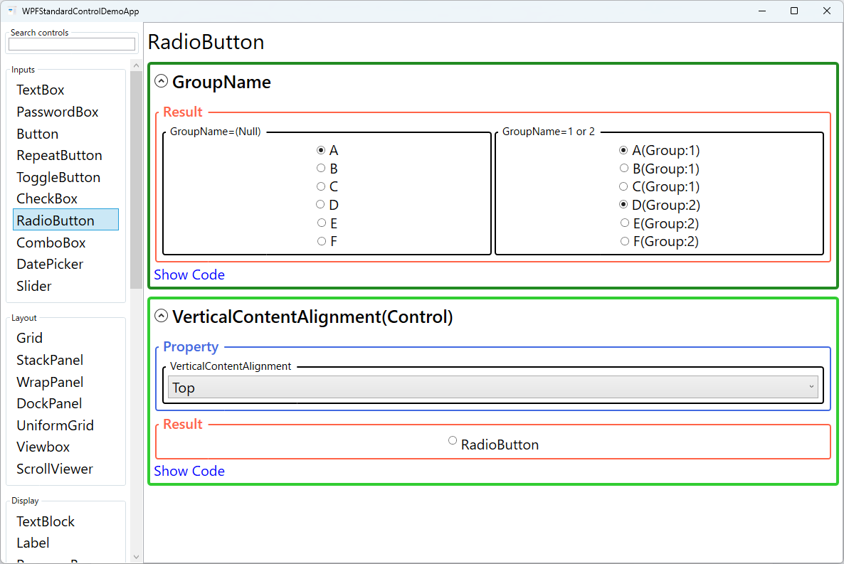
GroupName |
string (Null = same parent container) |
Use this when you have multiple independent RadioButton groups on the same screen. All RadioButtons sharing the same non-null GroupName form a mutual-exclusion group regardless of where they appear in the visual tree. Pitfall: GroupName works across different parent containers — a RadioButton inside one StackPanel and another inside a different StackPanel will still be linked if they share the same GroupName. This can cause surprising deselection across visually separate sections. Always use a unique, descriptive name per logical group to avoid unintended cross-container exclusion. |
IsChecked (ToggleButton) |
bool? |
Use this with a two-way binding to synchronize the selected option with a ViewModel property. Setting IsChecked = true from code automatically unchecks all other RadioButtons in the same group. Pitfall: When binding each RadioButton to a separate bool ViewModel property, you must manually set all sibling properties to false when one is set to true; otherwise the ViewModel state becomes inconsistent even though the UI looks correct. For three or more options, prefer a single enum property with an IValueConverter to avoid this synchronization problem entirely. |
VerticalContentAlignment (Control) |
Top / Center / Bottom / Stretch |
Use this when a RadioButton's label contains multi-line text or a tall panel, to control how the radio glyph aligns vertically against that content. Center is generally the most natural choice for tall labels, centering the glyph alongside the full label height. Pitfall: The default is Top, which places the glyph at the top edge of the content. For short single-line labels this is unnoticeable, but for labels that wrap to two or more lines the glyph floats at the top while the text runs below it — set VerticalContentAlignment="Center" to fix this. |
XAML Example
The following example shows a group of RadioButtons sharing the same GroupName, with MVVM bindings:
<StackPanel>
  <RadioButton Content="Option A" GroupName="MyGroup"
               IsChecked="{Binding IsOptionASelected, Mode=TwoWay}" />
  <RadioButton Content="Option B" GroupName="MyGroup"
               IsChecked="{Binding IsOptionBSelected, Mode=TwoWay}" />
  <RadioButton Content="Option C" GroupName="MyGroup"
               IsChecked="{Binding IsOptionCSelected, Mode=TwoWay}" />
</StackPanel>

<!-- Enum-based binding with converter -->
<RadioButton Content="Small"
             IsChecked="{Binding Size, Converter={StaticResource EnumBoolConverter},
                         ConverterParameter=Small}" />
Common Use Cases
- Settings dialogs — Offer mutually exclusive configuration options such as theme selection (Light / Dark / System) or language choice.
- Wizard navigation — Let users pick a single path or mode before proceeding to the next step.
- Survey forms — Present Likert-scale or yes/no questions where only one answer is valid.
- Custom tab strips — Re-template RadioButtons as tab headers to build a visually distinct navigation bar backed by the mutual-exclusion logic.
- Filter selectors — Offer view filters (All / Active / Completed) where enabling one filter disables the others.
Tips and Best Practices
- Always set GroupName when mixing groups — Without explicit group names, WPF uses the parent container as the scope, which can cause unexpected cross-group deselection when multiple groups share a panel.
- Ensure at least one item is pre-selected — A group with no selection can surprise users. Set an initial value in the ViewModel constructor or via
IsChecked="True"in XAML. Without a default, the group has no selection until the user clicks, which can be confusing and break validation. - Prefer enum converters over multiple bool properties — Binding each RadioButton to a separate
boolViewModel property creates verbose code and risks state synchronization bugs. A single enum property plus anIValueConverteris cleaner: the converter receives the current enum value and theConverterParameterfor each button, returningtruewhen they match. This scales cleanly as options are added. - Set TabIndex for keyboard navigation between groups — Within a RadioButton group, arrow keys move selection. Between groups, Tab should jump to the next group. Assign
TabIndexvalues so the tab order matches the visual layout, ensuring keyboard-only users can navigate predictably across multiple groups. - Use ControlTemplate for custom visuals — When the default bullet appearance does not fit your design, replace the template entirely; the underlying IsChecked and GroupName logic still works.
- Accessibility — Add
AutomationProperties.Namewhen the content is an image, so screen readers can announce the option label correctly.
Related Controls
- CheckBox — For independent boolean toggles that are not mutually exclusive.
- ToggleButton — The base class that provides
IsCheckedandIsThreeState. - ComboBox — An alternative single-selection control suitable for larger option sets.
- ListBox — Supports single or multiple selection from a scrollable list.
Source Code
The source code for this demo screen is available on GitHub. Use the built-in code view buttons in the app to see the exact XAML for each property.