WPF Standard Control Demo App › TreeView
TreeView List
TreeView displays hierarchical data in an expandable/collapsible tree structure. Each node can have child nodes, and users can expand or collapse branches. It supports data binding via HierarchicalDataTemplate, making it ideal for file system browsers, organizational charts, and nested category navigation.
Overview
The WPF TreeView control inherits from ItemsControl and renders its
items as TreeViewItem instances, each of which is itself an ItemsControl
that can contain more TreeViewItem children. This recursive structure allows
arbitrarily deep trees. Direct XAML construction with nested TreeViewItem elements is
simple but limited; for real applications, data-binding with
HierarchicalDataTemplate is the standard approach.
HierarchicalDataTemplate extends DataTemplate by adding an
ItemsSource binding property. This tells WPF where to find the child items for each
node in the data model. A single HierarchicalDataTemplate can represent a whole class
of nodes — for example, a FolderViewModel — and WPF recursively applies the template
to all levels of the hierarchy.
Unlike ListBox, TreeView only tracks a single selected item at a time. The
SelectedItem property (read-only on TreeView) returns the currently selected
TreeViewItem's data context. To get or set the selected item from a ViewModel,
listen to the SelectedItemChanged event and expose a property, or use an
attached behavior that makes SelectedItem bindable.
TreeView supports scroll bar customization via ScrollViewer attached properties
(ScrollViewer.HorizontalScrollBarVisibility, etc.). For large trees with many items,
UI virtualization is important for performance. By default, TreeView uses
VirtualizingStackPanel as its items host, which virtualizes items at the top level
but not nested levels. Fully virtualized trees require additional configuration.
Screen Preview
Demonstrated Properties
The following properties are demonstrated interactively in the WPF Standard Control Demo App. Each property can be configured in real time within the app to observe its behavior.
| Property | Values | Description |
|---|---|---|
ItemsSource (ItemsControl) |
IEnumerable |
When to use: Use whenever the tree is driven by a runtime data model rather than hard-coded XAML. Always pair it with a HierarchicalDataTemplate that specifies both how each node looks and which property contains its children.What happens: WPF recursively applies the template at every depth of the hierarchy — one template definition covers the entire tree. Each node's children are populated by following the ItemsSource binding declared on the template.Pitfalls: The DataType on HierarchicalDataTemplate must match the runtime type of your node ViewModel exactly. A mismatch causes nodes to render with no visual content, which can be very hard to diagnose.
|
SelectedItem (ReadOnly) |
object |
When to use: Read this property (or listen to SelectedItemChanged) in code-behind to react to selection changes when a full MVVM setup is not needed.What happens: Returns the data object of the currently selected node. Because this property is read-only by WPF design, it reflects selection state but cannot be used to set selection from the ViewModel directly. Pitfalls: Attempting to create a TwoWay binding on SelectedItem throws a runtime exception. The correct MVVM approach is to bind each node's IsSelected property via ItemContainerStyle to a ViewModel property and manage selection that way.
|
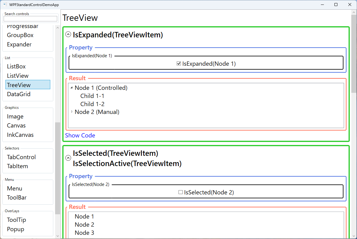
IsExpanded (TreeViewItem) |
bool |
When to use: Use when you need to save and restore expanded state between sessions, or when you want to programmatically expand the path to a specific node (e.g., a search result). What happens: Setting this to true in the ViewModel via an ItemContainerStyle two-way binding expands the node and reveals its children. Setting it back to false collapses it.Pitfalls: When UI virtualization is enabled, collapsed nodes that have not yet been rendered may not respond to programmatic IsExpanded changes because their TreeViewItem container has not been created yet. Expanding parent nodes first (forcing them into the visual tree) resolves this.
|
IsSelected (TreeViewItem) |
bool |
When to use: The primary way to control selection from the ViewModel in MVVM patterns. Add an IsSelected property to your node class and bind it via ItemContainerStyle with Mode=TwoWay.What happens: Setting the property to true selects that node in the TreeView. Because TreeView only allows one selected node at a time, making one node selected automatically deselects the previously selected one.Pitfalls: If multiple nodes have IsSelected = true in the ViewModel simultaneously, only one will actually appear selected. Manage this centrally in the ViewModel to ensure at most one node has IsSelected = true at any given time.
|
IsSelectionActive (TreeViewItem, ReadOnly) |
bool |
Indicates whether the selection is "active" (the TreeView has keyboard focus). When the TreeView loses focus, IsSelected remains true but IsSelectionActive becomes false, allowing the template to show a dimmed selected state. |
ItemTemplate / HierarchicalDataTemplate |
DataTemplate / HierarchicalDataTemplate |
The data template applied to each tree node. Use HierarchicalDataTemplate (which extends DataTemplate) to specify both the node's visual appearance and the binding for its children via the ItemsSource property on the template. |
HorizontalScrollBarVisibility / VerticalScrollBarVisibility (ScrollViewer) |
Disabled / Auto / Hidden / Visible |
Controls scroll bar display for the tree's content area. Auto is the most common choice, showing bars only when the tree content exceeds the visible area. |
XAML Example
TreeView bound to a hierarchical data model using HierarchicalDataTemplate:
<TreeView ItemsSource="{Binding RootNodes}">
  <TreeView.ItemTemplate>
    <HierarchicalDataTemplate ItemsSource="{Binding Children}">
      <StackPanel Orientation="Horizontal">
        <Image Source="{Binding Icon}" Width="16" Height="16"
               Margin="0,0,4,0" />
        <TextBlock Text="{Binding Name}" />
      </StackPanel>
    </HierarchicalDataTemplate>
  </TreeView.ItemTemplate>
  <TreeView.ItemContainerStyle>
    <Style TargetType="TreeViewItem">
      <Setter Property="IsExpanded"
              Value="{Binding IsExpanded, Mode=TwoWay}" />
      <Setter Property="IsSelected"
              Value="{Binding IsSelected, Mode=TwoWay}" />
    </Style>
  </TreeView.ItemContainerStyle>
</TreeView>
Common Use Cases
- File system browsers — Display a drive/folder/file hierarchy where folders can be expanded to reveal their contents.
- Project explorers — IDE-style project trees with solution, project, folder, and file nodes at multiple levels.
- Organizational charts — Browse company structures, team hierarchies, or reporting chains in an expandable tree.
- Category navigation — Product category trees in e-commerce apps or content management systems with nested categories.
- XML/JSON inspectors — Visualize nested data structures with expandable nodes for each element or object.
Tips and Best Practices
- Use HierarchicalDataTemplate for data-bound trees — Avoid hard-coding TreeViewItem elements; bind to a recursive data model so the tree can be driven by data.
- Expose IsExpanded and IsSelected in the ViewModel — Bind these via ItemContainerStyle to enable programmatic expand/collapse and selection from the ViewModel.
- Use an attached behavior for SelectedItem binding — TreeView.SelectedItem is read-only; use a behavior or event trigger to expose it as a bindable property in the ViewModel.
- Lazy-load children for large trees — Populate children only when a node is expanded to avoid loading the entire tree upfront. Check
IsExpandedin the ViewModel to trigger the load. - Keyboard navigation — TreeView supports arrow keys for navigation, Space to toggle selection, and Enter to trigger commands; verify this works for your use case.
- Implement search by expanding nodes programmatically — To highlight a search result in the tree, walk the path from root to the matching node and set
IsExpanded = trueon each ancestor, then setIsSelected = trueon the target node. This makes the result visible even if it was buried in a collapsed branch. - Add a context menu via ItemContainerStyle — Define a
ContextMenuinsideItemContainerStyleto attach right-click menus to tree nodes. TheDataContextof the context menu is automatically the node's ViewModel, so command bindings work naturally without anyRelativeSourcegymnastics.
Related Controls
Source Code
The source code for this demo screen is available on GitHub. Use the built-in code view buttons in the app to see the exact XAML for each property.