WPF Standard Control Demo App › UniformGrid
UniformGrid Layout
UniformGrid is a simplified panel that automatically arranges its children in equally-sized cells. Unlike the standard Grid, you do not need to define RowDefinitions or ColumnDefinitions — just set the desired number of columns and rows, and UniformGrid does the rest.
Overview
The WPF UniformGrid panel creates a grid where every cell has exactly the same width and height. It distributes the available space evenly among the specified number of columns and rows, making it ideal for button grids, icon palettes, image galleries, and any layout where equal sizing is desired without manual column/row definition.
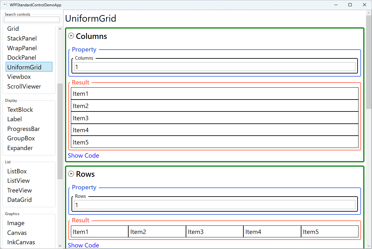
You can specify Columns and Rows independently. If only
Columns is set, the grid grows as many rows as needed to accommodate all children.
If both are set, the grid has a fixed cell count; children beyond the cell count overflow without
being displayed. If neither is set, UniformGrid arranges children in a square-ish layout,
automatically calculating columns based on the child count.
The FirstColumn property introduces an offset — the specified number of cells at
the beginning of the first row are left empty. This is useful when you want to start a partial
row for alignment purposes, for example when combining UniformGrid items with other elements
in a larger layout.
UniformGrid is part of the System.Windows.Controls.Primitives namespace, reflecting
its lower-level nature compared to Grid. Because it does not support star sizing, auto sizing,
or cell spanning, it is less flexible than Grid but much simpler to configure for uniform layouts.
Screen Preview
Demonstrated Properties
The following properties are demonstrated interactively in the WPF Standard Control Demo App. Each property can be configured in real time within the app to observe its behavior.
| Property | Values | Description |
|---|---|---|
Columns |
int |
Use this to fix the number of columns — for example, Columns="7" for a weekly calendar or Columns="4" for a dashboard tile grid. All columns receive an equal share of the available width, and rows are added automatically to accommodate all children. Pitfall: if you specify only Columns and leave Rows at 0, the row count is calculated automatically from the child count. This works well for a growing list of items. However, if both Columns and Rows are set and their product is less than the number of children, the excess children are silently dropped from the layout without any error — keep the child count consistent with the cell count. |
Rows |
int |
Use this to fix the number of rows in the grid. When set, each row receives an equal share of the available height. Leave at 0 (default) to let the grid grow as many rows as needed based on the child count and the Columns value. Pitfall: when both Rows and Columns are specified, the grid has a fixed cell capacity. Children beyond that capacity are not rendered — there is no automatic expansion or overflow indicator. Monitor the child count carefully when both values are fixed. |
FirstColumn |
int |
Use this to insert empty cells at the start of the first row, creating an offset. The classic use case is a monthly calendar: if the month starts on a Wednesday, set FirstColumn="3" (0 = Sunday) so that the day numbers align correctly under the weekday headings. Pitfall: if FirstColumn is equal to or greater than the Columns value, the offset is silently ignored. Ensure the day-of-week index (0-based) is always less than the column count. |
Background (Panel) |
Brush |
Sets the background fill of the panel area including empty cells. A non-null Background also makes the panel hit-testable, allowing mouse events to be caught in empty cells or gaps between items. Pitfall: the default null background disables hit-testing on background areas — set Background="Transparent" if you need the panel to capture mouse events in empty space. |
ZIndex (Panel attached) |
int |
Controls the draw order of sibling children when they overlap. Higher values render in front. Typically not needed in a UniformGrid because cells do not overlap, but useful if a child uses a negative Margin to deliberately extend beyond its cell boundaries. Pitfall: ZIndex affects only siblings within the same parent panel and has no effect across different containers. |
XAML Example
A 4-column UniformGrid used as a color swatch palette:
<UniformGrid Columns="4" Rows="2" Width="200" Height="100">
  <Button Background="Red" />
  <Button Background="Orange" />
  <Button Background="Yellow" />
  <Button Background="Green" />
  <Button Background="Blue" />
  <Button Background="Indigo" />
  <Button Background="Violet" />
  <Button Background="White" />
</UniformGrid>

<!-- Auto-column count -->
<UniformGrid Width="300">
  <Button Content="1" />
  <Button Content="2" />
  <Button Content="3" />
  <Button Content="4" />
  <Button Content="5" />
</UniformGrid>
Common Use Cases
- Color swatches — Display a palette of color buttons in a uniform grid where all swatches are the same size.
- Calculator-style button pads — Arrange digit and operator buttons in an equal-sized grid layout.
- Icon galleries — Show a browsable grid of equally-sized image thumbnails or icon buttons.
- Dashboard tiles — Display summary tiles or KPI cards in a uniform grid for a clean dashboard layout.
- Keyboard/numpad layouts — Render virtual keyboard keys in a grid where all keys have the same base size.
Tips and Best Practices
- Use when all cells need the same size — If cells need different sizes, use a standard Grid with ColumnDefinitions and RowDefinitions instead.
- Add Margin to children for spacing — UniformGrid does not have a gap property; apply a small Margin to each child to create visual spacing between cells.
- Fix Columns for predictable layouts — Relying on auto column calculation can produce unexpected results when the child count changes; set an explicit Columns value for stable UI.
- Prefer WrapPanel for variable-count items — If the number of items changes dynamically and you want wrapping behavior rather than a fixed grid, use WrapPanel instead.
- UniformGrid is in Primitives namespace — Add the XML namespace
xmlns:primitives="clr-namespace:System.Windows.Controls.Primitives;assembly=PresentationFramework"to use it in XAML. - Cell size depends on the parent container. UniformGrid divides the available space provided by its parent equally among all cells. If the parent gives no explicit size (e.g., inside an unbounded ScrollViewer or a StackPanel along its stacking axis), the cell size can unexpectedly become zero. Always ensure the parent has a finite width and height, or set explicit Width/Height on the UniformGrid itself.
- Children stretch to fill cells by default. Each child's
HorizontalAlignmentandVerticalAlignmentdefault toStretch, so children fill their entire cell. Set alignment properties explicitly on individual children when you want them to be smaller than the cell, such as centred icons in a palette.
Related Controls
- Grid — More flexible with independent column/row sizes, spanning, and proportional sizing.
- WrapPanel — Wraps children to new rows when space runs out; useful for dynamic item counts.
- StackPanel — Simpler single-axis layout without the grid structure.
Source Code
The source code for this demo screen is available on GitHub. Use the built-in code view buttons in the app to see the exact XAML for each property.