WPF Standard Control Demo App › StackPanel
StackPanel Layout
StackPanel arranges child elements in a single line, either horizontally or vertically. It is one of the simplest and most frequently used layout panels in WPF, ideal for linear sequences of controls such as button bars, form rows, and toolbars.
Overview
The WPF StackPanel stacks its children one after another along a single axis. When
Orientation is Vertical (the default), children are placed top-to-bottom;
when Horizontal, they flow left-to-right. StackPanel does not wrap — once children
overflow the available space, they are clipped or cause the panel to grow beyond its container.
For wrapping behaviour, use WrapPanel instead.
StackPanel measures each child with infinite space along the stacking axis, allowing children to take their natural size. Across the perpendicular axis, each child is stretched to fill the panel's width (vertical stack) or height (horizontal stack) unless the child specifies its own size or alignment. This makes StackPanel very predictable for forms and button bars where you want full-width rows.
StackPanel is commonly used inside ScrollViewer to create scrollable lists of elements,
inside ItemsControl as the items host, and as the root panel for simple dialog content.
It does not support proportional sizing (unlike Grid) or absolute positioning (unlike
Canvas), which keeps its implementation lightweight and fast.
For the common pattern of evenly spaced children, apply Margin on the children or use
a Style with a setter that adds uniform spacing. WPF does not have a built-in gap/spacing
property on StackPanel, so margin-based spacing is the idiomatic approach.
Screen Preview
Demonstrated Properties
The following properties are demonstrated interactively in the WPF Standard Control Demo App. Each property can be configured in real time within the app to observe its behavior.
| Property | Values | Description |
|---|---|---|
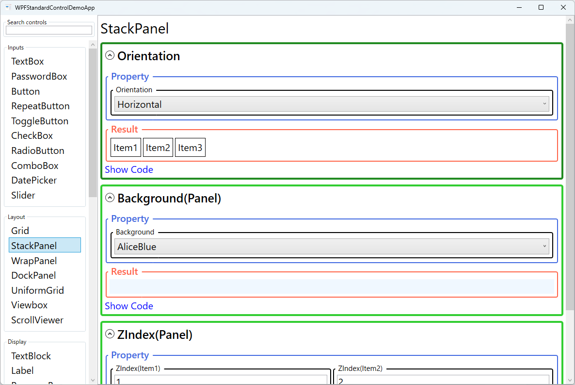
Orientation |
Horizontal / Vertical |
Use Vertical (default) when stacking form rows, notification items, or navigation menu entries top-to-bottom. Use Horizontal when arranging toolbar buttons or breadcrumb segments left-to-right. In a Vertical StackPanel, children are stretched to full width (HorizontalAlignment="Stretch") by default; in a Horizontal StackPanel, children are stretched to full height. Pitfall: Horizontal orientation in a narrow container does not wrap — items that exceed the available width are simply clipped. If you need wrapping behaviour, use WrapPanel instead. |
Background (Panel) |
Brush |
Use this when you want the entire StackPanel area to respond to mouse events such as hover highlights or click detection. Setting Background="Transparent" makes the whole panel hit-testable without painting any colour. Pitfall: the default is null, which disables hit-testing on the background — clicks in the empty space between children pass straight through to whatever is behind the panel. If the panel does not respond to mouse events in empty areas, a missing Background is the most likely cause. Always set Transparent explicitly when you want invisible-but-clickable background coverage. |
ZIndex (Panel attached) |
int |
Use this when children overlap — for example, when negative margins are applied intentionally to create a stacked card effect. Higher values render in front. Pitfall: ZIndex is scoped to siblings within the same parent panel only. A high ZIndex on a child of this StackPanel has no effect on elements outside the panel. If you need an element to visually float above elements in an outer container, you must place it in the outer container directly or use a Popup / AdornerLayer. |
XAML Example
A vertical StackPanel used as a simple form layout:
<StackPanel Orientation="Vertical" Margin="16">
  <Label Content="Name:" />
  <TextBox Text="{Binding Name}" Margin="0,0,0,8" />
  <Label Content="Email:" />
  <TextBox Text="{Binding Email}" Margin="0,0,0,8" />
  <Button Content="Submit" HorizontalAlignment="Right"
          Command="{Binding SubmitCommand}" />
</StackPanel>

<!-- Horizontal button bar -->
<StackPanel Orientation="Horizontal" HorizontalAlignment="Right">
  <Button Content="OK" Width="80" Margin="0,0,8,0" IsDefault="True" />
  <Button Content="Cancel" Width="80" IsCancel="True" />
</StackPanel>
Common Use Cases
- Form layouts — Stack labels and input controls vertically for clean top-to-bottom form flow.
- Button bars — Arrange OK/Cancel or toolbar buttons horizontally with consistent spacing via Margin.
- Navigation menus — Stack menu items vertically inside a sidebar or flyout panel.
- ItemsControl item template — Use as the ItemsPanel to display a flat list of items in a linear sequence.
- Notification stacks — Stack toast notifications or status messages vertically at the edge of the screen.
Tips and Best Practices
- Use Grid for complex layouts — StackPanel is optimal for simple linear sequences; switch to Grid when you need column alignment or proportional sizing.
- Apply Margin on children for spacing — StackPanel has no gap property; use a consistent bottom or right Margin on each child, or define it via a
Styletargeting the child type. In .NET 8 and later, StackPanel gained aSpacingproperty that applies uniform spacing between all children in a single setting — a much cleaner approach than per-child Margin when targeting modern WPF. - Wrap in ScrollViewer for long lists — StackPanel itself does not scroll; place it inside a ScrollViewer if the content can exceed the visible area.
- Prefer VirtualizingStackPanel for large data sets — When using StackPanel as an ItemsPanel for a ListBox or ItemsControl with many items, switch to VirtualizingStackPanel for better performance.
- Set HorizontalAlignment/VerticalAlignment on children — Children in a vertical StackPanel stretch to full width by default; explicitly set HorizontalAlignment to Left/Center/Right when a smaller natural width is desired.
- Control overflow with ClipToBounds — By default, StackPanel does not clip children that overflow its bounds; children can render outside the panel area. If you need to prevent overflow rendering, set
ClipToBounds="True"on the StackPanel.
Related Controls
- WrapPanel — Like StackPanel but wraps children to new rows/columns when space runs out.
- Grid — More powerful layout with rows, columns, and proportional sizing.
- DockPanel — Docks children to edges; the last child fills remaining space.
- UniformGrid — Automatically distributes children in equally-sized cells.
Source Code
The source code for this demo screen is available on GitHub. Use the built-in code view buttons in the app to see the exact XAML for each property.