WPF Standard Control Demo App › WrapPanel
WrapPanel Layout
WrapPanel arranges child elements sequentially from left to right (or top to bottom) and wraps to the next line when there is no more space. It is ideal for dynamically-sized content collections such as tag clouds, photo galleries, toolbar overflow panels, and chip lists that adapt to available width.
Overview
The WPF WrapPanel is a flow-layout panel that places children one after another
along the main axis and starts a new row or column when the available space is exhausted. This
makes it fundamentally different from StackPanel (which never wraps) and
Grid (which requires explicit positioning). WrapPanel naturally adapts to container
width changes, making it suitable for responsive UIs that need to rearrange items when the window
is resized.
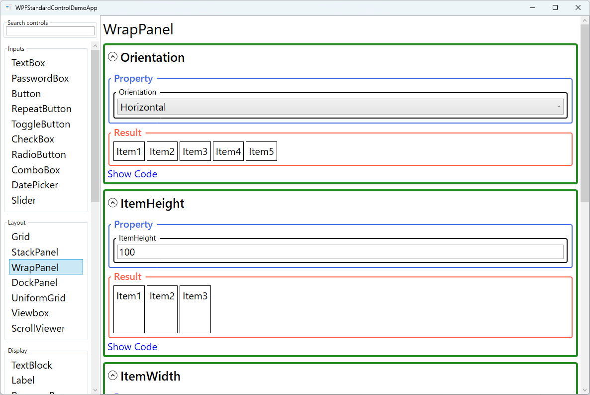
The Orientation property sets the primary layout direction. With
Horizontal (default), items are placed left to right and wrap to a new row when the
row is full. With Vertical, items are placed top to bottom and wrap to a new column
when the column is full.
The ItemWidth and ItemHeight properties constrain all children to a
uniform size, similar to UniformGrid but with wrapping. When set, all children are allocated
exactly this much space regardless of their natural size — children that are too large are
clipped. When not set (the default), each child takes its natural size, leading to rows of
variable height.
WrapPanel is commonly used as an ItemsPanel inside ItemsControl,
ListBox, or other items-based controls to produce a wrapping collection display.
Combined with data binding, this creates automatically-wrapping galleries and chip/tag lists
that update as items are added or removed.
Screen Preview
Demonstrated Properties
The following properties are demonstrated interactively in the WPF Standard Control Demo App. Each property can be configured in real time within the app to observe its behavior.
| Property | Values | Description |
|---|---|---|
Orientation |
Horizontal / Vertical |
Use Horizontal (default) for tag clouds, chip lists, or photo galleries where items should flow left-to-right and wrap to a new row when the row is full. Use Vertical when items should flow top-to-bottom and wrap to a new column when the column is full. Pitfall: if the WrapPanel is placed inside a horizontally-scrolling ScrollViewer, the container provides infinite width and the panel never wraps. Use a vertically-scrolling ScrollViewer (set VerticalScrollBarVisibility="Auto") around a Horizontal WrapPanel so that wrapping works correctly and the scroll bar appears when rows exceed the available height. |
ItemHeight |
double |
Use this when all rows should have the same height — for example, a thumbnail gallery where every image tile must align uniformly. When set, each child is allocated exactly this much vertical space and the row height is fixed to this value regardless of children's natural heights. Pitfall: children whose natural height exceeds ItemHeight are clipped rather than shrunk. Set an appropriate value and ensure child content fits, or leave it as NaN (the default) to allow each row height to be determined by its tallest child. |
ItemWidth |
double |
Use this when all children should occupy the same width — for example, a color swatch palette or icon palette where uniform tile width is required. Each child is allocated exactly this width in horizontal orientation, producing a predictable tile-grid layout that wraps when rows are full. Pitfall: like ItemHeight, children wider than ItemWidth are clipped. Leave as NaN (the default) when children have varying natural widths and you want each item to take only as much space as it needs. |
Background (Panel) |
Brush |
Use this when the WrapPanel background area — including the gaps between wrapped items — should respond to mouse events. Background="Transparent" enables hit-testing on the entire panel area without painting any colour. Pitfall: the default is null, which disables background hit-testing. Clicks in the spaces between items pass through to elements behind the panel. If you need click or hover events to fire over the full panel area, set Background="Transparent" explicitly. |
ZIndex (Panel attached) |
int |
Controls the draw order of individual children when they visually overlap — for example when a child has a negative margin that causes it to overlap its neighbour. Higher values render in front. Typically unnecessary in a WrapPanel because items are laid out sequentially without overlap, but useful for deliberate visual effects. |
XAML Example
WrapPanel as an ItemsPanel for a tag/chip list and as a photo thumbnail gallery:
<!-- Tag cloud / chip list -->
<ItemsControl ItemsSource="{Binding Tags}">
  <ItemsControl.ItemsPanel>
    <ItemsPanelTemplate>
      <WrapPanel Orientation="Horizontal" />
    </ItemsPanelTemplate>
  </ItemsControl.ItemsPanel>
  <ItemsControl.ItemTemplate>
    <DataTemplate>
      <Border Background="#E0E0E0" CornerRadius="12"
              Padding="8,4" Margin="4">
        <TextBlock Text="{Binding}" />
      </Border>
    </DataTemplate>
  </ItemsControl.ItemTemplate>
</ItemsControl>

<!-- Uniform photo grid with fixed tile size -->
<WrapPanel ItemWidth="120" ItemHeight="90" Orientation="Horizontal">
  <Image Source="/Photos/img1.jpg" Stretch="UniformToFill" />
  <Image Source="/Photos/img2.jpg" Stretch="UniformToFill" />
  <Image Source="/Photos/img3.jpg" Stretch="UniformToFill" />
</WrapPanel>
Common Use Cases
- Tag and chip lists — Display a collection of tags, labels, or filter chips that wrap naturally as tags are added or the window is resized.
- Photo galleries — Arrange thumbnail images in a wrapping grid that adapts to available width.
- Toolbar overflow areas — Display overflowed toolbar items in a wrap layout within a popup or overflow panel.
- Responsive button grids — Display action buttons that reflow as the container width changes without breaking the layout.
- Color/icon palettes — Show selectable swatches or icons that wrap to the next row when the palette is too narrow.
Tips and Best Practices
- Wrap in ScrollViewer for overflow handling — WrapPanel grows in the perpendicular direction as items wrap; place it inside a vertically-scrolling ScrollViewer (
VerticalScrollBarVisibility="Auto") to handle cases where the total height exceeds the available area. Avoid placing a Horizontal WrapPanel inside a horizontal-scroll ScrollViewer — this eliminates wrapping entirely. - Use ItemWidth/ItemHeight for uniform tile layouts — Setting both properties creates a responsive UniformGrid-like layout that wraps instead of overflowing.
- Use as ItemsPanel for data-bound wrapping lists — Set WrapPanel as the ItemsPanel in ListBox or ItemsControl to display bound collections with wrapping behavior.
- Add Margin to children for spacing — WrapPanel has no gap property; add consistent Margin to each child for visual spacing between items.
- Test with varying item counts and widths — Wrapping layouts can look unexpectedly different with few vs. many items, or with very short vs. very long item widths; test across realistic data ranges.
- WrapPanel does not virtualise. Unlike
VirtualizingStackPanel, WrapPanel renders all children immediately. For large collections (100+ items) consider a virtualizing alternative such as aVirtualizingStackPanelor a third-party wrapping virtualizing panel.
Related Controls
- StackPanel — Like WrapPanel but never wraps; use for simple linear sequences.
- UniformGrid — Uniform-cell grid without wrapping; better when the number of columns should be fixed.
- Grid — Full-featured grid with explicit column/row definitions and spanning.
Source Code
The source code for this demo screen is available on GitHub. Use the built-in code view buttons in the app to see the exact XAML for each property.