WPF Standard Control Demo App › Viewbox
Viewbox Layout
Viewbox is a decorator that scales its single child element to fill the available space while preserving or ignoring the aspect ratio. It enables resolution-independent UI by automatically scaling fixed-size designs to fit any container size, making it ideal for icons, logos, and scalable diagrams.
Overview
The WPF Viewbox control is a Decorator (inheriting from
FrameworkElement) that accepts exactly one child element and scales it uniformly or
non-uniformly to fill the Viewbox's available area. Unlike most panels, Viewbox does not layout
its child using the normal available-size mechanism; it measures the child at its natural (desired)
size, then applies a scale transform to fit it into the Viewbox.
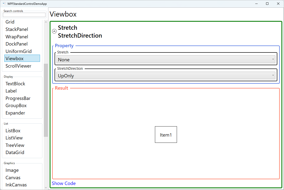
The Stretch property controls the scaling strategy. Uniform (default)
maintains the child's aspect ratio, fitting it entirely within the Viewbox with possible letterboxing.
UniformToFill also maintains aspect ratio but scales the child to fill the entire
Viewbox, potentially cropping edges. Fill stretches independently on both axes,
distorting the aspect ratio. None places the child at its natural size without scaling.
StretchDirection adds a constraint: UpOnly allows upscaling but prevents
downscaling (useful when the content should never appear smaller than its natural size);
DownOnly allows downscaling but prevents upscaling (prevents pixelation of small
graphics in large containers); Both (default) scales in either direction as needed.
Viewbox is particularly powerful for vector-based content like XAML drawings, Path elements, and Canvas-based illustrations. Because WPF uses device-independent units and vector rendering, Viewbox-scaled vector graphics remain crisp at any size. This makes it the standard approach for creating scalable icons in WPF applications that need to look sharp on both standard and high-DPI displays.
Screen Preview
Demonstrated Properties
The following properties are demonstrated interactively in the WPF Standard Control Demo App. Each property can be configured in real time within the app to observe its behavior.
| Property | Values | Description |
|---|---|---|
Stretch |
None / Fill / Uniform / UniformToFill |
Controls how the child is scaled. Uniform (default) scales proportionally to fit entirely within the Viewbox, which is the right choice for icons and logos where the complete design must always be visible. UniformToFill scales to fill completely while preserving the aspect ratio, potentially cropping edges. Fill stretches independently on both axes, distorting the aspect ratio — appropriate only for overlays where distortion is acceptable. None disables scaling entirely. Pitfall: with UniformToFill, the child is still measured and laid out at its full natural size even though it is cropped — this can waste CPU in complex child layouts. |
StretchDirection |
UpOnly / DownOnly / Both |
Constrains the scaling direction. UpOnly only enlarges the child (prevents shrinking below its natural size) — use this when content should never appear smaller. DownOnly only shrinks the child (prevents enlarging beyond its natural size) — use this to prevent pixelation of small icons in large containers. Both (default) scales in either direction as needed. Pitfall: with the default Both, a small icon placed inside a large container can be upscaled dramatically, appearing blurry or disproportionate. For icon assets, consider DownOnly to keep them at their natural size when the container is large. |
XAML Example
Viewbox used to scale a vector icon and a Canvas drawing:
<!-- Scale a vector icon to fill a 64x64 area -->
<Viewbox Width="64" Height="64" Stretch="Uniform">
  <Canvas Width="24" Height="24">
    <Path Data="M12,2 L15,9 L22,9 L17,14 L19,21 L12,17 L5,21 L7,14 L2,9 L9,9 Z"
          Fill="Gold" />
  </Canvas>
</Viewbox>

<!-- Responsive logo that scales with window size -->
<Viewbox Stretch="Uniform" StretchDirection="Both"
         HorizontalAlignment="Left" MaxWidth="300">
  <StackPanel Orientation="Horizontal">
    <Image Source="/Assets/logo.png" Width="40" Height="40" />
    <TextBlock Text="MyApp" FontSize="28" FontWeight="Bold"
               VerticalAlignment="Center" Margin="8,0,0,0" />
  </StackPanel>
</Viewbox>
Common Use Cases
- Scalable icons — Wrap XAML Path or Canvas icons in a Viewbox to reuse a single vector definition at any size.
- Responsive logos — Scale a logo lockup (image + text) proportionally as the header section resizes.
- Full-screen diagrams — Display a fixed-size Canvas diagram scaled to fill the window for presentation mode.
- High-DPI support — Scale UI elements designed at a standard reference size to render correctly on high-DPI displays.
- Adaptive thumbnails — Scale list item thumbnails uniformly within fixed-size cells in an ItemsControl.
Tips and Best Practices
- Prefer Uniform for icons and logos — UniformToFill can clip important content; Uniform ensures the complete design is always visible.
- Use StretchDirection="DownOnly" for bitmap images — Upscaling raster images causes blurriness; DownOnly prevents enlargement beyond the image's natural size.
- Viewbox only accepts one child — Place all content inside a single panel (Grid, StackPanel, Canvas) as the Viewbox child rather than adding multiple children.
- Vector content looks best — Viewbox-scaled Path and Canvas elements remain crisp at any size. For text-heavy content, prefer adjusting
FontSizedirectly rather than wrapping in a Viewbox, because the scale transform bypasses font hinting and can cause blurry rendering at non-integer scale factors. - Set explicit Width/Height or constrain the parent — Without size constraints, Viewbox fills its available space; set explicit dimensions or place it in a sized container to control its footprint.
- Be aware of the double layout pass — Viewbox measures its child at infinite space, then applies a scale. For complex child layouts this double-pass can increase CPU cost. If performance is a concern, use explicit dimensions on the child or choose a simpler scaling approach.
Related Controls
- Image — For displaying raster images with built-in Stretch support; use instead of Viewbox+Image for simple image display.
- Canvas — A common child of Viewbox for scaling vector drawings defined with absolute coordinates.
- Grid — For layouts that should resize by reallocating space proportionally rather than by scaling.
Source Code
The source code for this demo screen is available on GitHub. Use the built-in code view buttons in the app to see the exact XAML for each property.