WPF Standard Control Demo App › DockPanel
DockPanel Layout
DockPanel arranges child elements by docking them to the edges (Top, Bottom, Left, Right) of the panel. The last child fills the remaining space by default. It is commonly used for application main window layouts.
Overview
The WPF DockPanel is a layout container designed for edge-anchoring patterns. Each
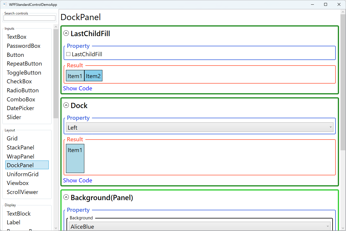
child specifies a DockPanel.Dock attached property value — Top,
Bottom, Left, or Right — and the panel progressively
allocates space from that edge inward. Children are processed in XAML order: the first child
claims its docked edge from the full available space, the second child claims from the remaining
space, and so on. This stacking behaviour makes DockPanel extremely intuitive for building
structured shells.
The most important behavioural property is LastChildFill. When True
(the default), the last child in the panel fills whatever space remains after all preceding
children have been docked. This is the classic "content area" pattern: dock a menu to the top,
a status bar to the bottom, a navigation sidebar to the left, and let the last child —
typically a Frame, ScrollViewer, or Grid — fill the
central content area automatically.
DockPanel is deliberately simple and does not support row/column spanning, proportional sizing,
or auto-fitting in the way Grid does. Its strength is clarity: the XAML ordering
of children directly communicates the visual structure, making it easy to read and maintain.
For the main window chrome of a desktop application — toolbar, sidebar, status bar, content
area — DockPanel is often the most readable choice.
The Panel.ZIndex attached property works on DockPanel children just as on any
other panel, allowing overlapping elements to stack visually without changing their layout
positions. Background fills the entire panel area including any space not covered
by children, which matters when LastChildFill is False and there is
unclaimed central space.
Screen Preview
Demonstrated Properties
The following properties are demonstrated interactively in the WPF Standard Control Demo App. Each property can be configured in real time within the app to observe its behavior.
| Property | Values | Description |
|---|---|---|
LastChildFill |
bool |
Use the default True for the classic application shell pattern: dock peripheral controls (menu, toolbar, status bar, sidebar) first, then let the last child — typically a Frame, ScrollViewer, or Grid — automatically fill whatever space remains. Set to False when all children should be docked to specific edges and the centre may intentionally remain empty (e.g., a floating toolbar row). Pitfall: when LastChildFill="True", the DockPanel completely ignores the DockPanel.Dock setting on the last child and forces it to fill the remaining area. Setting a Dock value on the last element has no effect and can be misleading — remove the Dock attribute from the last child to avoid confusion. |
DockPanel.Dock (attached) |
Left / Top / Right / Bottom |
Use this on each child to pin it to a specific edge — for example, Top for a menu bar, Bottom for a status bar, and Left for a navigation tree. Multiple children can be docked to the same edge; they stack outward-to-inward in XAML order. Pitfall: the order in which children appear in XAML directly determines how much space each one receives. A child docked earlier claims from the full available area; later children claim from what remains. Always write small UI components (menu, toolbar) before large ones (sidebar, content area). Docking a large element first leaves little room for elements that follow. |
Background |
Brush |
Use this to paint the panel background and to control hit-testing. When LastChildFill="False", the background is visible in the unclaimed centre area. Pitfall: a null background (the default) disables hit-testing on the panel itself — mouse events in uncovered areas pass straight through. Set Background="Transparent" to capture clicks without painting a colour. |
Panel.ZIndex (attached) |
int |
Controls the render order of overlapping children. Higher values render on top. Although DockPanel children do not overlap in a typical layout, setting a high ZIndex on a floating panel or overlay child ensures it renders above all other content. Pitfall: ZIndex is scoped to siblings within the same DockPanel only — it cannot make a child appear above elements in a different panel. |
XAML Example
The following XAML shows a typical main window chrome layout using DockPanel:
<DockPanel LastChildFill="True">

  <!-- Top menu bar -->
  <Menu DockPanel.Dock="Top">
    <MenuItem Header="_File">
      <MenuItem Header="_New" />
      <MenuItem Header="_Open" />
    </MenuItem>
  </Menu>

  <!-- Top toolbar -->
  <ToolBar DockPanel.Dock="Top">
    <Button Content="New" />
    <Button Content="Save" />
  </ToolBar>

  <!-- Bottom status bar -->
  <StatusBar DockPanel.Dock="Bottom">
    <StatusBarItem Content="Ready" />
  </StatusBar>

  <!-- Left navigation panel -->
  <Border DockPanel.Dock="Left" Width="200"
          Background="#F0F0F0" Padding="8">
    <TextBlock Text="Navigation" />
  </Border>

  <!-- Centre content area (LastChildFill) -->
  <ScrollViewer>
    <TextBlock Text="Main content goes here." Margin="16" />
  </ScrollViewer>

</DockPanel>
Common Use Cases
- Main window chrome: The canonical use — docking a
MenuandToolBarto the top, aStatusBarto the bottom, and letting the content area fill the rest. - Two-pane layouts: Docking a navigation or tree panel to the left and using
LastChildFillto give the remaining width to a details or preview panel. - Header/footer forms: Docking a
Borderheader to the top and a button row to the bottom, with aScrollViewerfilling the middle for a long data-entry form. - Toolbar rows: Stacking multiple
ToolBarTrayor customBorderelements at the top by docking each one toTopin sequence. - Sidebar panels: Docking optional inspector or properties panels to the right side of the window, which can be collapsed by setting their width to zero or using a
Visibilitybinding.
Tips and Best Practices
- Order children deliberately. DockPanel processes children in XAML order. A child docked to
Topthat appears before a child docked toLeftwill span the full panel width; reversing the order would shorten it. Write small peripheral elements (menus, toolbars) before larger ones (sidebars, content panels) to ensure each component gets the space it needs. - Use Grid for complex layouts. DockPanel excels at simple shell structures but becomes cumbersome for more than 4–5 regions. Switch to a
Gridwhen you need proportional sizing, spanning, or more than one content row. - Set
Backgroundwhen hit-testing matters. An empty DockPanel (or any panel with anullbackground) will not receive mouse events in the uncovered region. SetBackground="Transparent"to capture clicks without painting a colour. - Avoid deeply nested DockPanels. While it is tempting to nest DockPanels for sub-sections, each level adds layout passes. Flatten the hierarchy with a single
Gridto improve rendering performance and maintain readability. - Use
GridSplitterfor resizable regions. DockPanel itself does not support user-resizable panes. Place the docked panels inside aGridand add aGridSplitterto enable drag-to-resize behaviour. - Learn the window-frame layout pattern. The canonical DockPanel structure for a desktop application is:
MenudockedTop→ToolBardockedTop→StatusBardockedBottom→ content fills the rest (LastChildFill="True"). Memorising this four-edge pattern lets you scaffold the skeleton of almost any WPF window in minutes.
Related Controls
- Grid — the most powerful layout panel; use for multi-row/column layouts with proportional or absolute sizing.
- StackPanel — stacks children sequentially in one direction without edge-docking semantics.
- GridSplitter — adds drag-to-resize capability inside a Grid, complementing DockPanel-like pane layouts.
- WrapPanel — flows children with automatic wrapping; suited for dynamic item counts.
Source Code
The source code for this demo screen is available on GitHub. Use the built-in code view buttons in the app to see the exact XAML for each property.