WPF Standard Control Demo App › GridSplitter
GridSplitter Resizer
GridSplitter is a control placed inside a Grid that allows users to resize rows or columns by dragging. It is commonly used to create resizable pane layouts.
Overview
The WPF GridSplitter is a specialised thumb control that lives inside a
Grid cell and allows users to resize adjacent rows or columns by dragging. Unlike a
window resize handle, GridSplitter operates entirely within the layout tree — it redistributes
pixel space between the star-sized or fixed-pixel rows and columns on either side of it without
changing the window size. This makes it the standard technique for building split-pane and
multi-pane IDE-style layouts in WPF.
GridSplitter descends from Thumb, so it inherits all thumb behaviour: it raises
DragStarted, DragDelta, and DragCompleted events, and it
exposes the read-only IsDragging property while a drag is in progress. In practice,
most applications only need to configure a handful of properties — ResizeDirection,
ResizeBehavior, and optionally ShowsPreview — to get a fully functional
resizable splitter.
The ResizeDirection property specifies whether the splitter resizes columns or rows.
When set to Auto, WPF infers the direction from the splitter's alignment: a
HorizontalAlignment="Stretch" splitter in a grid column that spans one column will
resize columns; a VerticalAlignment="Stretch" splitter spanning one row will resize
rows. Making the direction explicit removes this ambiguity and prevents surprising behaviour when
the splitter is placed in a shared-size or spanning cell.
ResizeBehavior controls which pair of rows or columns changes size during a drag.
PreviousAndNext — the most intuitive choice for evenly balanced panes — shrinks one
neighbour while growing the other, keeping the total size constant. The CurrentAndNext
and PreviousAndCurrent modes grow or shrink only one side, pushing or pulling the
splitter's own cell. Understanding this distinction is essential for multi-pane layouts with more
than two resizable regions.
Screen Preview
Demonstrated Properties
The following properties are demonstrated interactively in the WPF Standard Control Demo App. Each property can be configured in real time within the app to observe its behavior.
| Property | Values | Description |
|---|---|---|
ResizeDirection |
Auto / Columns / Rows |
Use this when you want users to resize panes at runtime — for example, widening a file-explorer tree or adjusting an output log panel. When the user drags the splitter, the adjacent Grid column widths or row heights change in real time (or on mouse-up if ShowsPreview="True"). Setting this explicitly to Columns or Rows removes ambiguity and makes the intent clear. Pitfall: the GridSplitter must be placed in the correct Grid row or column that sits between the panels you want to resize. Placing it in the wrong cell, or outside a Grid entirely, means it renders but has no effect on any adjacent pane sizes. For layouts that do not need runtime resizing, a simple fixed or star-sized ColumnDefinition / RowDefinition is simpler and has less overhead than a GridSplitter. |
ResizeBehavior |
BasedOnAlignment / CurrentAndNext / PreviousAndCurrent / PreviousAndNext |
Use PreviousAndNext for the most intuitive two-pane behaviour — dragging shrinks one side while growing the other, keeping the combined size constant. BasedOnAlignment (default) infers the pair from the splitter's alignment and is sufficient for most straightforward layouts. Use CurrentAndNext or PreviousAndCurrent only in multi-pane layouts where the automatic inference does not produce the intended result. Pitfall: an incorrect setting causes a different row or column pair to resize — the most visible symptom is that the wrong pane changes size when dragging. Change this setting only when the default automatic inference is not working as expected. |
ShowsPreview |
bool |
Use True when the layout is expensive to re-render during a live drag — for example, when the resizable pane contains a large DataGrid, an embedded browser, or a resource-heavy chart. A translucent preview indicator is shown while dragging; the resize is committed only when the mouse button is released. False (default) causes pane sizes to update in real time during the drag, giving immediate feedback. Pitfall: with ShowsPreview="True", users may be surprised that the layout does not move until they release the mouse. Use PreviewStyle to style the preview indicator to clearly signal that it is a preview, not the final position. |
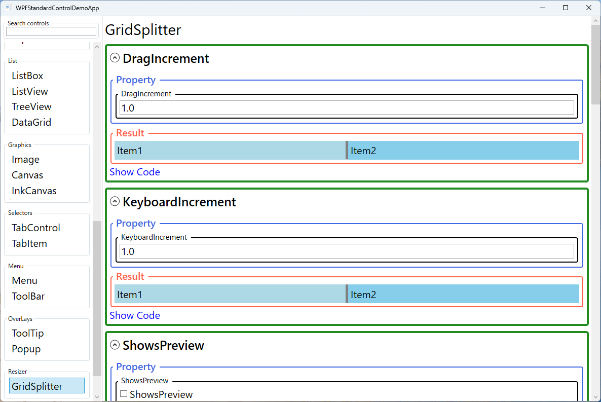
DragIncrement |
double |
Use this when you want the splitter to snap to fixed increments during mouse drag — for example, multiples of 8 pixels in a design-tool layout. The default is 1 (effectively continuous movement). Pitfall: large values create coarse, jerky snapping that can feel unnatural. Unless there is a specific design requirement to snap to grid intervals, leave this at the default. |
KeyboardIncrement |
double |
The number of pixels the splitter moves per arrow-key press when it has keyboard focus. The default is 10. This is an important accessibility setting — ensure the value is large enough to be practical for coarse adjustment, while still being small enough for fine-tuning. Pitfall: there is no built-in way to fully disable keyboard resizing. Use MinWidth / MinHeight constraints on the adjacent row or column definitions to prevent accidental keyboard-driven collapse to zero size. |
PreviewStyle |
Style |
Customises the visual style of the drag preview element shown when ShowsPreview="True". By default the preview is a translucent rectangle, but you can apply a Style targeting Control to change its colour, opacity, or border to match your application's theme. |
IsDragging (Thumb) |
bool (ReadOnly) |
A read-only inherited property from Thumb that is True while the user is actively dragging the splitter. Use it in triggers within a custom control template to provide visual feedback — such as highlighting the splitter bar — during an active drag operation. |
XAML Example
The following XAML creates a horizontal two-pane layout with a resizable vertical splitter and a vertical two-pane layout with a horizontal splitter:
<!-- Horizontal split: left tree + right content -->
<Grid>
  <Grid.ColumnDefinitions>
    <ColumnDefinition Width="200" MinWidth="100" />
    <ColumnDefinition Width="4" />     <!-- splitter column -->
    <ColumnDefinition Width="*" MinWidth="200" />
  </Grid.ColumnDefinitions>

  <TreeView Grid.Column="0" />

  <GridSplitter Grid.Column="1"
                Width="4"
                HorizontalAlignment="Stretch"
                VerticalAlignment="Stretch"
                ResizeDirection="Columns"
                ResizeBehavior="PreviousAndNext"
                ShowsPreview="False"
                KeyboardIncrement="10"
                Background="#CCCCCC" />

  <ScrollViewer Grid.Column="2">
    <TextBlock Text="Main content" Margin="8" />
  </ScrollViewer>
</Grid>

<!-- Vertical split: top list + bottom details -->
<Grid>
  <Grid.RowDefinitions>
    <RowDefinition Height="*" MinHeight="80" />
    <RowDefinition Height="4" />     <!-- splitter row -->
    <RowDefinition Height="160" MinHeight="60" />
  </Grid.RowDefinitions>

  <ListView Grid.Row="0" />

  <GridSplitter Grid.Row="1"
                Height="4"
                HorizontalAlignment="Stretch"
                VerticalAlignment="Stretch"
                ResizeDirection="Rows"
                ResizeBehavior="PreviousAndNext"
                Background="#CCCCCC" />

  <Border Grid.Row="2" Background="#F9F9F9" Padding="8">
    <TextBlock Text="Details panel" />
  </Border>
</Grid>
Common Use Cases
- IDE-style split views: File explorer tree on the left and editor pane on the right, with a vertical GridSplitter allowing users to widen the tree or give more space to the editor.
- Master-detail layouts: A top list of records with a detail panel below, separated by a horizontal GridSplitter so users can allocate more height to whichever section they are working in.
- Multi-pane dashboards: Three-column dashboards (navigation | main content | inspector) with two vertical splitters, each independently resizable.
- Log viewers: A code or document view on top and a log/output panel below, with a horizontal splitter to balance the two panes as the user switches focus between writing and reading output.
- Comparison tools: Side-by-side text or image comparison panels separated by a centred splitter, allowing users to temporarily maximise one side for closer inspection.
Tips and Best Practices
- Dedicate a row or column to the splitter. Place the GridSplitter in its own zero-or-thin-sized row/column rather than sharing a cell with content. This makes hit-testing reliable and keeps XAML intent clear.
- Set
MinWidth/MinHeighton resizable rows and columns to prevent panes from being dragged to zero size, which can leave the UI in an unusable state the user cannot recover from without restarting. - Use
ShowsPreview="True"in layouts with expensive rendering (largeDataGridwith thousands of rows, embedded browser controls) to prevent continuous layout recalculations during drag, which cause stuttering. - Persist pane sizes between sessions by binding column
Widthor rowHeightto ViewModel properties that are saved to user settings. Users strongly prefer having their customised pane layout restored when they reopen the application. - Ensure keyboard accessibility. A focused GridSplitter responds to arrow keys for resizing. Set a reasonable
KeyboardIncrementand verify via keyboard-only testing that the splitter is reachable with Tab and operable without a mouse. - Know when GridSplitter is overkill. GridSplitter is the right choice when users need to freely adjust pane sizes at runtime. If pane proportions are fixed by design or are only changed programmatically via code or data binding, a simpler approach — binding
ColumnDefinition.WidthorRowDefinition.Heightdirectly to ViewModel properties — is easier to implement and maintain without the overhead of a drag handle.
Related Controls
- Grid — GridSplitter only works inside a Grid; understanding Grid row/column definitions is a prerequisite.
- DockPanel — an alternative for fixed-edge layouts; does not support runtime resizing by the user.
- ScrollViewer — typically wraps the content panels on either side of a GridSplitter when content may exceed the pane size.
- TreeView — a common occupant of the left pane in a GridSplitter-divided layout, such as a file-browser tree.
Source Code
The source code for this demo screen is available on GitHub. Use the built-in code view buttons in the app to see the exact XAML for each property.