Overview
After the Fluent theme is introduced into an existing WPF application, some controls may keep their previous squared-off appearance instead of adopting the Fluent look.
The symptom appears on controls that carry a Style which is not chained to the Fluent style through BasedOn.
An implicit style such as <Style TargetType="Button"> is the most common way an application ends up in that state without the author noticing.
Setting Style="{x:Null}" to opt out of style application leaves the same legacy look.
No exception is raised, no warning appears, and the output window stays silent, so the theme setup itself is easily mistaken for the cause.
This article explains the behavior from how the Fluent theme is delivered to controls, and presents the fix based on BasedOn.
It also documents the placements where BasedOn is written but never resolved, using a results table produced by measurement.
Prerequisites / Environment
- Framework: WPF on .NET 9 / .NET 10 (
net9.0-windows/net10.0-windows) - OS: Windows 11 (standard colors; high contrast is out of scope)
- Theme activation: the
ThemeModeproperty, or merging theFluent.xamlresource dictionary directly - Target: styles declared in
Application.Resources,Window.Resources, or a separate resource dictionary file - Architecture: the behavior is identical for MVVM and code-behind
- Verification environment: .NET 10 / Windows 11
- Also confirmed:
BasedOnresolution behaves the same on .NET 9
The measurements in this article were taken in the environment above by reading the template supplied to each control and its Style property.
The following points were confirmed in that environment:
- Leaving
ThemeModeunset versus setting it toLightchanges the template supplied to a control. - Whether the application’s implicit style applied was determined here from the
Styleproperty. - Placing an implicit style without
BasedOnunder the same key stops the Fluent template from being supplied. - Where a template came from was determined from named parts unique to that template.
ThemeMode exists on both Application and Window, so the theme can be set for the whole application or per window.
The results table below includes combinations whose result depends on which one carries the setting.
The pack URI for merging Fluent.xaml directly is the following.
pack://application:,,,/PresentationFramework.Fluent;component/Themes/Fluent.xaml
Assign this URI to the Source of a ResourceDictionary.
With ThemeMode, that markup is unnecessary.
In measurement, setting ThemeMode merged the resolved Fluent.Light.xaml or Fluent.Dark.xaml automatically.
ThemeMode is published as an experimental API.
Every implementation in this article sets it as a XAML attribute, so no suppression is required, but as what’s new in WPF for .NET 9 states, accessing it from code produces error WPF0001.
In that case, suppress it with <NoWarn>$(NoWarn);WPF0001</NoWarn> in the project file, or with #pragma warning disable WPF0001.
Problem
Enabling the Fluent theme takes a single attribute.
Setting ThemeMode on the Application element in App.xaml gives the whole application the Fluent appearance.
The problem appears when the existing App.xaml already carries an implicit style.
The following App.xaml applies the Fluent theme while widening the padding of Button as before.
<Application x:Class="MyApp.App"
             xmlns="http://schemas.microsoft.com/winfx/2006/xaml/presentation"
             xmlns:x="http://schemas.microsoft.com/winfx/2006/xaml"
             StartupUri="MainWindow.xaml"
             ThemeMode="Light">
  <Application.Resources>
    <Style TargetType="Button">
      <Setter Property="Padding" Value="16,6" />
    </Style>
  </Application.Resources>
</Application>
The style only adds Padding, and neither the template nor the colors are touched.
Even so, the Button does not adopt the Fluent appearance at run time.
A CheckBox placed in the same window renders with the Fluent look, which shows that the theme itself is active.
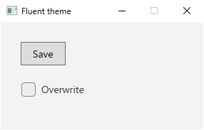
App.xaml above, with the {x:Type Button} implicit style placed directly in Application.Resources. Captured on Windows 11 / .NET 10 with ThemeMode=Light. The Button has square corners and a gray background, while the untouched CheckBox stays Fluent.Inspecting this button’s template on .NET 10 with ThemeMode=Light shows a CornerRadius of 0 and a background of #FFDDDDDD on the inner Border.
What’s new in WPF for .NET 9 states that the default ThemeMode of None uses Aero2.
The measured values match the Aero2 Button on Windows 11 with standard colors, which confirms that no part of the Fluent style is in effect.
Cause / Background
The cause lies in the path through which the Fluent theme reaches a control.
Fluent is delivered as implicit styles, not as a theme style
The earlier WPF themes such as Aero2 are applied as the theme style of a control.
Dependency property value precedence ranks the theme style as the weakest source among styles, with values from the application’s own style layered above it.
Measurement confirms that a control carrying an implicit style that sets nothing but Padding still receives the Aero2 template.
Unless OverridesDefaultStyle is set to true, a theme style keeps supplying the template even when the application assigns Style.
The Fluent theme does not use that path.
The reference for the Application.ThemeMode property states that setting the property loads the Fluent theme dictionaries into the application resources.
As far as style delivery is concerned, Fluent arrives as a resource dictionary merged into the resources of the element that carries ThemeMode rather than as a theme style.
The reference for the Window.ThemeMode property likewise states that setting it on a Window loads the Fluent theme dictionaries into that window’s resources.
The dictionary also holds many brushes and numeric resources; the implicit styles keyed by values such as {x:Type Button} are one part of it.
This difference is observable in measurement.
A control with Style="{x:Null}", which explicitly opts out of style application, renders with the Aero2 appearance even while the Fluent theme is active.
If Fluent were supplied as a theme style, clearing Style would leave the Fluent appearance in place.
A style with the same key hides the Fluent style
The key of the Fluent implicit style is exactly the key that <Style TargetType="Button"> produces in application code: {x:Type Button}.
When the same key exists in two places, resource lookup rules determine which one is used.
In both placements described below, the application style is the one selected.
For a style placed directly in Application.Resources, the outcome follows the precedence between a dictionary and the dictionaries merged into it.
The article on merged resource dictionaries states that when a key is defined in the primary dictionary and also in a merged dictionary, the resource returned comes from the primary dictionary.
ThemeMode adds Fluent as a merged dictionary, so the style written directly in Application.Resources takes precedence.
For a style placed in an inner scope such as Window.Resources, the outcome follows scope proximity.
The article on styles and templates explains that the search for an element’s style walks up the element tree, then looks in the application resources, and consults the theme last.
Window.Resources is examined before Application.Resources, so the application style is selected.
In both cases the application style does not extend the Fluent style; it replaces and hides it entirely.
Once hidden, the Fluent template is no longer supplied, and the control falls back to the built-in WPF theme style, Aero2.
That is why a style adding nothing but Padding discards the whole Fluent appearance.
All of this describes a style written without BasedOn. Where the original can be inherited through BasedOn, the template survives while your own setters still apply.
The last two rows of the table below measure that for a TextBox style placed in Window.Resources.
Depending on where the style lives, though, BasedOn itself may fail to resolve. The Solution section covers that condition.
Which source supplied the template can be told apart by the named parts inside it.
The Fluent TextBox template holds a DeleteButton; the Aero2 theme does not.
| window | Style applied | named parts present | Padding.Left |
|---|---|---|---|
| no ThemeMode | theme style | PART_ContentHost | 0 |
| ThemeMode=Light | implicit style | DeleteButton, PART_ContentHost | 10 |
| ThemeMode=Light + implicit Style | implicit style | PART_ContentHost | 8 |
| no ThemeMode + implicit Style | implicit style | PART_ContentHost | 8 |
| merge Fluent.xaml directly | implicit style | DeleteButton, PART_ContentHost | 10 |
| merge Fluent.xaml + implicit Style | implicit style | PART_ContentHost | 8 |
| ThemeMode=Light + implicit Style, BasedOn | implicit style | DeleteButton, PART_ContentHost | 8 |
| merge Fluent.xaml + implicit Style, BasedOn | implicit style | DeleteButton, PART_ContentHost | 8 |
Measured on .NET 10 / Windows 11. The Style applied column reports whether the Style property is filled in (an implicit style) or left null (the Aero2 theme style).
The point is the second row, where Style applied reads implicit style. Setting ThemeMode alone fills in the Style property, showing that Fluent arrives as an implicit style rather than a theme style.
On the first row, without ThemeMode, Style stays null and the template comes from the Aero2 theme style.
On the third row, an application-side implicit style under the same key that carries no BasedOn makes DeleteButton disappear.
Padding reads 8, so the application style did take effect. It is precisely because it took effect that the Fluent style was replaced and its template lost with it.
The last two rows inherit the original through BasedOn. On both routes — ThemeMode and a direct merge of Fluent.xaml — Padding reads 8 just the same and DeleteButton survives.
What this table measures is an implicit TextBox style placed in Window.Resources.
A Button, or a style placed directly in Application.Resources, lands elsewhere; the table in the Solution section covers those.
Solution
Add BasedOn to the style so that it inherits the Fluent implicit style.
Writing BasedOn="{StaticResource {x:Type Button}}" layers the local Setter elements on top of the Fluent style.
This markup carries one constraint that must be respected.
When the key passed to BasedOn is the same as the style’s own key, and that key also exists in a dictionary merged into the dictionary declaring the style (including nested merged dictionaries), BasedOn is left unresolved and stays null.
No exception is raised, and the legacy appearance remains.
This condition was derived from measurement on .NET 9 and .NET 10; it is not a description of how StaticResource resolves internally.
Declaring an implicit style directly inside Application.Resources meets that condition.
ThemeMode adds the Fluent dictionaries as merged dictionaries of the very Application.Resources that declares the style.
The rule above states only when the reference fails, and the converse does not hold: avoiding the condition does not guarantee that BasedOn reaches Fluent.
As the table below shows, some placements fail to reach Fluent without meeting the condition.
The figure below contrasts placing the style directly in Application.Resources with moving it into a dedicated resource dictionary file, referred to here as Styles.xaml.
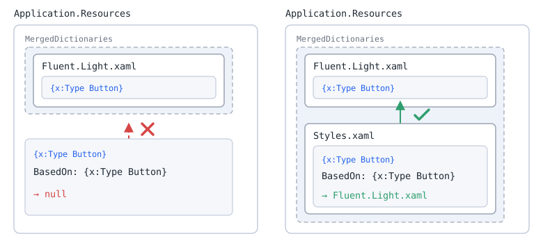
BasedOn target and the dictionary that declares the style. A dashed frame is MergedDictionaries, a white box is a resource dictionary, and the lighter box inside it is a style. On the left the style sits directly in Application.Resources, so the referenced key matches the style's own key and also exists in a dictionary merged into that same dictionary, leaving it unresolved. On the right the style lives in a separate file inside MergedDictionaries, so it reaches the Fluent entry in the same MergedDictionaries. Both set ThemeMode on Application, and both were confirmed on .NET 9 and .NET 10 running Windows 11.A failed reference can be spotted quickly by inspecting the style at run time.
For a style placed in Application.Resources, basedOn below being null means it did not resolve.
Style? style = Application.Current.Resources[typeof(Button)] as Style;
Style? basedOn = style?.BasedOn;
For a style placed in Window.Resources, read the target window’s Resources the same way instead of Application.Current.Resources.
This check misses cases, however.
A non-null basedOn can still point at the default theme style rather than at Fluent.
Make the final call by rendering the control and looking for Fluent-specific traits such as rounded corners.
The configuration that reliably inherits Fluent is therefore the following.
- Set
ThemeModeonApplication, not on aWindow. - Keep the style out of
Application.Resourcesitself (moving it into a dedicated resource dictionary file and merging that file is the most manageable way to do so). - Do not merge the Fluent dictionary inside that file.
- Add
BasedOn="{StaticResource {x:Type Button}}"to the style.
Implementation
Move the style into a separate resource dictionary
First, extract the implicit style into Styles.xaml.
Specify {StaticResource {x:Type Button}} for BasedOn so the Fluent style becomes the base.
<ResourceDictionary xmlns="http://schemas.microsoft.com/winfx/2006/xaml/presentation"
                    xmlns:x="http://schemas.microsoft.com/winfx/2006/xaml">
  <Style TargetType="Button" BasedOn="{StaticResource {x:Type Button}}">
    <Setter Property="Padding" Value="16,6" />
  </Style>
</ResourceDictionary>
Do not merge the Fluent dictionary into this file.
Merging Fluent.xaml inside Styles.xaml makes the target a merged dictionary of Styles.xaml, and the reference stops resolving.
Merge the dictionary from App.xaml
App.xaml is then limited to setting ThemeMode and merging Styles.xaml.
Keeping the style itself out of Application.Resources is the essential point.
<Application x:Class="MyApp.App"
             xmlns="http://schemas.microsoft.com/winfx/2006/xaml/presentation"
             xmlns:x="http://schemas.microsoft.com/winfx/2006/xaml"
             StartupUri="MainWindow.xaml"
             ThemeMode="Light">
  <Application.Resources>
    <ResourceDictionary>
      <ResourceDictionary.MergedDictionaries>
        <ResourceDictionary Source="pack://application:,,,/MyApp;component/Styles.xaml" />
      </ResourceDictionary.MergedDictionaries>
    </ResourceDictionary>
  </Application.Resources>
</Application>
The Fluent dictionary merged by ThemeMode and Styles.xaml become sibling merged dictionaries within Application.Resources.
With this layout, BasedOn resolves to the Fluent implicit style and only the Padding setter is layered on top.
In measurement, the Fluent dictionary added by ThemeMode precedes Styles.xaml, so the ordering issue described later does not arise.
For a file in the same project whose build action is Resource, a relative path such as Source="Styles.xaml" also works.
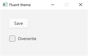
Styles.xaml and App.xaml above as written. Captured on Windows 11 / .NET 10 with ThemeMode=Light. Compared with the previous figure, the Button now has rounded corners and a lighter background. In measurement, the Padding setter survives unchanged in this state.Placement and resolution results
Whether BasedOn resolves depends on the combination of where the style lives and where Fluent comes from.
The following results were measured for Button on both .NET 9 and .NET 10.
The BasedOn column shows the key passed to BasedOn="{StaticResource ...}".
For the row with x:Key, the keyed style was applied explicitly through Style="{StaticResource ...}", with no implicit {x:Type Button} style placed alongside it.
The table covers only placements where the custom style actually applies to the control; for placements where the custom style never applies at all, see the notes below.
| Placement of the style | Source of Fluent | BasedOn |
Result |
|---|---|---|---|
Directly in Application.Resources (implicit) |
ThemeMode on Application |
none | Legacy look |
Directly in Application.Resources (implicit) |
ThemeMode on Application |
{x:Type Button} |
Legacy look (BasedOn is null) |
Directly in Application.Resources (implicit) |
ThemeMode on Application |
DefaultButtonStyle |
Fluent |
Directly in Application.Resources (with x:Key) |
ThemeMode on Application |
{x:Type Button} |
Fluent |
Separate file merged into Application.Resources (implicit) |
ThemeMode on Application |
{x:Type Button} |
Fluent |
Window.Resources (implicit) |
ThemeMode on Application |
{x:Type Button} |
Fluent |
Separate file merged into Window.Resources (implicit) |
ThemeMode on Application |
{x:Type Button} |
Fluent |
Window.Resources (implicit) |
ThemeMode on the same Window |
{x:Type Button} |
Legacy look (BasedOn is null) |
Separate file merged into Window.Resources (implicit) |
ThemeMode on the same Window |
{x:Type Button} |
Legacy look (BasedOn is not null) |
Separate file that merges Fluent.xaml itself (implicit) |
Fluent.xaml in that same file |
{x:Type Button} |
Legacy look (BasedOn is null) |
Each of the three rows where BasedOn becomes null meets the same condition: the key passed to BasedOn matches the style’s own key, and that key also exists in a dictionary merged into the dictionary declaring the style.
The row referencing DefaultButtonStyle, whose key differs, and the row whose style carries an x:Key do not meet that condition, so they resolve even though they sit directly in Application.Resources.
The row pairing a separate file merged into Window.Resources with ThemeMode on that same Window, by contrast, keeps the legacy look without meeting the condition.
The dictionary declaring the style in that row is the separate file, and Fluent sits outside it in the merged dictionaries of Window.Resources, so the condition does not apply.
Even so, BasedOn was not null in measurement; it resolved to the default theme style instead of Fluent.
When ThemeMode is set on a Window, moving the style into a separate file is not enough.
Moving ThemeMode up to Application resolves it.
In measurement, both a style directly in Window.Resources and one in a file merged into Window.Resources reached Fluent that way.
Moving the style into Application.Resources itself is a separate matter, and the second row of the table shows that it does not resolve.
Alternative: when the App.xaml structure cannot change
When the file layout is fixed, reference DefaultButtonStyle, which the Fluent theme dictionary provides.
Because that key differs from the style’s own {x:Type Button} key, it resolves even directly inside Application.Resources.
<Application.Resources>
  <Style TargetType="Button" BasedOn="{StaticResource DefaultButtonStyle}">
    <Setter Property="Padding" Value="16,6" />
  </Style>
</Application.Resources>
Measurement shows that the Fluent {x:Type Button} style carries no setter of its own and that its BasedOn is DefaultButtonStyle itself.
For Button the two are effectively equivalent, so this form loses no setter.
DefaultButtonStyle is not a documented key and depends on the internal structure of Fluent.xaml, so treat it as a stopgap.
Applying the same approach to another control requires checking that control’s key name, and whether its implicit style is equivalent to the style under that key.
In measurement the TargetType of DefaultButtonStyle is ButtonBase, not Button, so the referenced style may target a base type.
Alternative: confining the change to part of the UI
A keyed style resolves BasedOn against {x:Type Button} even directly inside Application.Resources.
<Application.Resources>
  <Style x:Key="WideButton" TargetType="Button"
         BasedOn="{StaticResource {x:Type Button}}">
    <Setter Property="Padding" Value="16,6" />
  </Style>
</Application.Resources>
Because this style does not occupy the {x:Type Button} key itself, the target of the reference is the Fluent implicit style.
A keyed style is not applied automatically, so every control needs an explicit Style="{StaticResource WideButton}".
This form reaches Fluent only as long as no implicit {x:Type Button} style remains directly in Application.Resources.
In measurement, keeping an implicit style alongside it made BasedOn resolve to that implicit style instead, leaving the legacy appearance.
A keyed style applied without BasedOn also falls back to the legacy appearance, just as an implicit one does.
Notes
- Nothing reports the failure. An unresolved
BasedOnproduces no exception and no warning in the output window. Only the rendered appearance reveals it, so verify migrations visually against Fluent-specific traits such as rounded corners. - Set
ThemeModeonApplication. Setting it per window creates placements whereBasedOnresolves to the default theme style rather than Fluent, even with the style moved into a separate file. A separate problem also appears: withThemeModeon aWindowand the custom styles merged intoApplication.Resources, the appearance does turn Fluent but the custom setters have no effect. The Fluent implicit style thatThemeModeplaced inWindow.Resourcesis found before the custom style in the outerApplication.Resources, so the custom style never applies. Unless individual windows need different light/dark modes, keep the setting onApplication. Note that onceApplicationcarries anything other thanNone, aWindowcan no longer be set back toNone. - Each control type needs its own fix. Implicit style keys are per type, so repairing
Buttonleaves the styles ofTextBoxorCheckBoxuntouched. Enumerate the declared styles by type before migrating an existing application. - The set of controls Fluent covers differs by version. What’s new in WPF for .NET 10 added styles for controls such as
GroupBox. Measurement confirms that the implicit style forGroupBoxis absent from Fluent on .NET 9 and present on .NET 10. For a control that Fluent does not style implicitly,BasedOnresolves to the default theme style instead of becomingnull, so anullcheck does not catch it; judge by the unchanged appearance. Style="{x:Null}"opts out of Fluent. Disabling style application leaves that control with the Aero2 appearance. Review any place that uses{x:Null}to restore a default look before adopting Fluent.- When using
ThemeMode, do not merge the Fluent theme dictionaries by hand. The reference for theApplication.ThemeModeproperty recommends against adding the Fluent theme dictionaries manually when the property is set, because the manually added ones take precedence. The same reference notes thatThemeModealso controls the window backdrop and dark mode, so it is not equivalent to mergingFluent.xamlby hand. - The order of merged dictionaries changes the result. As the article on merged resource dictionaries states, when the same key appears twice in one
MergedDictionaries, the later entry wins. In measurement, mergingFluent.xamlafter the custom styles discarded the custom setters. PlaceFluent.xamlbefore the custom styles when merging it manually. - A direct
Fluent.xamlmerge follows the Windows theme setting. In measurement, mergingFluent.xamlon a machine set to dark mode loaded the dark dictionary at startup. Whether it follows a theme switch made while the application is running was not verified for this article. To pin the appearance, drop the manual merge and setThemeModetoLightorDark. AddingThemeModewhile keeping the manual merge leaves the control colors unpinned, because the manual merge wins. ThemeModeand Fluent are still changing.ThemeModeremains an experimental API as of .NET 10, and its reference notes that it may be removed in a future version. The Fluent style implementation is also still in progress. The results table above reflects .NET 9 and .NET 10, and later versions warrant a recheck.
Alternatives / Comparison
| Approach | Pros | Cons | Best suited for |
|---|---|---|---|
Separate dictionary with BasedOn="{StaticResource {x:Type Button}}" |
Relies only on documented markup, and implicit styles keep applying automatically | Requires changing the file layout | The standard case of migrating an existing app to Fluent |
BasedOn="{StaticResource DefaultButtonStyle}" |
Leaves the App.xaml structure untouched |
Depends on a key that is not documented | A stopgap when the file layout cannot change |
Keyed style applied explicitly with BasedOn |
Limits the scope of the change to the chosen controls | Every usage needs an explicit Style reference |
Adjusting only certain screens or controls |
| Keep the existing styles without Fluent | No migration work | Loses the Windows 11 appearance and does not follow the light/dark theme | Applications that already ship a fully custom design |
Summary
As far as style delivery is concerned, the Fluent theme arrives as implicit styles inside a resource dictionary rather than as a theme style.
An application style using the same {x:Type Button} key therefore hides the Fluent style, and the control falls back to the Aero2 appearance.
The fix is inheritance through BasedOn="{StaticResource {x:Type Button}}", but when the key passed to BasedOn matches the style’s own key and also exists in a dictionary merged into the dictionary declaring the style, BasedOn stays unresolved and the legacy look remains with no error to signal it.
For migrating an existing application, set ThemeMode on Application and make the default structure a dedicated resource dictionary file holding the styles, merged from App.xaml.
Setting ThemeMode per window creates placements where the style is never chained to Fluent, even when it lives in a separate file.
Reference DefaultButtonStyle only when the App.xaml structure cannot be changed, and choose keyed styles with explicit application when the change should stay confined to part of the UI.