Overview
A required-field check is in place, yet the TextBox never turns red.
The symptom splits into two variants.
In one, a breakpoint in the validation code is never hit; in the other, validation clearly runs and Validation.GetHasError returns true, but the screen does not change.
Neither is a defect in the validation logic.
WPF validation is split into three independent parts: the path that produces an error, the place that stores it, and the place that draws it.
When one of them is missing, the other two keep working correctly while the UI stays silent.
This article breaks the “no error shown” symptom into those three stages, isolates each cause, and compares ValidationRule, IDataErrorInfo, INotifyDataErrorInfo, and exception-based validation.
One more symptom is covered alongside them: all three stages hold, yet the message alone is missing, which is the documented behavior of the default ErrorTemplate.
Every behavior and default value described here was measured on .NET 10 / Windows 11 (the behaviors in the notes are collected in the table at their end).
Prerequisites / Environment
- Framework: .NET 6 or later / WPF (behavior verified on .NET 10 / Windows 11)
- Language: C# 12 or later / XAML (samples use collection expressions; on targets whose default language version is C# 11 or earlier, such as
net6.0, read[]asnew()and the spread element[.. messages]asnew List<string>(messages)) - Target features:
Bindingvalidation (Validationattached properties,ValidationRulesubclasses,IDataErrorInfo,INotifyDataErrorInfo,ValidatesOnExceptions) - Architecture: MVVM, with the view model holding validation results
- Other constraints: the default
ErrorTemplateis the baseline; custom templates are covered in the implementation section
Problem
Three TextBox controls are stacked in one panel against the same state, an empty required name.
Only the binding syntax and the interface implemented by the view model differ.
The validation logic is identical in all three cases: an empty string yields exactly one “required” error.
<StackPanel>
    <!-- Bound to a view model that implements IDataErrorInfo -->
    <TextBox x:Name="Plain"
             Text="{Binding Name, UpdateSourceTrigger=PropertyChanged}" />

    <!-- Same view model, with ValidatesOnDataErrors added -->
    <TextBox x:Name="WithFlag"
             Text="{Binding Name, UpdateSourceTrigger=PropertyChanged,
                    ValidatesOnDataErrors=True}" />

    <!-- Bound to a view model that implements INotifyDataErrorInfo -->
    <TextBox x:Name="Notify"
             Text="{Binding Name, UpdateSourceTrigger=PropertyChanged}" />
</StackPanel>
For the comparison, each TextBox receives its own DataContext.
Plain.DataContext = new DataErrorAccount();     // implements IDataErrorInfo
WithFlag.DataContext = new DataErrorAccount();  // same type
Notify.DataContext = new NotifyErrorAccount();  // implements INotifyDataErrorInfo
DataErrorAccount and NotifyErrorAccount are view models that return the same required-field check through IDataErrorInfo and INotifyDataErrorInfo respectively; their definitions are omitted here.
When all three are displayed at once, the default error indication, a red border, appears on the lower two only.
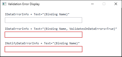
TextBox was added to the figure to identify the corresponding binding (produced on .NET 10 / Windows 11).For the top TextBox, Validation.GetHasError stays false and Validation.Errors is empty.
A breakpoint in the IDataErrorInfo indexer is never hit.
The two controls that do show a red border have a problem of their own.
Validation.Errors holds the message, but no message reaches the screen.
There is also a configuration in which not even the border appears.
In an application that replaces the ControlTemplate of its Window, Validation.GetHasError returns true and Validation.Errors contains an entry, yet the UI is completely unresponsive to the error.
The Three Stages, and Where It Stops
WPF validation consists of three independent stages, all of which must hold before anything reaches the screen.
- Production — a validation rule associated with the binding runs and creates a
ValidationError. - Storage — the
ValidationErroris added toValidation.Errorson the binding target element, andValidation.HasErrorbecomestrue. - Rendering —
Validation.ErrorTemplateis drawn on the adorner layer of that element.
Stage 2 is handled by the binding engine, so the stages that application code can leave incomplete are 1 and 3.
The sections below separate the symptoms by which of the two is missing.
Stage 1: no rule is associated with the binding
This stops at stage 1.
Implementing IDataErrorInfo does not by itself take part in validation.
The indexer this[string columnName] is called only once a DataErrorValidationRule has been added to the binding.
ValidatesOnDataErrors is the shorthand that adds that rule, and its default value is false.
The activation requirements and the measured default behavior of each approach are as follows.
| Validation approach | Rule recorded on the error | Required setting | Default | Error present on initial display |
|---|---|---|---|---|
Custom ValidationRule |
The custom class | Add to Binding.ValidationRules |
Inactive unless added | No by default; yes with ValidatesOnTargetUpdated="True" |
IDataErrorInfo |
DataErrorValidationRule |
ValidatesOnDataErrors="True" |
False |
Yes |
INotifyDataErrorInfo |
NotifyDataErrorValidationRule |
ValidatesOnNotifyDataErrors (on by default) |
True |
Yes |
| Type conversion failure | Internal conversion rule | None | Always active | — |
| Exception thrown by a setter | ExceptionValidationRule |
ValidatesOnExceptions="True" |
False |
— |
ValidatesOnNotifyDataErrors is the only one that defaults to true.
That is why a view model implementing INotifyDataErrorInfo produces a red border even when the binding itself declares nothing.
INotifyDataErrorInfo also differs in how the error comes into being.
NotifyDataErrorValidationRule.Validate reports success regardless of the value passed to it; in the measured run IsValid was true even for null and an empty string.
The error itself is whatever the view model returns from GetErrors, which the binding engine reads and then keeps in step with through ErrorsChanged notifications to update Validation.Errors.
The rule serves as the marker that appears in RuleInError on the resulting ValidationError.
That read follows a fixed order.
The binding engine consults HasErrors first and calls GetErrors only when it returns true.
In the measured run, an implementation whose GetErrors returned a message displayed nothing and never had GetErrors called at all while HasErrors returned false.
A false result clears any notify errors already recorded, and the check repeats on every ErrorsChanged.
Implementing HasErrors independently of the per-property validation results is therefore enough on its own to produce a view model that holds errors the UI never shows.
Behavior on initial display differs by approach.
DataErrorValidationRule and NotifyDataErrorValidationRule both reported an error before a single character was typed.
A custom ValidationRule, by contrast, was not called when the binding was attached; Validate ran only at the first source update.
This difference explains why a custom rule stays silent when a required field is empty at startup.
The property behind the difference is ValidationRule.ValidatesOnTargetUpdated, which decides whether the rule also runs when the target is updated, that is, when the binding is established and when the source value changes.
In the measured run, the built-in DataErrorValidationRule and NotifyDataErrorValidationRule both returned true, while the default for a custom ValidationRule was false.
Specifying ValidatesOnTargetUpdated="True" makes a custom rule validate from startup as well: the rule was called immediately after launch and then re-evaluated on every change of the source value.
To establish this stage, activate the approach in use.
A design built on IDataErrorInfo specifies ValidatesOnDataErrors="True" on the binding.
INotifyDataErrorInfo is active by default, allows several messages per property, and can report results that arrive asynchronously, such as a server lookup. Choose it when several messages or asynchronous validation are needed.
Stage 3: there is no adorner layer
This stops at stage 3.
Validation.ErrorTemplate does not modify the target control itself; it is drawn on top of it, on the adorner layer.
The most common provider of that layer is AdornerDecorator, which the default ControlTemplate of Window contains.
Replacing the window template with a custom one and omitting AdornerDecorator removes the rendering surface.
In the measured run, a template containing only a ContentPresenter made AdornerLayer.GetAdornerLayer return null, and nothing appeared even though Validation.HasError was true.
Adding a single AdornerDecorator to the same template made the layer resolvable and attached one adorner.
Window.ControlTemplate |
Validation.HasError |
AdornerLayer.GetAdornerLayer |
Red border on screen |
|---|---|---|---|
| Default | true |
Resolved | Shown |
Replaced, without AdornerDecorator |
true |
null |
Not shown |
Replaced, with AdornerDecorator |
true |
Resolved | Shown |
The error is produced and stored correctly, so nothing looks wrong from logs or from HasError.
That asymmetry is what makes this cause hard to locate.
The window template is not the only source of a layer.
An AdornerDecorator placed anywhere in the visual tree creates a new layer for the subtree beneath it.
The following content sits inside a Window whose template omits AdornerDecorator.
<StackPanel>
    <TextBox Text="{Binding Name, UpdateSourceTrigger=PropertyChanged}" />

    <AdornerDecorator HorizontalAlignment="Left">
        <TextBox Text="{Binding Name, UpdateSourceTrigger=PropertyChanged}" />
    </AdornerDecorator>
</StackPanel>
Both TextBox controls bind to the same property of the same view model and hold the same validation error.
The only difference is whether an AdornerDecorator wraps them.
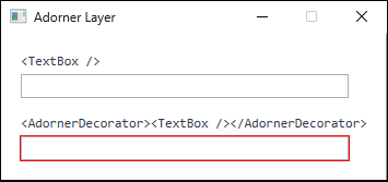
AdornerDecorator, draws a red border. Before the capture, Validation.HasError was confirmed to be true on both and AdornerLayer.GetAdornerLayer to return null for the upper one, so the difference comes from the rendering surface rather than from the error itself (produced on .NET 10 / Windows 11).AdornerDecorator is not the only provider.
The ScrollContentPresenter inside a ScrollViewer carries a layer as well.
In the measured run, a TextBox placed inside a ScrollViewer drew its red border even under a Window template that omits AdornerDecorator.
Results therefore diverge between the inside and the outside of a ScrollViewer within one screen, and the symptom can surface as “only some fields lack the border”.
When the template has been replaced but the symptom does not reproduce, check whether the control sits inside a ScrollViewer.
To establish this stage, something above the target element must supply an AdornerLayer.
Including AdornerDecorator when the Window template has been replaced is the usual remedy, but as noted above, inside a ScrollViewer the ScrollContentPresenter supplies the layer and that alone is enough.
Before stage 1: the source has not been updated yet
This concerns when stage 1 is reached.
As described earlier, the two built-in rules have ValidatesOnTargetUpdated set to true, so they are also evaluated when the binding is established and when the source value changes.
Input typed by the user, however, is validated only when the value is transferred from the target to the source.
The default UpdateSourceTrigger for TextBox.Text is LostFocus, so typing alone updates neither the source nor the validation state of that input.
In the measured run, clearing a TextBox that started with a valid value left Validation.HasError at false until focus moved away.
This applies to IDataErrorInfo and, as in the implementation below, to an INotifyDataErrorInfo that validates inside its setters.
The latter follows ErrorsChanged on the view model, but in that arrangement the event is raised by the property setter, and the setter is invoked by the source update.
With UpdateSourceTrigger=Explicit the effect is stronger: in the same arrangement the validation state did not change until UpdateSource was called.
An implementation that raises ErrorsChanged independently of the source update, such as one that reports when an asynchronous lookup completes, is not bound by this.
To report results while the user is still typing, specify UpdateSourceTrigger=PropertyChanged on the TextBox.Text binding. This applies to a binding that updates its source, that is TwoWay (the default for TextBox.Text) or OneWayToSource; with Mode=OneWay the input never reaches the source and the setter does not validate it.
Which stage a case stops at can be told apart by reading Validation.HasError, the Validation.Errors count, and the number of adorners separately.
The figure below records those for a TextBox bound to a source that always reports an error.
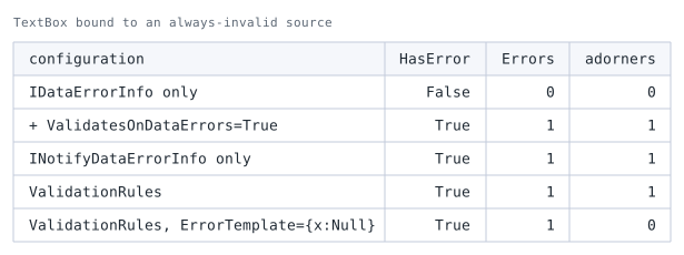
TextBox bound to a source that always reports an error. adorners is the count returned by AdornerLayer.GetAdorners.The first row shows 0 errors. Implementing IDataErrorInfo is not enough to reach stage 1 without ValidatesOnDataErrors.
The second row turns it on: one error appears, and one adorner is drawn.
INotifyDataErrorInfo behaves differently, as the third row shows. Its counterpart ValidatesOnNotifyDataErrors defaults to enabled, so implementing the interface is enough to take part in validation.
The two interfaces differing in their default is part of what makes this hard to diagnose.
The last row is a case that reaches stage 3 and stops there. HasError is True and Errors still holds one entry, but the adorner count is 0.
The error is held and simply not drawn. A value that is invalid without any red outline appearing corresponds to this row.
Implementing All Three Stages
With the three in place, supply an ErrorTemplate that renders the message.
The default template draws only a red border and never shows the contents of Validation.Errors.
The first piece is a base class that stores validation results.
INotifyDataErrorInfo is designed to return a set of messages per property name, so a dictionary keeps the implementation small.
// With ImplicitUsings disabled, System and System.Collections.Generic are also required.
using System.Collections;
using System.ComponentModel;
using System.Runtime.CompilerServices;

public abstract class ValidatableBase : INotifyPropertyChanged, INotifyDataErrorInfo
{
    private readonly Dictionary<string, List<string>> errors = [];

    public bool HasErrors => errors.Count > 0;

    public IEnumerable GetErrors(string? propertyName) =>
        propertyName is not null && errors.TryGetValue(propertyName, out List<string>? list)
            ? list
            : Array.Empty<string>();

    public event PropertyChangedEventHandler? PropertyChanged;

    public event EventHandler<DataErrorsChangedEventArgs>? ErrorsChanged;

    protected void SetProperty<T>(ref T field, T value, [CallerMemberName] string? propertyName = null)
    {
        if (EqualityComparer<T>.Default.Equals(field, value))
        {
            return;
        }

        field = value;
        PropertyChanged?.Invoke(this, new PropertyChangedEventArgs(propertyName));
        Validate(propertyName!);
    }

    protected void SetErrors(string propertyName, IReadOnlyList<string> messages)
    {
        if (messages.Count == 0)
        {
            errors.Remove(propertyName);
        }
        else
        {
            errors[propertyName] = [.. messages];
        }

        ErrorsChanged?.Invoke(this, new DataErrorsChangedEventArgs(propertyName));
        PropertyChanged?.Invoke(this, new PropertyChangedEventArgs(nameof(HasErrors)));
    }

    protected abstract void Validate(string propertyName);
}
ErrorsChanged must be raised when an error is cleared, not only when one is added.
Omitting that leaves the red border in place.
The change notification for HasErrors supports binding the enabled state of a save button directly to that property.
Driving CanExecute of an ICommand instead requires a separate trigger for re-evaluation, such as CommandManager.InvalidateRequerySuggested, because the notification alone does not re-query the command (Fixing a RelayCommand Whose CanExecute Does Not Update the Button State in WPF).
The property name passed to SetErrors must match the binding path exactly; the behavior on mismatch is covered in the notes.
A derived class only describes the validation of its own properties.
public sealed class AccountViewModel : ValidatableBase
{
    private string name = string.Empty;

    public AccountViewModel() => Validate(nameof(Name));

    public string Name
    {
        get => name;
        set => SetProperty(ref name, value);
    }

    protected override void Validate(string propertyName)
    {
        if (propertyName != nameof(Name))
        {
            return;
        }

        List<string> messages = [];
        if (string.IsNullOrWhiteSpace(Name))
        {
            messages.Add("Name is required.");
        }
        else if (Name.Length > 20)
        {
            messages.Add("Name must be 20 characters or fewer.");
        }

        SetErrors(nameof(Name), messages);
    }
}
Validate is called from the constructor so that HasErrors is correct from the initial state, which blocks the save operation immediately after startup.
On the XAML side, define an ErrorTemplate that draws the message and apply it through a Style.
AdornedElementPlaceholder marks where the original control sits, and any decoration can be placed around it.
<StackPanel Margin="16">
    <StackPanel.Resources>
        <ControlTemplate x:Key="FieldErrorTemplate">
            <StackPanel>
                <Border BorderBrush="#D13438" BorderThickness="1">
                    <AdornedElementPlaceholder x:Name="Adorned" />
                </Border>
                <TextBlock Margin="2,2,0,0" FontSize="11" Foreground="#D13438"
                           Text="{Binding ElementName=Adorned,
                                  Path=AdornedElement.(Validation.Errors)/ErrorContent}" />
            </StackPanel>
        </ControlTemplate>

        <Style TargetType="TextBox">
            <Setter Property="Validation.ErrorTemplate" Value="{StaticResource FieldErrorTemplate}" />
            <Setter Property="Margin" Value="0,0,0,22" />
        </Style>
    </StackPanel.Resources>

    <TextBox Width="240" HorizontalAlignment="Left"
             Text="{Binding Name, UpdateSourceTrigger=PropertyChanged}" />
</StackPanel>
The parentheses in AdornedElement.(Validation.Errors) denote an attached property, and the trailing /ErrorContent refers to the current item of the collection, which by default is the first error.
Running this XAML with an AccountViewModel as its DataContext rendered Name is required. under the TextBox right after startup and Name must be 20 characters or fewer. once 21 characters were entered; entering a valid value removed the adorner entirely.
The bottom margin in the Style reserves space for the message.
Adorners take no part in layout, so without that margin the message overlaps the element below it.
Notes
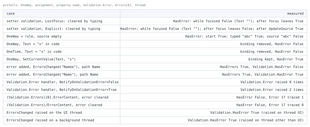
- The default
ErrorTemplatedoes not display a message.
It draws only a red border on the adorner layer.
In the measured run, theToolTipof the failingTextBoxstayednull.
Displaying the message requires either replacing theErrorTemplateor settingToolTipfrom aStyletrigger onValidation.HasError. - Adorners do not expand the layout.
MeasuringActualHeightof the parent panel with and without an error produced the same value.
AnErrorTemplatethat grows vertically therefore overlaps the elements below unless space is reserved in advance. (Validation.Errors)[0].ErrorContentreports a binding error when the error clears.
A path that addresses the first element by index is re-evaluated the moment the collection becomes empty, which loggedSystem.Windows.Data Error: 17to the output window.
The display itself clears correctly, so the trace is easy to miss.
Rewriting the path as/ErrorContent, which refers to the current item, keeps the same display and produces no trace.
How to read output window messages is covered in Reading WPF Binding Errors and Diagnosing Them with the Output Window.Mode=OneWaydoes not validate user input, and typing does not clear a red border once shown.
OneWayhas no target-to-source transfer, so typed input never becomes subject to validation.
That does not mean validation never runs.
ThroughValidatesOnTargetUpdateddescribed above, the rules were evaluated underOneWayboth when the binding was established and when the source property changed, producing a red border for an invalid value.
The problem is that no user action clears that border: typing a valid string into aTextBoxbound withOneWayleftValidation.HasErrorattrue.
Changing the source to a valid value did clear it, through re-evaluation on the target update.
A field switched toOneWayfor display purposes therefore keeps its error indication until the source changes.- Assigning to the target of a
OneWaybinding from code removes the binding.
After a plain assignment toTextBox.Text,BindingOperations.GetBindingreturnednulland the red border disappeared.
OneTimebehaves the same way.
User input andSetCurrentValueboth keep the binding intact, so only assignment from code produces this result. - An
ErrorsChangedproperty name that differs from the binding path suppresses the display.
RaisingErrorsChangedwithNameewhile the binding path wasNameleftValidation.HasErroratfalseeven thoughHasErrorswastrue.
Usingnameofinstead of string literals prevents this. ErrorsChangedraised from a background thread was still reflected.
The binding engine subscribes toErrorsChangedto updateValidation.Errors. In the measured run, raising it insideTask.Runstill madeValidation.HasErrortrue.
When the error dictionary is read and written from both the UI thread and a background thread, however, the view model has to synchronize that access itself.- The
Validation.Errorattached event is not raised by default.
Handling errors outside the visual layer, for logging or for blocking navigation, requiresBinding.NotifyOnValidationErrorto beTrue.
The default isFalse, and without it the handler is never invoked. - Exceptions thrown by a setter are swallowed by default.
Feeding an invalid value to a view model whose setter throwsArgumentOutOfRangeExceptionleftValidation.HasErroratfalsewithoutValidatesOnExceptions, and the value was not updated.
WithValidatesOnExceptions="True",ExceptionValidationRulecaught the exception andException.Messagebecame the error content.
Messages from theArgumentExceptionfamily carry a suffix such as(Parameter 'value'), which is rarely acceptable as user-facing text. - Only type conversion failures surface without any setting.
Typingabcinto aTextBoxbound to anintproperty produced an error with neitherValidatesOnExceptionsnor any validation rule in place, because the binding engine treats a conversion failure as a validation error.
That message is generated by the framework and localized to the running UI language, appearing asValue 'abc' could not be converted.underen-US, so replacing it with domain wording requires a customValidationRuleor anIValueConverter. - A custom
ValidationRulereceives the value before conversion.
The defaultValidationStepisRawProposedValue, andValidatereceived astringeven though the binding targeted anintproperty.
Validating it as a number requires parsing inside the method or settingValidationStep="ConvertedProposedValue". DataGridcells behave differently depending on the column type.
For columns where the framework creates the editing control at run time, such asDataGridTextColumn, the official documentation states thatValidation.ErrorTemplatecannot be used the way it is with simple controls and that no dedicated error template exists for cells. Feedback then goes throughDataGridBoundColumn.EditingElementStyleper cell andDataGrid.RowValidationErrorTemplateper row.
ADataGridTemplateColumn, by contrast, carries a hand-written editing control inCellEditingTemplate, and settingValidation.ErrorTemplateon that control drew the message inside the cell being edited.EditingElementStyleis a member ofDataGridBoundColumnand does not exist on this column type.
Switching controls between display and edit modes is covered in Switching Controls Between Display and Edit Modes in WPF DataGrid Cells.- Validation timing follows
UpdateSourceTrigger.
Whether results appear while typing or after focus leaves is a decision about update timing, not about presentation.
The differences between the values are covered in Controlling When TextBox Input Reaches the Source with UpdateSourceTrigger in WPF.
Driving the update from the view whenExplicitis chosen is covered in Calling TextBox UpdateSource from the View in WPF: Implementation and Pitfalls.
InputManager). Error 17 is the number of entries recorded in the data binding trace.Alternatives / Comparison
The four approaches that produce errors compare as follows.
| Approach | Activation | Multiple messages per property | Deferred or async validation | Best suited for |
|---|---|---|---|---|
Custom ValidationRule |
Add to ValidationRules |
No (only one entry reaches Validation.Errors) |
No | Input format checks kept inside the view |
IDataErrorInfo |
ValidatesOnDataErrors="True" |
No (a single string) |
No | Existing code already built on IDataErrorInfo |
INotifyDataErrorInfo |
Active by default | Yes | Yes, reported later through ErrorsChanged |
New implementations where the view model owns validation |
ValidatesOnExceptions |
ValidatesOnExceptions="True" |
No | No | Domain models that enforce invariants in setters |
Registering several custom ValidationRule objects still yields at most one entry in Validation.Errors, because no rule is evaluated after an earlier one fails.
Carrying several messages in a single error is possible instead, since ValidationResult.ErrorContent is typed as object and accepts a collection.
Doing so requires a display side that can render a collection, such as an ItemsControl; binding ErrorContent to TextBlock.Text as the implementation above does would show the type name.
Being active by default is an advantage of INotifyDataErrorInfo and, at the same time, a path for unintended validation.
Once a view model base class implements the interface, validation is enabled even where nothing is written on the individual bindings.
Disabling it for a specific binding requires an explicit ValidatesOnNotifyDataErrors="False".
Several approaches can be active at once.
Combining IDataErrorInfo with INotifyDataErrorInfo accumulated two entries in Validation.Errors in the measured run.
Adding a custom rule at the RawProposedValue step to that configuration and making it fail, however, removed the DataErrorValidationRule entry.
The UpdatedValue step sits later on the target-to-source validation path, and the path stops at the first failing step.
NotifyDataErrorValidationRule occupies the same UpdatedValue step, yet its entry survived, because that error is supplied from the state the view model holds through ErrorsChanged and is therefore maintained independently of that path.
An ErrorTemplate that shows only the first entry therefore depends on this evaluation order for which message appears, so keeping to a single approach is easier to reason about unless the display requirements demand otherwise.
Summary
Start from the value of Validation.GetHasError when an error fails to appear.
false— either no validation rule is associated with the binding, or the typed input has not reached the source yet.
CheckValidatesOnDataErrors="True"forIDataErrorInfo, and the entry inValidationRulesfor a custom rule.
SpecifyUpdateSourceTrigger=PropertyChangedto react while the user types (it has no effect withMode=OneWay, which never sends input to the source).truewith nothing on screen — the rendering surface is missing.
IncludeAdornerDecoratorif theWindowtemplate has been replaced.- A red border but no message — that is the behavior of the default
ErrorTemplate.
Supply a custom template containingAdornedElementPlaceholderand display(Validation.Errors)/ErrorContent.
Choose the approach on these criteria.
For new implementations where the view model owns validation, adopt INotifyDataErrorInfo.
Use a custom ValidationRule only when an input format check belongs inside the view, and combine ValidatesOnExceptions when the domain model enforces its invariants in setters.
For existing code built on IDataErrorInfo, check first that ValidatesOnDataErrors="True" has not been omitted.